Text-to-Chart and Text-to-Widget in Flatlogic-generated applications
Now it is possible to simply create charts and widgets from plain text. Just type what you want, for example “chart of orders by month” and have the chart added to your dashboard in seconds automatically!
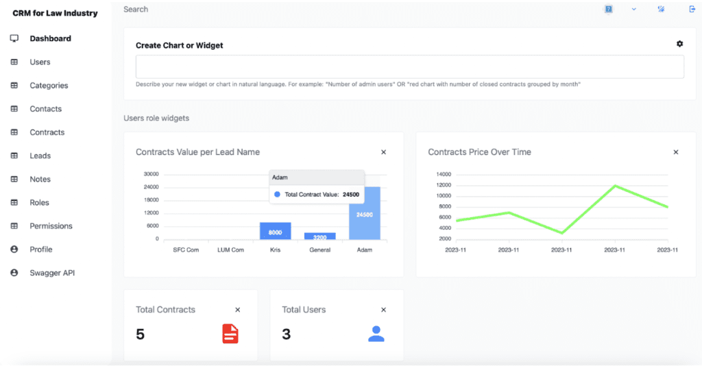
Limitations this feature applies to the default stack only.
- Text-to-Chart. Transform textual data or descriptions directly into charts, streamlining the process of data visualization.
- Text-to-Widget. Similar to Text-to-Chart, this feature allows you to create widgets from textual descriptions, enhancing efficiency in dashboard customization.
- Role-Based Customization. Admins can create different widgets for various user roles, allowing your users to see different dashboards based on their roles.
- Color Customization. Users can change widget colors for a personalized look and feel.
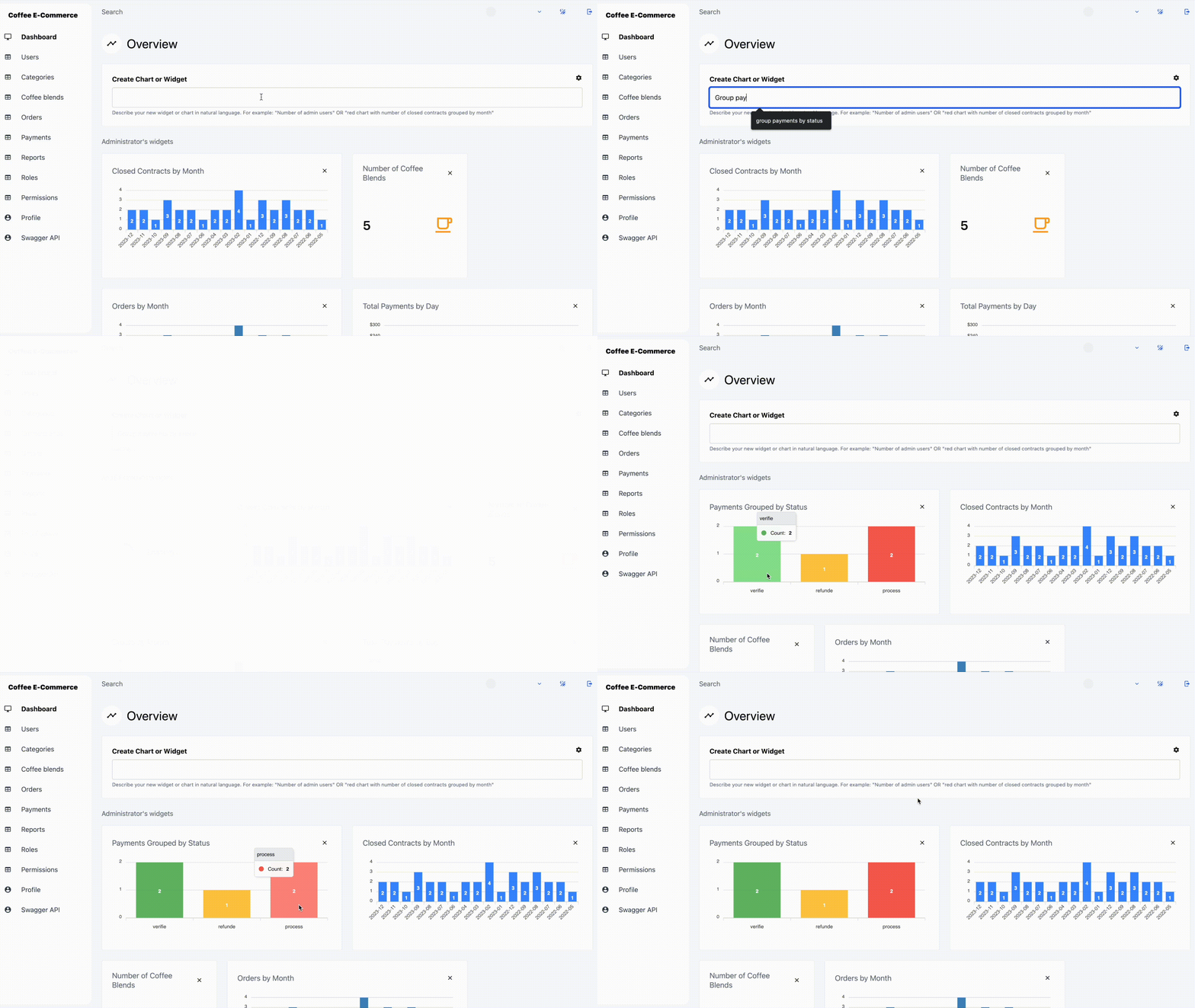
How it works?
Open your generated app and go to the dashboard. Then simply describe what you want in a “Create Chart or Widget” field. Good examples are:
- “Contracts Value per Lead” in pink
- “Number of Leads” in vibrant green
- “Contracts Value per Lead” in sleek gray
Available chart types: bar chart and line chart.
Let’s say you want to see the sum of contract values grouped by lead. In this case you need to enter your description – “Sum of Contract Values Grouped by Lead” beyond the Create Chart or Widget field.
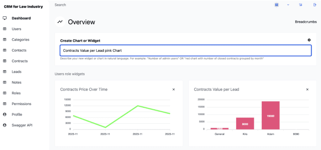
Next, in a few seconds, the “Contracts Value per Lead” widget with a chart will appear.

Example – Contracts Value per Lead pink Chart
This chart is going to stay up-to-date and will be refreshed whenever you refresh the dashboard.
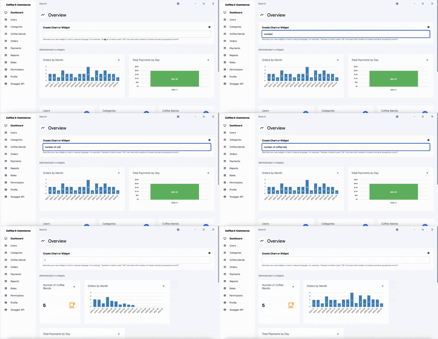
Example – Widget of Number of Coffee Blends
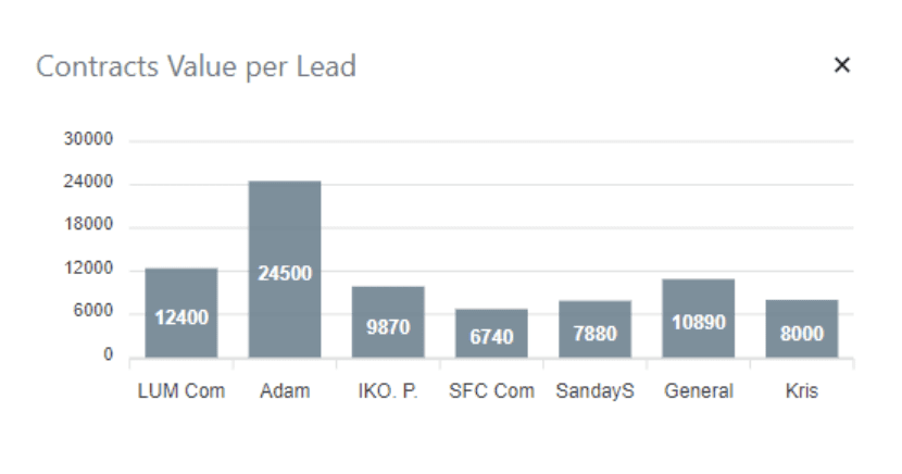
Example – Contracts Value per Lead gray Chart
Charts and widgets are saved on a per-role basis. Admin can create role-specific widgets and set their access in settings. Users have view-only permissions to widgets tailored to their roles. Widgets are automatically matched to the role of the creator, but admins can customize access and creation permissions for different roles in the preferences.
To be able to use this functionality you need to have an active subscription or your app has to be created in the last 20 days.
Our new feature smartly analyzes data with Apex Charts, uses OpenAI’s intelligence for insightful interpretations, offers role-based customization for user-specific needs, and allows aesthetic personalization for visual appeal. It’s efficient, adaptable, and user-friendly. If you have any difficulties with the new feature feel free to contact us through our support channels. We’ll get back to you as soon as we can!
Sample data
In the updated application, we introduce the generation of SIDs with different data types, such as short text entries, numeric values, date formats, and one-to-one relational data. As a result, users will find the new application already equipped with a set of preliminary data.