Data Visualization Articles on Flatlogic Blog
Exploring various ways to visualize data, including list, card, and calendar views, to enhance user experience and data comprehension.
Building an Analytical BI Dashboard (CSV → Charts) with Flatlogic’s LAMP Template
Learn how to build an Analytical Business Intelligence Dashboard using Flatlogic's LAMP template, turning CSV data into visual insights.
by • 5 min read
Best 10+ AI Tools For Data Analysis
Drowning in data but starving for insights? This journey through the top AI tools for data analysis might just be your lifeline.
by • 15 min read
Best 19+ JavaScript Chart Libraries to Use in 2024
JavaScript chart libraries are an integral part of creating a web application. Chart libraries are used for presenting data effectively.
by • 15 min read
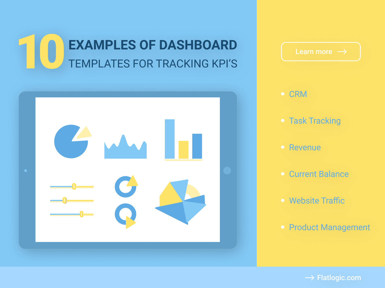
10 KPI Templates and Dashboards for Tracking KPI’s
KPIs or Key Performance Indicators are a modern instrument to make a system (business, for example) work effectively. KPIs show how successful the business is, or how professional the employee...
by • 12 min read
12 JavaScript Image Manipulation Libraries for Your Next Web App
An Image Manipulation Library or IML is a tool that’s main goal is to help you systemize, organize and manipulate graphic elements of your app in different ways. Different Image Manipulation Libraries typically serve different purposes.
by • 8 min read
JavaScript Tabs: Save Space! Examples of Tabbed Widgets
A tab is a single content area/component of a site design system (also called a tabbed widget) with multiple panels, each linked to a title/header in the list. Tabs may vary in size and shape, and they make the website page more structured and easier to grasp.
by • 12 min read
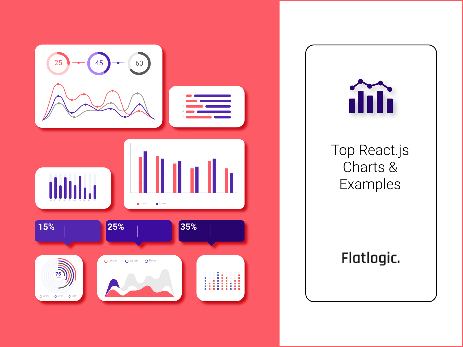
Top 30 Open Source and Paid React Charts + Examples
Representing your data in the form of charts is a great way to convey information to users. But the visualization of charts must be beautiful and insightful to users. The modern design of apps has gone far beyond the standard flat visualization that was a decade ago.
by • 17 min read
Using HTML and JavaScript to Manipulate Videos
Videos offer an efficient and engaging method of conveying information as well as providing entertainment and visual aids. Subsequently, they are being used increasingly more by organizations and individuals for...
by • 5 min read
Top 5 Ways to Visualize Net Promoter Score
Net Promoter Score is a way to measure if customers like your company or product. It lets them rate you on a 1-10 scale of how likely you would be to recommend it to a friend. 0-6 are detractors 7-8 are passives and 9-10 are promoters. Detractors count as -1, passives are 0, and promoters are +1. You add the ratings together and then divide by the total number of ratings. You then multiply the number by 100.
by • 5 min read
- 1
- 2


