TL;DR
- Hands-on guide to building, styling, and customizing Bootstrap tables for responsive web apps.
- Explains essential classes: .table, .table-striped, .table-bordered, .table-hover, .table-sm, .thead-*.
- Shows responsive patterns, image cells, hover effects, and contextual row colors with code samples.
- Curates top tools and templates: Bootstrap Table, FooTable, jsGrid, React options, Colorlib, and MDbootstrap generator.
Fact Box
- Bootstrap tables are opt-in: add .table to a <table> element to enable base styling.
- Wrap a table in a div with .table-responsive (or -sm|-md|-lg|-xl variants) to enable horizontal scrolling.
- .table-hover highlights rows on mouseover without editing CSS.
- Bootstrap Table plugin adds responsive design, AJAX JSON, sorting, pagination, and localization. Source
- FooTable displays 10 entries per page by default and supports search, pagination, and column sorting. Source
Tables are one of the most important UI components in business software. They power admin panels, dashboards, reports, and internal tools – anywhere users need to scan, compare, filter, or export structured data.
Bootstrap gives you a solid baseline for table styling and responsiveness, but the real work is choosing the right pattern: compact vs spacious, static vs interactive, mobile-friendly vs desktop-first, and whether you need features like sorting, pagination, fixed headers, or row selection.
This guide explains how Bootstrap tables work, which classes matter, what to watch out for in real apps, and then shares the best Bootstrap table examples you can reuse and customize.x<!–xIf you’re building the full workflow around those tables, custom web development services are often faster than stitching every screen together from scratch.–>
Tables and data visualization
In business applications, tables are not decoration – they are workflow. Users rely on them to answer questions quickly: What changed? What’s overdue? Which customers are at risk? What needs approval?
That’s why table design is less about making it beautiful and more about making it usable:
- Can users scan rows without losing context?
- Can they find what they need fast (search/filter)?
- Can they act (select rows, bulk actions, edit cells)?
- Does it work on smaller screens without becoming unreadable?
Bootstrap tables are a great starting point, but for data-heavy interfaces, you often need a combination of Bootstrap styling plus a table plugin or framework component.If the table is only one part of a broader product, an AI web app generator can speed up the surrounding data model, auth, and CRUD setup.


Tables before Bootstrap
Data visualization is an ancient art. You may have heard of “Ptolemy’s Map“. That is the name commonly given to all geographical knowledge in the works of Claudius Ptolemy (do not confuse it with Egyptian pharaohs). Claudius Ptolemy was a mathematician, astronomer, geographer, and musical theorist (apparently, it was a thing back then). He lived in Alexandria in the second century A.D. and almost certainly never visited most places found on his maps. Still, his maps and descriptions give a fair representation of distant geography. The proportions were distorted and the distances inaccurate, but Ptolemy died almost 1,800 years before the launch of the first satellite. Let us give him some credit! Even back then maps were tools, not curiosities. When the world’s largest library contained less data than your smartphone does today, it was obvious how helpful visual representation was. Hence the modern popularity of infographics and diagrams.
Tables in Modern Web Development
Tables remain the default UI for structured data. They are especially common in admin dashboards and SaaS back offices because they support dense information and predictable layouts.
Bootstrap tables are best for:
- Clean default styling
- Fast layout and spacing control
- Responsive wrappers for horizontal scrolling
- Simple variants like striped rows, hover states, and borders
When you need sorting, pagination, search, row selection, fixed headers, or inline editing, you typically pair Bootstrap with a JavaScript table library or a Bootstrap-compatible table plugin.
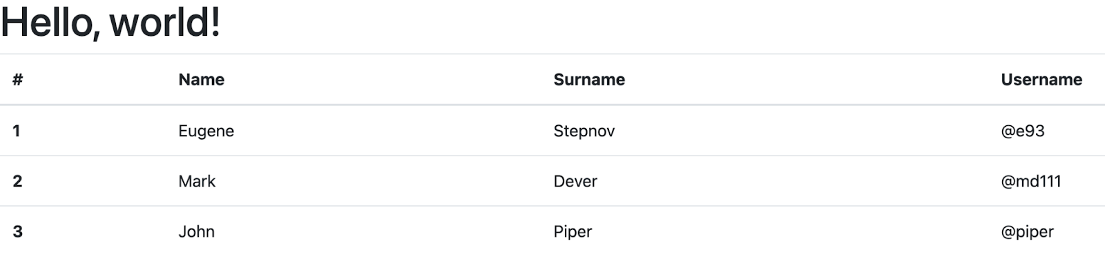
What is a bootstrap table? A basic example of a Bootstrap table
Bootstrap tables are well-organized components for displaying data. The data is presented in the form of columns and tables. Bootstrap tables are opt-in. To build it, you just need to add .table class to any <table> and then style it.
The code example of the basic Bootstrap table looks like this:
<table class="table">
 <thead>
 <tr>
 <th scope="col">#</th>
 <th scope="col">Name</th>
 <th scope="col">Surname</th>
 <th scope="col">Username</th>
 </tr>
 </thead>
 <tbody>
 <tr>
 <th scope="row">1</th>
 <td>Eugene</td>
 <td>Stepnov</td>
 <td>@e93</td>
 </tr>
 <tr>
 <th scope="row">2</th>
 <td>Mark</td>
 <td>Dever</td>
 <td>@md111</td>
 </tr>
 <tr>
 <th scope="row">3</th>
 <td>John</td>
 <td>Piper</td>
 <td>@piper</td>
 </tr>
 </tbody>
</table>
Bootstrap Table Classes
The basic principle when developing a bootstrap table is classes. You don’t need to write cumbersome CSS to style and customize your table. Just add classes to the <table> tag describing how the table will behave. For example, here are the most popular classes:
Border: Add a border with .table bordered;
Colors: Add color to different rows with .table striped;
Condense: Make your rows more compact with .table-condensed;
Hover: Highlight a table sortable line when you hover with .table-hover.
Next, we’ll look at how to put these classes into practice.
Best practices for Bootstrap tables in real apps
Bootstrap makes tables easy to style, but usability comes from a few practical choices:
- Prefer “scan-friendly” density: use compact spacing for dashboards, but don’t sacrifice readability.
- Keep headers sticky if the table scrolls vertically (users hate losing context).
- Use right alignment for numbers and consistent formatting (currency, dates, statuses).
- Avoid pure color-only meaning (e.g., red/green rows) – combine with labels or icons.
- For mobile: don’t force tiny columns – use horizontal scroll or switch to a card layout.
If you’re building business software, table usability affects productivity directly – bad tables create more support tickets than you expect.
Types of bootstrap table
Now let’s take a look at different basic manipulations with Bootstrap table.
Striped rows and dark table
For creating a striped row table you just need to add .table-striped to any table row within the <tbody>. You can also add the table dark class to make the table dark and invert the colors.
<table class="table table-dark table-striped">
 <thead>
 <tr>
 <th scope="col">#</th>
 <th scope="col">Name</th>
 <th scope="col">Surname</th>
 <th scope="col">Username</th>
 </tr>
 </thead>
 <tbody>
 <tr>
 <th scope="row">1</th>
 <td>Eugene</td>
 <td>Stepnov</td>
 <td>@e93</td>
 </tr>
 <tr>
 <th scope="row">2</th>
 <td>Mark</td>
 <td>Dever</td>
 <td>@md111</td>
 </tr>
 <tr>
 <th scope="row">3</th>
 <td>John</td>
 <td>Piper</td>
 <td>@piper</td>
 </tr>
 </tbody>
</table>

Bordered and borderless bootstrap table
To add borders to a table, use the .table-bordered class. In this case, the table tag will look like this
<table class="table table-bordered">
...
</table>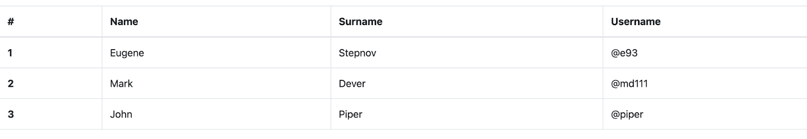
For the borderless table, you should use:
<table class="table table-borderless">
...
</table>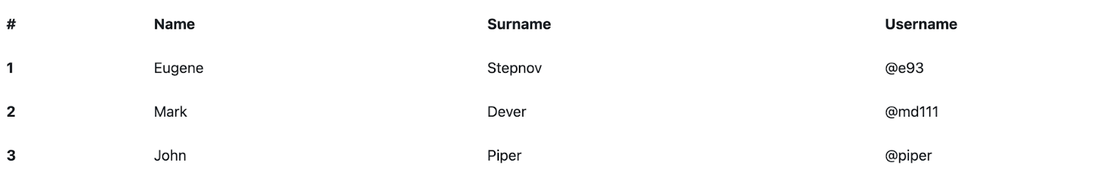
Contextual Bootstrap table classes
You can also use contextual classes to colorize individual lines or cells. It’s also worth mentioning that you can use several different classes at the same time to build a wide variety of tables.
To make a colorized table, you can apply the following classes to <tr> elements (rows) or <td> elements (individual cells):
.Table-primary
.Table-secondary
.Table-success
.Table-danger
.Table-warning
.Table-info
.Table-light
.Table-dark
In our example below, we have made a small table with a hover, using 3 context classes to colorize individual lines.
<table class="table table-sm table-hover">
 <thead>
 <tr>
 <th scope="col">#</th>
 <th scope="col">Name</th>
 <th scope="col">Surname</th>
 <th scope="col">Username</th>
 </tr>
 </thead>
 <tbody>
 <tr class="table-danger">
 <th scope="row">1</th>
 <td>Eugene</td>
 <td>Stepnov</td>
 <td>@e93</td>
 </tr>
 <tr class="table-success">
 <th scope="row">2</th>
 <td>Mark</td>
 <td>Dever</td>
 <td>@md111</td>
 </tr>
 <tr class="table-warning">
 <th scope="row">3</th>
 <td>John</td>
 <td>Piper</td>
 <td>@piper</td>
 </tr>
 </tbody>
</table>

Bootstrap Table head colors
You can also specify different background colors for the table head using the modifier classes .thead-light or .thead-dark on the <thead> element.
The following example uses the class .thead-light to create a table with a light head.
<table class="table table-dark table-striped">
 <thead class="thread-light">
 <tr>
 ...
 </tr>
</table>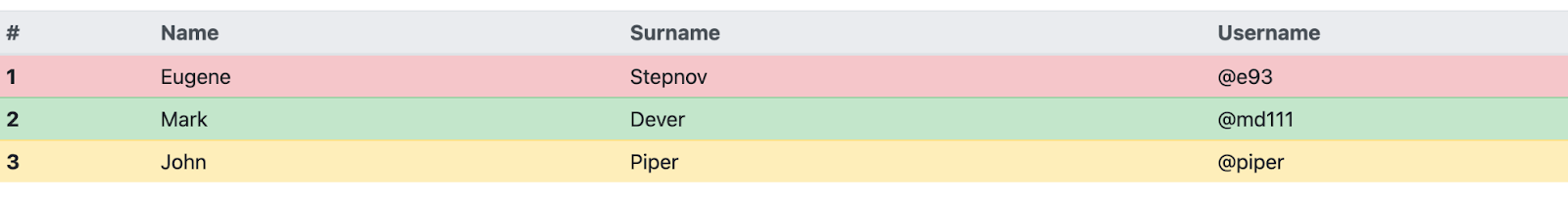
Likewise, you can use the class .thead-dark to create a table with a dark head.
<table class="table table-dark table-striped">
 <thead class="thread-dark">
 <tr>
 ...
 </tr>
</table>
Hoverable rows
Sometimes you need to highlight some rows of a table. Then we need to use :hover. In Bootstrap, you don’t need to modify anything in the CSS file: just add the .table-hover class to the <table> tag
<table> tag

<table class="table table-hover">
...
</table>
Small table
If you want to develop a small compact table, just add class .table-sm.
<table class="table table-sm">
...
<table/>
Responsive bootstrap table
One thing you simply need to know about is responsive bootstrap tables. To make any table responsive, wrap the <table> tag in <div> with the class .table-responsive. Or you can specify the maximum breakpoint at which this table property will appear by adding the class .table-responsive {-sm | -md | -lg | -xl}. Look at the example below.
<div class="table-responsive">
 <table class="table">
 ...
 </table>
</div>
Bootstrap table with images
When adding images to a table, make sure you specify a max-width for the parent cell. You can use the sizing utilities or write your own CSS. By default, the content in a table cell is vertically aligned to the top.
<table class="table table-image">
 <thead>
 <tr>
 <th scope="col">Number</th>
 <th scope="col">Avatar</th>
 <th scope="col">First Name</th>
 <th scope="col">Last Name</th>
 <th scope="col">Username</th>
 <th scope="col">Social Link</th>
 </tr>
 </thead>
 <tbody>
 <tr>
 <th scope="row">1</th>
 <td class="w-25">
<img src="https://s7d9.scene7.com/is/image/LifeWayChristianResources/piper_john_author?wid=300&hei=300&op_usm=2,.5,6,0" alt="John Piper">
 </td>
 <td>John</td>
 <td>Piper</td>
 <td>@johnpiper</td>
 <td>twitter</td>
 </tr>
 <tr>
 <th scope="row">2</th>
 <td class="w-25">
<img src="https://www.capitolhillbaptist.org/monkimage.php?mediaDirectory=mediafiles&mediaId=3241749&fileName=mark-dever-2-300-300-0-0.jpg" class="img-fluid img-thumbnail" alt="Mark Dever">
 </td>
 <td>Mark</td>
 <td>Dever</td>
 <td>@markdever</td>
 <td>twitter</td>
 </tr>
 </tbody>
</table>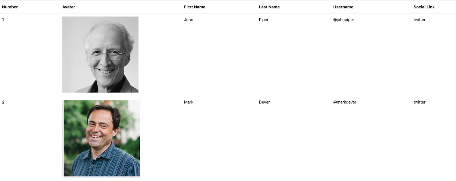
Which Bootstrap table example should you pick?
Use this quick mapping:
- Need a simple static table: start with the basics
.table+ optional striped/hover/border variants. - Need a table for admin dashboards: prioritize compact spacing (
.table-sm), scanability, and consistent column alignment. - Need advanced features (search, sort, pagination): use a table plugin/library and keep Bootstrap for styling.
- Need large datasets: choose a solution with virtualization or server-side pagination – Bootstrap styling alone won’t solve performance.
Common questions about bootstrap tables
How to style a bootstrap table?
To style the bootstrap table, add various classes to the <table>, <th>, <tr> tags. For example, the .table-sm class will make your table compact. For more details refer to the official bootstrap documentation.
What is table responsive in bootstrap?
Table responsive allows any table to scroll horizontally. To make any table responsive just add a .table-responsive class to <table> tag.
How do I add a border to a bootstrap table?
To add borders to the table, use the .table-bordered class on the <table> tag
How do I center the text bootstrap table?
The easiest way to center text in the bootstrap table is to add .text-center class in the <table> tag.
How do I make a scrollable table in Bootstrap?
Use a responsive table to add a scroll. Just add .table-responsive class to a <table> tag.
Best Bootstrap Table Examples
Bootstrap table
The bootstrap table is a plugin for integration with the most popular CSS frameworks. It is an extended version of the table that integrates with many CSS frameworks. It supports Material Design, Bootstrap, Bulma, Semantic UI, and Foundation. You can install it with npm or yarn by using the Bootstrap Table source JavaScript files and CSS.
One of the most important things about this plugin is that you make the table fully responsive in a very short time. The plugin is maintained by thousands of contributors and it has thousands of commits. The other good thing is that this library has great documentation with many live examples with source code on how to use this plugin. For instance, there are examples of a Modal table, different uses of buttons, how to add search, merge, or update cells, and other features that can extend your bootstrap table.
Notable features:
- responsive web design;
- scrollable table with fixed headers;
- fully configurable via data attributes;
- get data in JSON format using AJAX;
- simple column sorting with a click;
- powerful pagination and localization.
Bootstrap tables in Light Blue Bootstrap Admin Template
Light Blue HTML5 Admin Template is a product developed by Flatlogic, made in dark and transparent colors. The template is made based on Bootstrap 4 and is fully responsive. In addition to tables, you will find many other components in this template such as buttons, icons, dashboards, and others.
As for tables, in this template, they are subdivided into Tables Basic and Tables Dynamic.
In Tables Basic you will find static bootstrap tables with the following features:
- Tables with buttons;
- Tables with images;
- Striped and bordered tables;
- Hover and overflow tables;
- Tables with checkboxes.
In the Tables Dynamic section you will find the following features:
- Sortable tables;
- Working search console;
- Tables made on top of Backgrid.js;
- Tables made on top of jQuery DataTables.
As a result, using this template, you get not only different types of well-designed bootstrap tables but also a well-thought-out admin panel for a full-fledged web application with different components.
MDbootstrap bootstrap tables generator

This tool allows you to quickly generate a bootstrap table to see how it will look, and copy the resulting code. The tool can create tables using the following combinations of bootstrap classes:
- Striped
- Hoverable
- Bordered
- Borderless
- Small
- Responsive
- Captions
Also, in addition to this, you can choose the color of cells and borders. This tool will be very helpful if you want to test different table styles.
Fixed Column Bootstrap Table by Colorlib

The table is well suited for displaying huge data arrays since it’s not always possible to remember which cell corresponds to which one. This is why the first column is fixed while you scroll horizontally. It is fully customizable, allowing you to use any color you choose, or create a responsive table and add rows if necessary.
It uses Bootstrap and Fontawesome. The scroll is implemented with jQuery.
The product is completely free. To download and run it, you will need to leave your email on the site.
Bootstrap 4 static table with checkboxes and fixed header
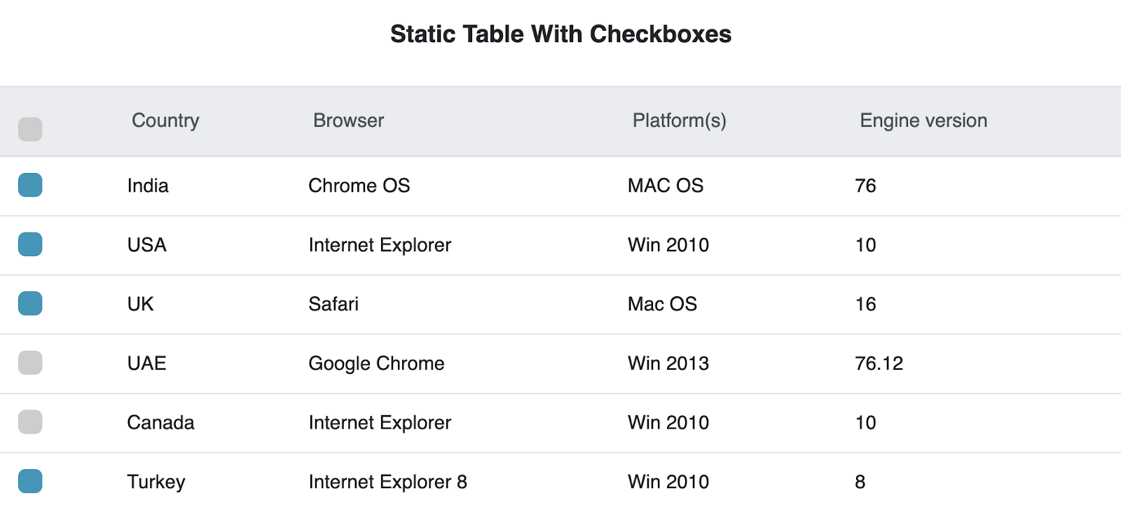
Fixed header and checkbox tables are featured in one of the largest bootstrap communities. The table has a very accurate design and a good user experience. The table uses Bootstrap 4 and Jquery. This snippet is free and open-source – you can use it in your project. The project has integration with FontAwesome and includes more than 1000+ images.
Creative Tim bootstrap table

This Bootstrap table is based on the Bootstrap table plugin. The project is completely free and open-source, nevertheless, it has wide functionality. You can set the background color (5 colors), the background of the table can be created from scratch, or you can leave only the header. Also, the table can run either in full-screen mode or compact. This table has all the functionality of the Bootstrap – table plugin.
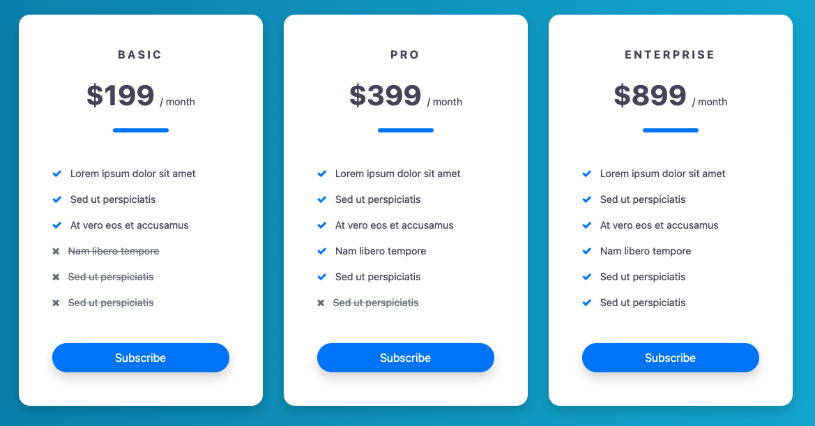
Bootstrapious Pricing table
Fixed header bootstrap table template
Fixed Header Bootstrap Table Template has – guess what – a fixed header that gives you the ability to scroll vertically. The table has rounded corners, and it is also possible to change the table color and use different color combinations. There is no column border in the variants, which allows you to add as much content as you like without getting cut off. The columns simply adjust themselves to keep the table looking impressive.
Sortable

This small bootstrap table has important functionality, namely the ability to sort the various columns of the table. This function is done with a little bit of jQuery code:
$(function(){
 $('#keywords').tablesorter();
});
Fade and Blur on Hover Data Table
This table has a strict corporate design that can be suitable for large, serious applications. Of course, you can change the color configuration settings and choose your theme from unlimited custom combinations that will deliver the right look for your table.
However, the main feature of this table is this: when you hover over a row, it will be highlighted by fading out the others. This will allow your users to focus better and see what they are reading.
Fixed column datatable

In this template, you will find 6 different example tables. This is a plugin written in Vue and Bootstrap. By using this template you get a data table with checkboxes, a data table with accordion, and data tables with different column alignment. The code script for all six designs is shared as a single code file. The template is fully customizable and responsive.
Bootstrap datagrid

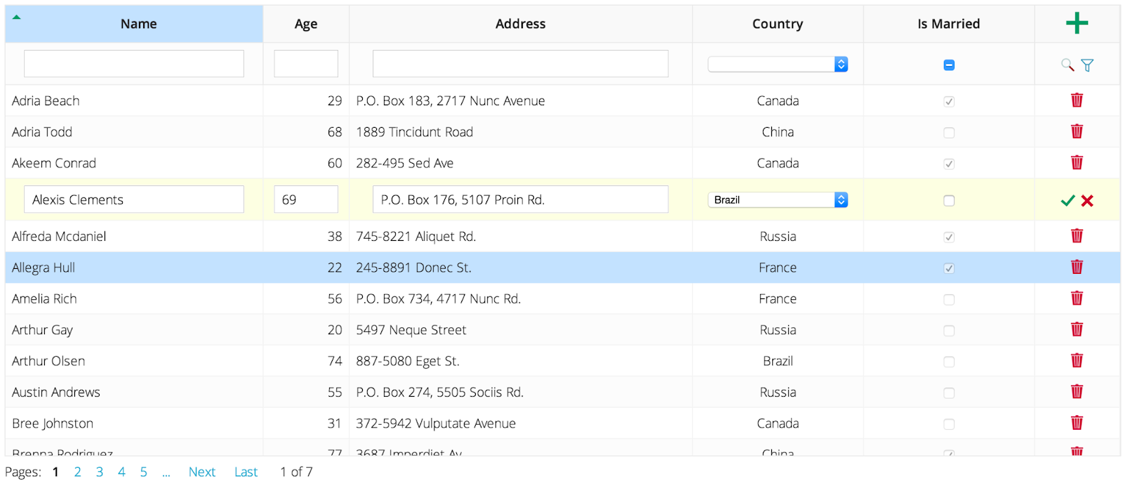
Bootstrap Datagrid is a jQuery Datagrid plugin compatible with Bootstrap 2 and 3. It is completely free and open source, available under MIT license. The disadvantage of this tool is no Bootstrap 4 support. The plugin is completely responsive and fully configurable. The features of the plugin include sorting, filtering, changing column order, showing or hiding columns, single or multiple row selection, filters, localization, pagination, and more. As a bonus, Bootstrap Datagrid has neat documentation.
React bootstrap table

A very useful tool indeed: react and bootstrap are the two most popular front-end libraries. React bootstrap table allows you to create bootstrap-style tables inside the React application. It works with Bootstrap 3 and 4. The installation, configuration, and usage are very intuitive.
React bootstrap table supports the following built-in features:
- Striped, borderless, condensed table;
- Column align, hidden, width, sort, title, styling, customization;
- Table scrolling;
- Cell format;
- Pagination;
- Row selection;
- Table Search, Column filter;
- Cell editor;
- Insert & delete Row;
- Export to CSV;
- Rich function hooks;
- Header column span;
- Remote mode;
- Row expand;
- Keyboard navigation.
Footable

FooTable is a responsive plugin built for Bootstrap. The table is free to download and fully responsive. The features of this table include searching within the table, searching by category, pagination, sorting in individual columns, and tag indicating the number of entries. The table displays 10 entries at a time, which can be changed according to your needs.
Js grid
jsGrid is a jQuery plugin you can add to your Bootstrap site. The plugin has a lot of basic features for tables such as sorting, searching, pagination, scrolling the entries, etc. Additional features of the table include data editing, validation, filtering, etc.
The plugin has very good documentation. Despite the fact it is written in jQuery, there are still periodic updates.
Conclusion
Bootstrap tables are a strong foundation for building clean, responsive data layouts quickly. For simple static data, Bootstrap’s classes are enough. For real admin panels and business dashboards, you’ll often need more: sorting, filtering, pagination, fixed headers, and sometimes inline editing – which is where plugins and table libraries come in.
The best table is the one that matches your users’ workflow: fast scanning, clear hierarchy, and actions that feel obvious. Start with a solid Bootstrap base, then add complexity only when the product truly needs it.