TL;DR
- Bootstrap delivers fast, consistent UIs with many components, but can be heavy due to jQuery unless carefully trimmed
- Material UI offers React-based Material Design components with rich motion; flexible, but a smaller speed boost than Bootstrap
- Both use responsive 12-column grids; choose Bootstrap for information-first speed, Material for mobile-first, animated experiences
- Combine both via MDBootstrap, or jumpstart CRUD apps with Flatlogic's Platform
Fact Box
- Bootstrap began at Twitter as 'Twitter Blueprint' and was open-sourced on Aug 19, 2011.
- Material UI first beta released June 23, 2017; first stable version shipped in 2018. Source
- Both Bootstrap and Material Design use responsive 12-column grid systems.
- MDBootstrap layers Material Design atop Bootstrap and supports React, Angular, and Vue. Source
- Flatlogic Platform generates CRUD apps in minutes, with code preview, GitHub push, and REST API docs. Source
Looking to elevate your next web app but tangled in the Bootstrap versus Material-UI debate? Unsure if another framework might better suit your needs?
“A successful web application must have a strong foundation in both UX design and user interface,” states Brad Frost, emphasizing the critical role of choosing the right technology framework. Bootstrap and Material-UI stand out as leading contenders in the user interface domain, offering developers streamlined paths to deploying visually appealing and functional web applications. The dilemma of choosing between these two, or venturing for an alternative, highlights the significance of making an informed decision that aligns with your project’s goals-especially crucial in the realm of business software, where the choice can significantly impact user experience and operational efficiency.
By reading this article to the end, you’ll learn the pros and cons of each framework, which popular websites are currently using each one, and which one is the ideal choice for your project. So, if you’re on the fence about Bootstrap vs. Material-UI, let’s dive right into the details!
A short comparison for those who are looking for a quick answer
[table id=5 /]
Bootstrap vs Material: A Detailed Comparison
Common Information
Bootstrap stands as a formidable trio of CSS, HTML, and JavaScript, designed to facilitate the development of responsive web applications. Reigning as the most utilized framework for both mobile and desktop app creation, its origins trace back to Twitter, where it was initially crafted as an internal tool dubbed Twitter Blueprint. Launched into the open-source domain on August 19, 2011, Bootstrap’s primary aim was to simplify the development process while promoting uniformity across internal applications. This framework has proven its worth by underpinning major applications such as Airbnb, Dropbox, Apple Music, Twitter, Coursera, and Bloomberg, showcasing its versatility and strength in supporting business software development across a diverse array of industries. 
In Flatlogic we create web & mobile application templates built with React, Vue, Angular and React Native to help you develop web & mobile apps faster. Go and check it out yourself!
See our themes!
Material UI is a React UI framework that follows the principles of Material design. It is based on Facebook’s React framework and contains components that are made according to Material guidelines. Material design was developed by Google in 2014 while Material UI was developed by a small, dedicated, and passionate team in 2017. The first beta version of the Material UI on GitHub came out on June 23 in 2017. The first running version dates from 2018 according to the official website. Material UI is strongly connected with Material design, but you shouldn’t confuse the two. Material UI is just a react component library without Material design, that’s why we built our comparison from the perspective of the fact that Material guidelines go first, Material framework follows. Google uses Material Design in all its products, Material UI is used by Nasa, Amazon, Unity, JPMorgan, etc.
Bootstrap vs Material: the Grid System
Bootstrap grid is a flexible and fully responsive mobile-first grid system that uses containers, rows and columns to help the app adapt to any screen. Rows and columns merge to create 1 or more containers. The bootstrap grid system is a twelve-column system that has a range of rules to follow. For example, rows can serve to create columns, there must be no content inside the row, only columns can be immediate children of rows, and others (read more here).
Material Designs’ responsive UI is based on twelve columns grid layout. Column width is flexible, while gutter widths that form the space between content are fixed values in the range between 0 and 10px. Margin widths that separate the content from the left and right screen borders are also defined as fixed values. Gutter and margin widths can be either equal or not. Grid system adopts when the screen size reaches some predetermined values, or “breakpoints”. When that happens, the layout adjusts to the screen and changes the number of columns where the app places its content. This provides developers and users with a fully responsive UI.
Information Layout
Bootstrap is a system of organizing and presenting information. And we put a major emphasis on the word “information” because apps like Twitter, Coursera, and Apple music have minimalistic designs with soft colors, bold and big headlines, little or no animation. People visit these websites not to enjoy fancy buttons or smooth and bright animation, but to get information as fast and easy as possible. Bootstrap offers that opportunity with a minimum amount of distractions and provides a clear and readable UI.
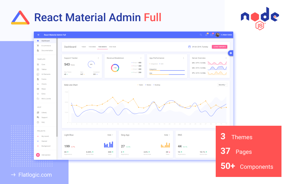
Check out React Material UI Admin Node.js!
PostgreSQL integrated. No jQuery or Bootstrap!
Material design was primarily made for mobile development. Mobiles have smaller screens and, as a result, less space to place elements and information – the solution from Material UI is animation, layers, sliders, pop-ups. Mobiles don’t have a pointer, but users need to understand where they touch on a touch screen – here animated feedback of touch from the app goes. Immediate feedback is necessary for mobiles, but for what reason can you use all this click-get-feedback animation for the web? Animation makes the user experience better and looks cool indeed, but if you use some app daily (for example, for work) this nice-looking smooth animation can be overwhelming. It’s quite easy to make the app look incredible with Material UI, but a nice-looking design doesn’t always meet the users’ needs.
Dependencies
Bootstrap is not a simple framework. The package contains tons of features and a big code with a lot of scripts, a large number of CSS classes, and jQuery dependency. This leads to problems with performance, the huge size of the app, battery draining, page speed. It’s possible to avoid the consequences of the Bootstrap framework if you devote time and get rid of components you don’t plan to use in your app. Then you will get a lightweight working app. Don’t forget that removing the largest client-side dependency isn’t a fast task to accomplish. More than a year has passed since that announcement, and the release date was in early 2020 first, now we’re expecting to see it somewhere in late 2020.
Material UI is a set of React-based components. Components can work independently from each other, which means you have in your app only styles for components that the app uses. Material UI is pure CSS and doesn’t require any library to work. You get only what you need and want to use.
Customization
From the perspective of customization, we can compare Bootstrap and Material UI as consistency vs uniqueness. Why so?
As we have mentioned in the first paragraph, Bootstraps’ developers wanted to provide consistency in the experience both for developers and users. To be honest, they have succeeded. If you look at several dozen apps that are based on Bootstrap, you will see the same things in the same places with little differences. Material UI is based on Material guidelines. Material guidelines are rules and principles for motion, interaction, animation, building navigation, typography, shapes, colors, etc. You shouldn’t follow them all, you must instead combine them, and don’t forget that your design must fit the content it displays so the user experience becomes better.
But there is no one-size-fits-all solution for every web app, there is a set of rules (Material guidelines) that helps a designer to create a modern and stylish interface that will be unique. That leads us to the problem, when we use 100s different UIs and every time we open a new app created by a Material design dedicated designer, we meet a situation like “Erm… Where am I supposed to click?” There is no consistency of experience, but there is a space for creativity.
The Speed of Development
As we mentioned before, Bootstrap goes with many UI components, like typography, tables, buttons, navigation, labels, alerts, tabs, etc. It provides enough necessary elements to build a good-looking design with modest efforts and allows developers to concentrate on the functionality of the app. Furthermore, there are a lot of themes and templates to download on the web. That results in high development speed.
Material UI provides developers with material-based UI components. They help save some time on design and app development. But since Material UI is mostly a set of UI components, it doesn’t offer such a great boost to the development speed as Bootstrap does. If you want to improve development speed significantly, it’s better to use material templates.
Bootstrap vs Material: What if I want to use both?
Is it possible to take advantage of them both and enjoy stylish responsive design without a lot of time spent adopting the app for different resolutions?
Yes, it’s possible with Material Design bootstrap (also known as MDBootstrap). It is a set of libraries built on top of Bootstrap and other popular frameworks like Vue, Angular, React and follows Material design guidelines. That combo allows Web developers to use close-to-bootstrap syntax that everybody is familiar with, so there will be fewer problems while developing. A list of MDBootstrap for different frameworks can be found here.
This is not know-how, MDBootstrap goes with a large number of tutorials, free and premium templates, a friendly community, and a long history (almost since that day when Material Design has gone from being an idea to the real guidelines). Try it, maybe you’ll like Bootstrap AND Material more than Bootstrap vs Material.
That’s all. Thanks for reading.
Bonus: Create your Material-UI or Bootstrap app with Flatlogic’s Full Stack Web App Platform
Most web applications follow the CRUD pattern. CRUD stands for Create, Read, Update, Delete. These are the four actions an application can perform. And should we take a closer look at any application, we’ll see that each of its operations is one of the four or a combination of two of them. Just like we can categorize an application’s functions, we can create parts and components and then combine them into a myriad of combinations to suit just about any demand.
At Flatlogic we have built a development platform that simplifies the creation of web applications – we call it the Flatlogic Platform. The tool allows you to create the CRUD app in minutes, you just need to choose the stack, design, and define the database model with help of an online interface and that is all. Moreover, you can preview generated code, push it to your GitHub repo and get the generated REST API docs. Try it for free!
Here is a quick guide on how to do a full-stack web app based on Material-UI with help of Flatlogic Platform.
Step №1. Choose your project name
Any good story starts with a title, any good React App starts with a name. So, summon all of your wit and creativity and write your project’s name into the fill-in bar in Flatlogic Platform.

Step №2. Select your React Material-UI App Stack
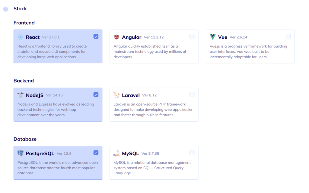
In this step, you will need to choose the frontend, backend, and database stack of your app. Also, to correlate with our illustrative React App, we will choose here React for the frontend, Node.js for the back-end, and PostgreSQL for the database.
Step №3. Choose your React App Design
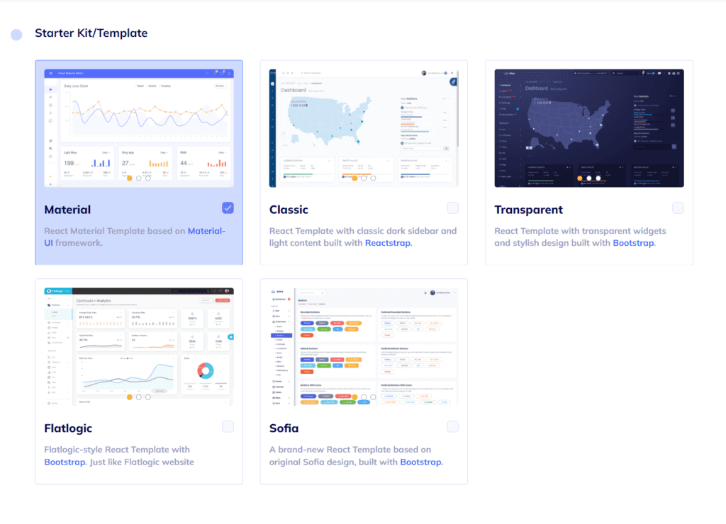
As we’ve already mentioned, design is quite important. Choose any from a number of colorful, visually pleasing, and, most importantly, extremely convenient designs Flatlogic’s Full Stack Web App Platform offers. In this case we’ll choose Material UI.
Step №4. Create your React App Database Schema
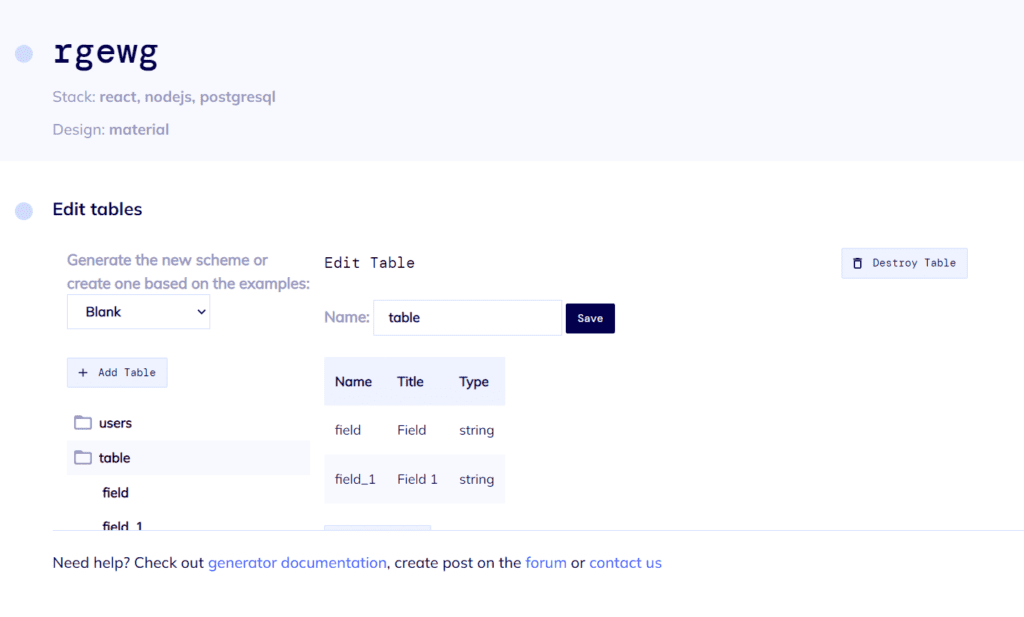
You can create a database model using the UI editor. There are options to create custom tables, columns and relationships between them. So basically you can create any type of content. Also, you will receive automatically generated REST API docs for your application.
Step №5. Review and Generate your React App
In the final step, just to make sure everything is as you want it to be, you can review all of the previously made decisions, check the Connect GIT Repository box if you want to, and click the “Finish” button.
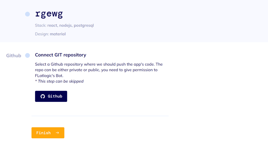
After a short time to generate, you will have at your fingertips a beautiful and fully functional web App. Voila! Nice and easy!
