TL;DR
- Curated 8 Material UI templates for 2024, spanning admin dashboards and full-stack kits.
- MUI pros: rich components, flexible styling, tree-shaking; cons: generic look, weight, design limits.
- Highlights: Hulk ($24), Crema (6 dashboards, 300+ widgets), EasyDev (6 dashboards, 200+ UI elements).
- Flatlogic's React Material Admin offers free and paid tiers; Flatlogic Platform generates CRUD apps with guided steps.
Fact Box
- Hulk is priced at $24.
- React Material Admin Full costs $99 (Personal) or $499 (Developer); Node.js edition starts at $149.
- Material UI includes over 1000 customizable icons.
- EasyDev offers six ready-to-use dashboards.
- Reactify provides 30+ pre-built pages and 60+ widgets.
The evolution of Material UI, from Google Now to the distinctive Material Design, underscores its importance in crafting intuitive and visually appealing interfaces for business software, reflecting a commitment to usability and aesthetic consistency across platforms. In 2012 Google released Google Now, the predecessor of Google Assistant. On October 29 of the same year, the update added Gmail cards. The cards pulled information from the Gmail accounts and displayed it without opening dedicated apps. Google used tile-like design and depth effects as the foundation to keep building on. On June 25, 2014, Material Design was announced. Gmail Cards’ legacy was visible, but a lot had changed. Transitions were smooth and responsive. Depth effects became more complex. Finally, the padding and grid-based layout gave Material-compliant applications a distinctive minimalist look. The look we would grow to associate with Google and Android.
Why Use Material UI
What’s the value of this decision? Usually, a company uses design languages to give its software a recognizable view. Products from the same manufacturer look different but are related thanks to patterns in shapes, colors, and construction elements. Apple is a nice example. If you covered the Apple logo on an iPhone or a MacBook, the distinctive simple shapes and smooth colors would still give them away. But we have a different situation with Material Design. While most companies guard their proprietary designs, Google encourages developers to use theirs. Everything falls into place when we remember the company’s trade. Docs, Spreadsheets, Calendars, and other services don’t exist in a vacuum.
Google services are easy to integrate, both with each other and outside platforms.
A link to an online document you send via messenger often comes with a preview. The said document can contain links to calendar events. You can connect said events to outside software, which could lead the user to yet another Google service. They encourage integration, making each app and each service an extension of something else. More websites and apps complying with Material UI guidelines make the web more seamless. This brings smoother transitions and a deeper and more consistent experience.
Material UI
Material UI’s synergy with React principles facilitates the creation of SEO-friendly, reusable components, making it a cornerstone for developing business software that is both efficient and aesthetically aligned with modern design standards. There’s a good reason React is so popular. Whatever metric you choose to evaluate frameworks by, React will be among the top spots or at least a decent contender. As we can assume, Material UI inherits a lot from both React and Material Design. Keep reading for more details on Material UI’s pros and cons.

Material UI Pros
1. Space for maneuvering
MUI offers a huge selection of components. Few libraries offer you the same freedom within one framework while adhering to design standards. Whatever admin panel you want, chances are it can be built with Material UI.
2. Flexible styling
Managing CSS styles with JavaScript isn’t exactly new. But within Material UI this feature opens up on a new level. Change one style and one class at a time or adjust the whole theme. Use unique class names and scope classes to components. MUI can be as precise or as broad as you need it to be.
3. Popularity
A solution’s popularity is good on multiple levels. Social proof means it’s either good or at least not bad enough to cause serious issues. A wide pool of users means that any problem you might face was likely dealt with by many before you. And some of them are bound to have shared their valuable experience online.
4. Proven success
Material UI is a solution that works. It’s a merger of two solutions that have been tried and tested thoroughly over the years. When it comes to feedback, there was never a shortage of respondents. Whatever your content is, chances are Material UI will work fine.
5. Arsenal of tools
Material UI comes with over 1000 customizable icons out of the box. It supports TypeScript and features associated with it. Its Grid system supports adaptive design compatible with all platforms and devices.
6. Optimization
Material UI takes a good part of the unused code out of the package for the production build. If you take full advantage of this feature, your apps will weigh less and load faster.
7. Saving time
This is a plus for many libraries, not just MUI. It leaves you with fewer things you must choose. Big Tech giants can afford the luxury of being both efficient and unique. Smaller companies and individual creators often have to choose. If a unique design is not your priority, the time you’ll save will be of greater value.
8. Simplicity
Highly versatile solutions are often overly complicated. Oddly, MUI is simple enough. Its features are scalable. In other words, MUI is as advanced as you need it to be, and won’t require that you learn all the features to make the most basic interfaces.
Material Cons
The Material isn’t perfect, of course. Let’s round up reasons to avoid it
1. Popularity
Yes, that was the first good thing about Material Design. But popularity is a double-edged sword. Complying with Material UI guidelines leaves your products with a ‘Googly look’ that makes them similar to Google and about half of all the web.
2. Design Limitations
Material UI is a safe option that works almost every time but rarely excels. You might want to use different styles for a library and a tattoo salon. They’ll be hard to differentiate between if you want to comply with Material UI. However, this shouldn’t be an issue for admin dashboards.
3. Heavy Weight
This is the bane of many frameworks and libraries. Their developers usually try to include all the popular features. The thing is, most users don’t use all or even most of them at once. The result is a load of code that is there but serves no purpose, only adding weight and slowing the whole application down. Mind that and check the limiting factors like your server’s capabilities. Usually, though, this downside is balanced out by MUI’s “tree-shaking” capability that removes unnecessary code from the package.
4. Complicated inner mechanisms
When using MUI templates, it’s easy to forget how the end product works on a molecular level. And it is even easier to never bother with it in the first place. This is rarely a problem since Material UI templates usually come with plentiful documentation and support. Yet now and then there’s a compatibility issue, and that’s when troubles might arise since few people have delved deep into MUI templates’ inner mechanisms.
Top Material UI Templates
At this point, we’ve covered the reasons for you to use MUI or avoid it. For this article, we’ve collected many templates to fit all needs: some are great UI templates, and others are admin panels with easy navigation and an unobtrusive design. Each has something it excels at, and we’ll explain it all so you can make your picks.
1. Hulk
- Source: ThemeForest page
- Preview: https://preview.themeforest.net/item/hulk-reactjs-redux-material-ui-admin-template/full_screen_preview/26538639
- Technologies: React.js, Material UI, HTML 5, CSS3
- Compatible browsers: IE11, Firefox, Safari, Opera, Chrome, Edge
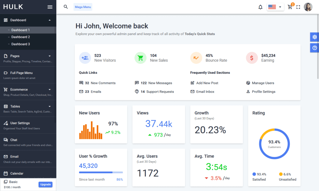
This hulking force of the template has you covered on many fronts. There are three dashboards in one package. It has a multitude of charts and graphs including React-Google-charts, Echarts-for-React, and React-chartjs-2. Hulk has a layered side menu that lets you navigate it with ease. Hulk is integrated with Firebase, Autho, and JSON Web Tokens. This allows for multiple authorization methods. And if those aren’t enough, Hulk also supports digital signatures. Hulk’s responsive design works great on mobile screens. Finally, there’s support. We usually say “responsive” about software but this time we’ll give credit to Hulk’s support team. They’re very helpful and always there. Proper documentation is nice but consulting with the people who wrote the template is a whole other level of support. Hulk’s list of features and components is solid in any context but at $24 it’s a real treat. Take a look!
2. React Material Admin by Flatlogic
- Source:
- Technologies: React 16, React Hooks, Material UI, Node.js, PostgreSQL
- Compatible browsers: IE 10, IE 11, Firefox, Opera, Chrome, Edge
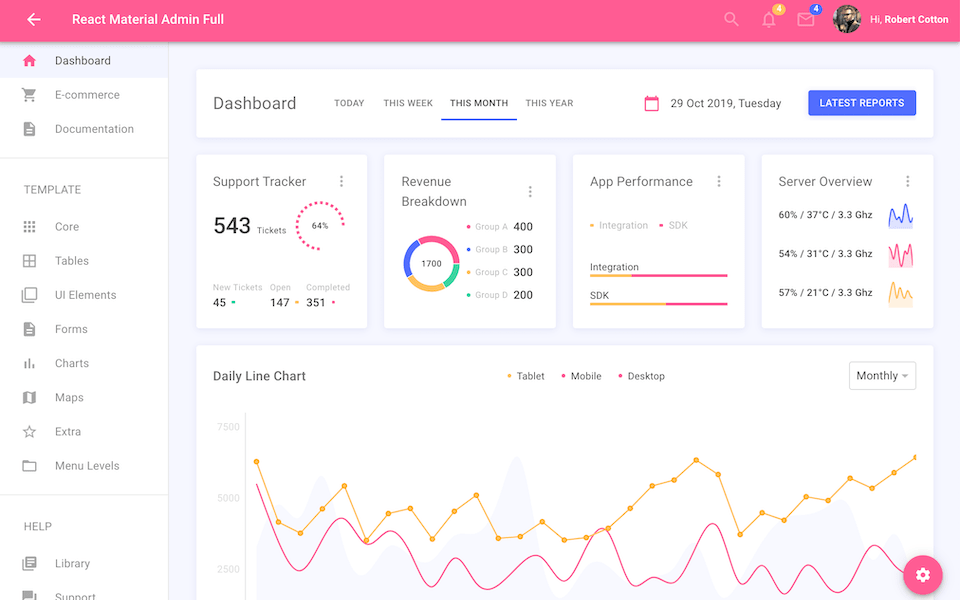
The next entry is our product. The React Material Admin name leaves no room for doubt. It’s built on React 16 and the 4th version of Material-UI. We carefully structure our templates’ interfaces to let you do more with the same number of buttons and toggles. This React-based template goes well with eCommerce platforms, SaaS, Project management, CRM, and more. React Material Admin is inter-browser-compatible and supports React hooks. The code is lightweight and all adjustments are intuitive. It’s easy to adjust React Material Admin and even easier to have it replace the demo data with actual information from your API endpoints.
If you have software development experience, you know how easy it is to inflate the software to the point where it messes with performance. When developing React Material Admin we had a balance to uphold. Insufficiency of features is bad for obvious reasons. Excess causes slower performance and a greater number of things that can go wrong. We want as many features and technologies as possible so the template can perform anything. At the same time, we took care to keep it lightweight. We believe we managed it.
React Material Admin comes in three versions. The basic free version lets you learn the handling of React Material Admin. React Material Admin Full comes at $99 for the Personal license and $499 for the Developer license. Finally, the most complete version, the React Material Admin Node.js, comes with Node.js (hence the name) and PostgreSQL and starts at $149. Other parts besides the admin panel are built-in, with only the end-user interface remaining.
3. MaterialPro
- Source: https://themeforest.net/item/materialpro-bootstrap-4-admin-template/20203944
- Preview: https://preview.themeforest.net/item/materialpro-bootstrap-4-admin-template/full_screen_preview/20203944
- Technologies: Bootstrap 5, Material Design, HTML 5, CSS3
- Compatible browsers: IE11, Firefox, Safari, Chrome, Edge
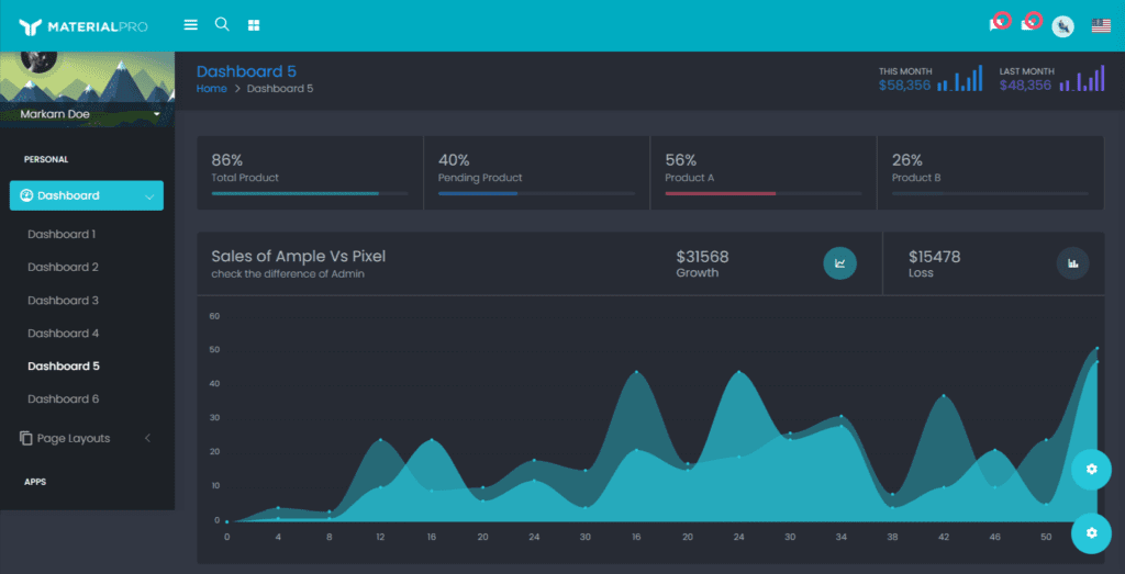
It’s hard to pinpoint what exactly sets MaterialPro apart. It doesn’t exactly outperform all competitions in any particular regard but it is solid in each. Compatibility with major browsers? Documentation? Plenty of it. MaterialPro is a versatile template and can be useful for any type of business or website. It’s especially good for warehouse management, accounting, and SaaS applications, according to the creators. MaterialPro is a great choice for beginners, too. It’s intuitive and simple. MaterialPro is among the easiest-to-install templates on the market. And every time it gets unintuitive, its thorough documentation kicks in.
This blend of simplicity and versatility makes MaterialPro great for just about anyone. Especially beginners and anyone who doesn’t want their admin panel to take too much time. The main downside we could think of is the ambiguity of its compatibility with Internet Explorer. If you prefer a good old Explorer (we’re not here to judge), you might want to keep looking. If not, give MaterialPro a try!
4. EasyDev
- Source: https://themeforest.net/item/easypro-developer-friendly-react-bootstrap-4-admin-template/21798550
- Preview: https://preview.themeforest.net/item/easypro-developer-friendly-react-bootstrap-4-admin-template/full_screen_preview/21798550
- Technologies: React, Bootstrap 4, React Hooks, Material UI
- Compatible browsers: Firefox, Safari, Opera, Chrome, Edge
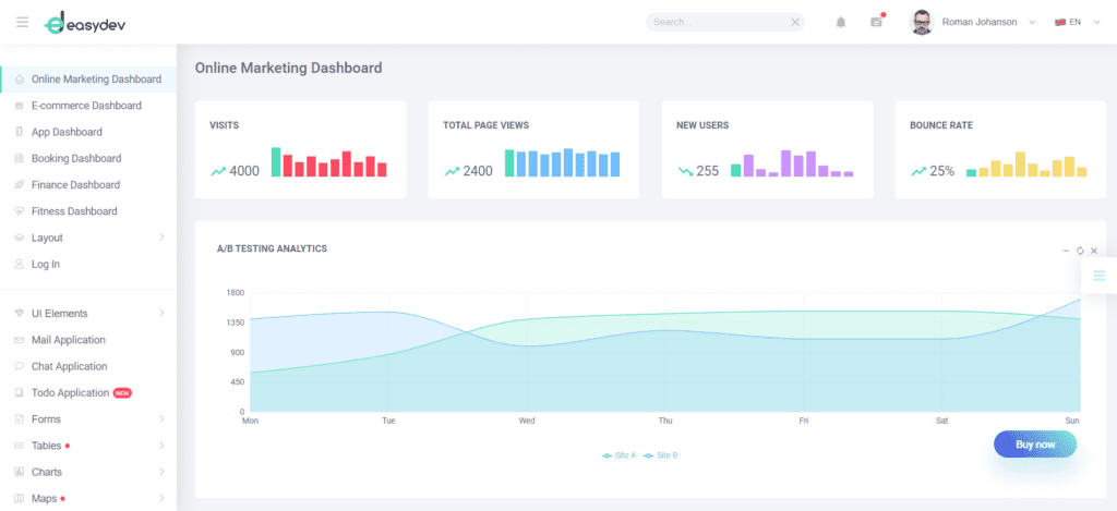
EasyDev is among the most complete packages we could find. Its SASS-based Material Design has light and dark modes. React hooks are responsible for the routing and the template is easy to deploy using Dockerfile. But the thing (or things) that caught our eyes the most was the selection of six separate dashboards. The E-Commerce dashboard is for sales, orders, and reports. Usage statistics and conversions appear in the App dashboard. The Finance dashboard tracks exchange rates. Each one is ready for action. All you have left is to connect the template to your API’s endpoints which is easier than it sounds. Pick one that fits best, or switch between them at your discretion, whichever suits you.
Visuals are also a strong plus. EasyDev uses Recharts, ChartJS, and React-Vis for interaction with outside services. All the data from your website and other platforms goes straight to the dashboards with little to no delay. The selection of 200+ UI elements is enough for building new functionality if preinstalled dashboards don’t cut it. Finally, EasyDev sports a proprietary chat application for commuting with your clients. Follow the links below to check it out!
5. Enlite Prime – React Admin Dashboard Template
- Source: https://themeforest.net/item/enlite-prime-reactjs-fullstack-website-template/23803960
- Preview: http://enlite.ux-maestro.com/
- Technologies: React, Material UI, Firebase, Redux Saga
- Compatible browsers: Firefox, Safari, Opera, Chrome, Edge
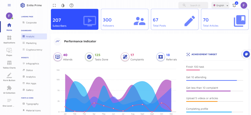
Enlite Prime is our next pick. We’re talking about a React-based full-stack template, meaning you will not have to worry about the back-end or database. Enlite Prime won’t work with WordPress, and neither can you use it as a static HTML template. Those limitations aside, we couldn’t find a single area where Enlite Prime is lacking. The 12-grid system makes for a flexible layout that fits any screen. There are multiple themes, light and dark, including pitch-black backgrounds, that work so great on OLED displays. Enlite has 30+ React components. This isn’t as much as some competitors have, but combined with adaptive design will likely cover all needs.
But perhaps the biggest thing setting Enlite Prime apart is its quick-starting capacity. It comes with pre-built CRUD apps, a selection of sample pages, and a ‘Starter Project’ option. The latter lets you set up your online platform in no time at all.
6. Crema
- Source: click the link
- Preview: https://preview.themeforest.net/item/crema/full_screen_preview/26540158
- Technologies: Material UI, React, React Hooks, Ant Design
- Compatible browsers: Firefox, Safari, Opera, Chrome, Edge
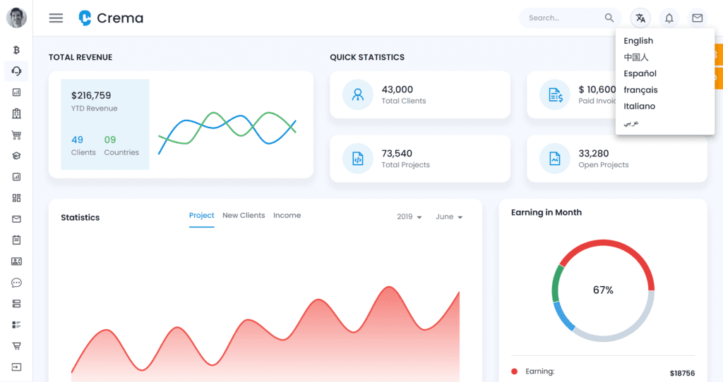
Coming up is another well-rounded package called Crema. This isn’t the first time Crema has appeared on our lists. It has 7 built-in Apps, 3 theme styles, and 11 navigation styles. As if that wasn’t enough to choose from, Crema lets you adjust the color scheme and pick one of many thousands of possible combinations. Crema sports 6 dashboards: Analytics, e-commerce, CRM, Crypto, Healthcare, and Academy. Each was preconfigured for specific tasks and use cases. The included apps cover useful functionalities like Scrum board, task manager, and SM style Wall. Crema supports logins with four different services: AWS, Firebase, Auth0, and JWT.
Crema utilizes over 300 widgets and metrics, most of them ready to integrate with outside sources. This covers virtually all use cases and allows for seamless integration with other services. Finally, Crema lets you choose between 5 menu styles to find the one that makes you feel the coziest.
7. Reactify
- Source: click the link
- Preview: https://preview.themeforest.net/item/reactify-reactjs-redux-material-bootstrap-4-admin-template/full_screen_preview/20922934
- Technologies: React, Bootstrap 4, React Hooks, Redux
- Compatible browsers: IE11, Firefox, Safari, Opera, Chrome, Edge
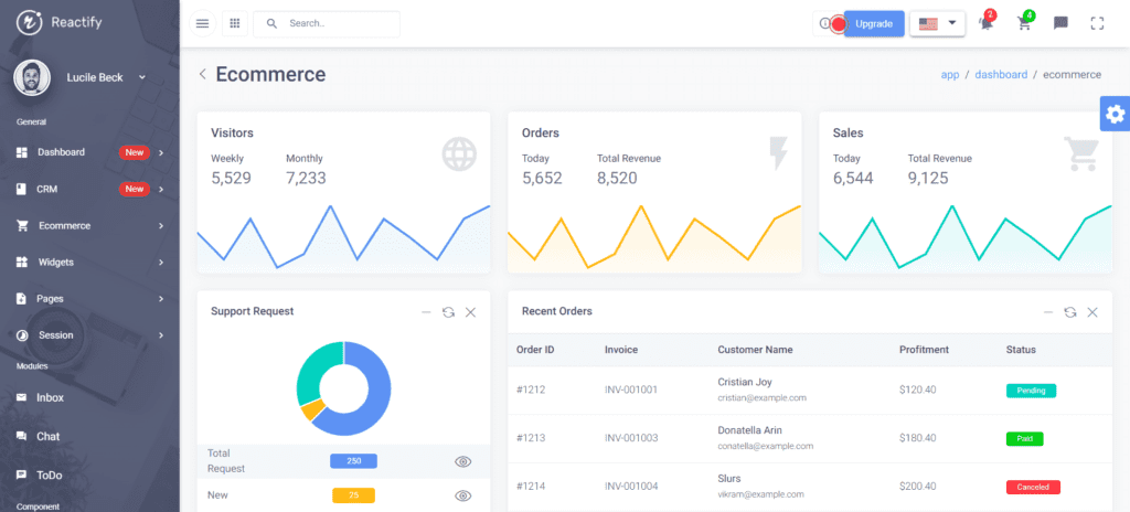
Reactify is a mixture of React and Bootstrap with Material-based design. We’re not sure if we can call it a Material UI template in the traditional sense. What we can call it is a template that deserves a spot on this list. Right off the start, you’ll get 30+ pre-built pages and 60+ widgets, some of them proprietary and exclusive to Reactify. As you install it, you will almost instantly find solutions for typical situations in business. They only require minimal calibration on your part. If those options don’t cut it, you can explore Reactify’s full features.
Don’t let the initial ease mislead you. Reactify is a solid tool for advanced users, too. It has charts, promo widgets, and customizable reports. Set up chats, interactive feedback, pricing plans, and more. Reactify has tons of features, and you can customize each one for your needs. Visit this page and give Reacify a try!
8. Egret
- Source: click the link
- Preview: http://preview.themeforest.net/item/egret-react-redux-material-design-admin-dashboard-template/full_screen_preview/24673283
- Technologies: React, Firebase, Redux,
- Compatible browsers: Firefox, Safari, Opera, Chrome, Edge
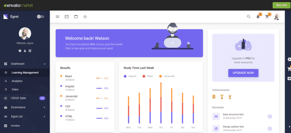
An egret takes up the next spot. We liked the aesthetics of each template on the list, but boy does Egret catch the eye! The color scheme seems typical for admin templates, yet the subtle difference in tones, shades, and contrast makes this dashboard stand out. We don’t know if that’s a plus or a minus, considering you’ll have to do business with this thing, not casually observe it. We do know that Egret has plenty to offer in other departments, too.
Egret’s list of features and components isn’t long, but they’re well-picked and customizable. This gives you a balance between advanced freedom and easy entry that can be hard to find and uphold. Egret comes with dashboards tailored for online education, analytics, and sales. This serves as a starting ground, and one of them is bound to come in handy in any business. As you get the hang of it, you can delve deeper into Egret’s functionality. It has seven pre-built-in apps: Event Calendar, Inbox, Chat, Invoice Builder, CRUD List, To-do list, and Infinite Scroll list. The Forms section includes form validation, Upload, Wizard, and Rich Text Editor. You’ll cover lots of ground with those. Egret integrates with Google Maps, Calendar, and a multitude of other outside services you might require data from. Follow the link below to give Egret a try.
Building new apps with Flatlogic Platform
We’ve covered our picks for the best Material UI templates we know of. They’re versatile and offer a great variety of features for managing your business. Some even work as full-stack web applications, not requiring you to develop any additional software. But at Flatlogic Platform there is another path to pick if you need a web app for your business.
Web applications have more in common than you might think. There is a term CRUD in web development. It stands for Create, Read, Update, Delete. These are the most basic functions any application performs. Like basic actions, other features of an app can be categorized and replicated. We followed this line of thought and developed a platform that lets you build web applications from scratch. We took Web App development and stripped it down to a few choices. Keep reading to know what they are.
#1: Choose a Name
The first step is inelaborate, even by beginner standards. We chose a name easy enough for you to associate with the project.
#2: Choose Stack
An app consists of the front-end (or end-user interface), the database, the admin panel, and the back-end that makes everything work together. We’re constructing a headless CMS. That means we’ll handle the end-user interface separately and concentrate on other components for now. On each level, we have multiple options working on different technologies. For example, we can choose between React, Angular, and Vue.js admin panels. Likewise, we pick technologies that our database and back-end will run on.
#3: Choose the Design
Admin dashboard design has its peculiarities. It’s meant to be clear and easy on the eye, rather than pretty and original. We offer you five distinctive dashboard designs on the Flatlogic platform and keep working on new ones so you can have more options to choose from.
#4: Choose Database Schema
Next up, we construct the schema. The schema is the backbone of a database. It includes attributes, tags, fields, and the meaning of the data in those fields. This step is more complicated than the ones before it. Luckily, it doesn’t require any specialized expertise beyond understanding your business and the kind of data you’ll deal with.
#5: Review and Generate your App
Everything has been set. Check if everything is the way we need it and hit the Create App button. After a brief compilation, your app will be at your disposal. The Flatlogic Platform is integrated with GitHub and lets you push your application there. Or you can host your app without help from external services. Either variant costs mere seconds of your active involvement. At this point, your app is ready and fully functional. Enjoy!
Conclusion
That was it for our favorite Material UI templates. Items on this list have different strengths and weaknesses but each has a solid build and operation. Each has all the awesome features we expect from the blend of React and Material Design. Each is a capable solution that will work for your business website. Now, you know the reasons to choose Material UI and reasons to avoid it, and can use that knowledge to make better calls and build great web applications. Happy developing!