TL;DR
- Roundup of 11+ Bootstrap alternatives, grouped by Material Design vs non-Material
- Covers MUI, Vuetify, Angular Material, Materialize, plus Bulma, Foundation, Semantic UI, Skeleton, Ink, Vue Material, Material Tailwind
- Compares grids, components, language support, and quick-start install options
- Advice: choose tools that fit your style and needs if Bootstrap feels heavy
Why you should look for Twitter Bootstrap alternatives?
Bootstrap is the most popular HTML, CSS, and JS framework that is used for building responsive web interfaces. Nowadays, Bootstrap is not only an adaptive grid system but a full-fledged toolkit with components and JS plugins. A part of Flatlogic web templates is made with Bootstrap (check out a Bootstrap dashboard theme). In this article, we will speak about different frameworks that can offer a grid system and look through popular toolkits with components and UI elements.
But first, answer the main question: if Bootstrap is so popular and recognized, why should we use alternatives?
Finding the right front-end framework from this article can simplify project development, offering alternatives to Bootstrap that might better suit your specific business software needs, whether you’re looking for a comprehensive framework or a toolkit with a pre-built grid system.
If you feel overwhelmed with Bootstrap, or think that it doesn’t fit your programming style, or if development with Bootstrap becomes a headache, you should give a try to another technology. Don’t forget that all frameworks are tools to achieve some specific purposes, so it’s a good practice to clearly define your task before you start looking for instruments to complete it. We are here to help you get acquainted with these instruments that can become viable alternatives for Bootstrap. We divided the top into two blocks: first includes all frameworks and libraries that are built according to Material Design principles, frameworks from the second block doesn’t use Material Design.
Enjoy reading.
[table id=13 /]
Twitter Bootstrap Alternatives with Material Design
Material UI
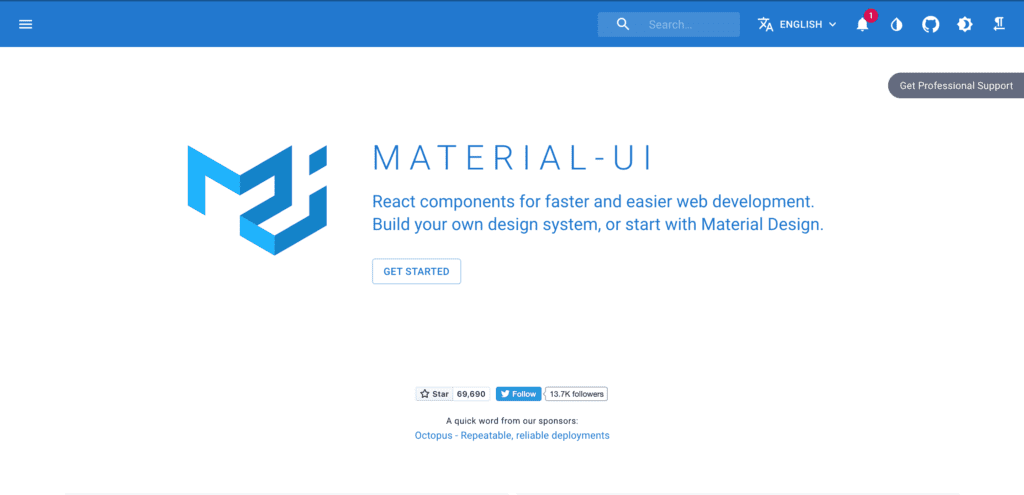
Material UI is a very popular React UI framework that is based on material design principles. It is a crowd-funded JavaScript open-source project with 60 k stars on GitHub. According to the official website, such big global companies, like Amazon, NASA, J.P.Morgan, Unity use Material UI for development. The framework offers a big set of React-based components and has a long release history with the option to download any previous version. Material UI goes with a responsive grid system that provides flexibility with CSS’s Flexible Box module. According to Material Design principles, Material UI focuses on the consistent spacing between columns. By default, the spacing is equal to 8 px, but it varies as an integer between 0 and 10 inclusive. 
The additional feature that we should mention:
Developers used Material UI framework to build premium and free admin templatesand kits so users can either quick start a new project with the help of ready-to-use components in templates or improve current project and redesign it.
Thanks to the crowd-funded principle of the project, the team of developers continue to develop Material UI and support users.
To start using Material UI you can:
Install as npm package
npm install @material-ui/core
yarn add @material-ui/core
Or download from CDN
Vuetify.js
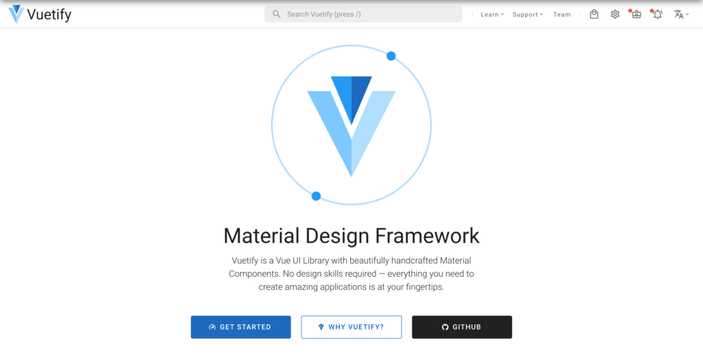
Vuetify.js is another Material Design framework. That is a very popular and loved Vue component library for building awesome web applications. The developers tried their best to decrease the bundle size and to provide wide customization opportunities. The grid system from Vuetify is a 12 point grid system that uses breakpoints to control the layout of the application for different window sizes. Breakpoints can be customized with special Breakpoint service.
Vuetify is also sponsored by anyone who wants to take part in the project development via Patreon and OpenCollective web platforms for donations. The developer community with 27 k stars on GitHub is not as big as Material UI one. However, the whole community is vibrant and active and you can use several channels for communication (twitter, discord, GitHub, Reddit, official Vuetify website support). You can also use premium themes, kits, and dashboard if you need to speed up the development of your project. The last release of a new version of Vuetify was less than a month ago.
Additional features:
Vuetify supports more than 30 languages. The top developers provide paid consulting services.
To get started you need to download Vue CLI. It’s a specific tool for Vue.js development, that you can install with one npm or yarn command
npm install -g @vue/cli
# OR
yarn global add @vue/cli
(more info you can find on the official website: https://cli.vuejs.org/).
Then use the next command for your Vue.js project: $ vue add vuetify
Several other options to install Vuetify are available (via Vue UI, Nuxt, CDN, etc.) in the official documentation of the framework.
Angular Material
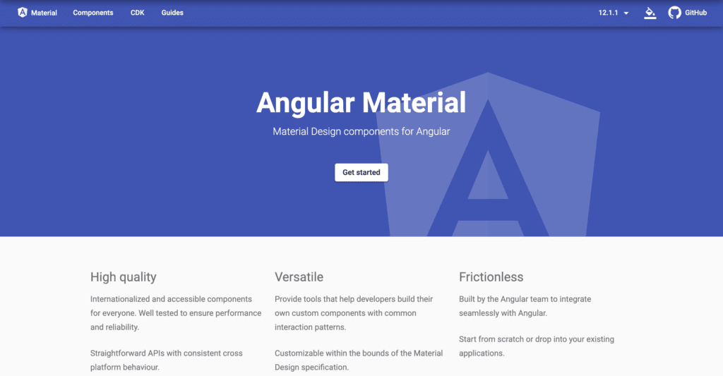
Angular Material is a framework that contains a high-quality UI component for development and gives the developers tools to build custom components with predefined patterns. The main focus of developers stays on building well-tested and customizable Material Design components, so a grid system is not a cornerstone in that framework. The grid system goes with some setting for row height, gutter size, multiple rows or columns, etc, and it is not the strength of Angular Material.
The developers team of the framework consists of a part of Angular team at Google and community contributors all around the world. They are constantly improving their product that got more than 20 k stars on GitHub.
Additional features:
Theming system for individual configurations of components.
Angular Material offers very qualify components with clean code and comprehensive documentation.
How to start:
Run the command in the Angular CLI’s:
ng add @angular/material
Materialize
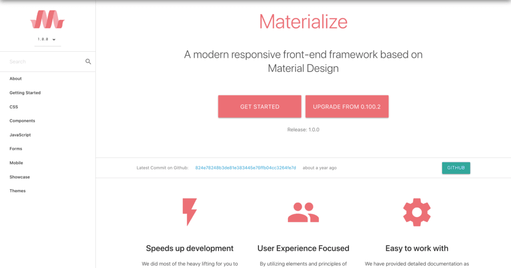
Materialize is a CSS front-end Framework based on Material design principles. That framework incorporates a responsive system that works across all browsers and devices. Materialize is one of the most popular alternatives for bootstrap with 38 k stars on GitHub. Materialize offers two different versions depending on your expertise. The standard version that goes with unminified and minified CSS and javascript files, and Sass version with SCSS files. The second version requires additional knowledge of Sass syntax and Sass compiler.
Additional features:
Materialize goes with two starter templates: one is a simple starter page with the familiar structure like header, footer, banner, etc.; another is a similar page, but with additional parallax effect.
You can start using Materialize by downloading CDN at cdnjs or you can get it via NPM command.
npm install materialize-css@next
Vue Material
Vue Material is a relatively young UI toolkit that helps to build interactive and adaptive web apps. The first version of the toolkit was developed by a passionate developer who wanted to find a fast and lightweight solution with Material Design for Vue. The project has gained the support of sponsors and developers community and now it has almost 9k stars on GitHub. You can import and use different parts of Vue Material pack: separate components or whole developer tools, such as batteries-included webpack boilerplate, a SSR template for Nuxt.js, and a Single HTML file.
Additional features:
There are several premium themes of dashboards and Material Kit that are built on top of Vue Material.
To get started install through NPM or Yarn:
$ npm install vue-material --save
$ yarn add vue-material
Material Tailwind
Material Tailwind is a freshly launched open source component library for Tailwind CSS and Material Design 2. It was built by developers for developers and it comes with a large number of fully coded CSS components. The first version of Material Tailwind is based on ReactJS, but versions for Vue.js, Angular.js, Svelte, and Vanilla Javascript will be released in the near future. You only need to have a basic knowledge of ReactJS to use this library. Material Tailwind is an open-source project by Creative Tim, so anyone can contribute to solve different issues or expand its components.
Additional features: Material Tailwind also comes with 3 fully coded sample pages: Landing Page, Profile Page, and Login Page.
To get started install through NPM or Yarn:
$ npm i -E @material-tailwind/react
$ yarn add @material-tailwind/react -E
Twitter Bootstrap Alternatives without using Material Design
Skeleton
Skeleton is a rare beast on the Internet. The developers name it “a dead simple, responsive boilerplates”, and this is the absolute truth. Why so? All other libraries and frameworks go with tens and hundreds of inbuilt components and elements, that stay with the app whether it uses them or not. Hence, frameworks increase the weight of the code and the number of lines in the code.
The core idea of Skeleton is to be as lightweight and “dead simple” as possible, and the developers succeeded. That boilerplate contains approximately 400 lines of code and the whole documentation that contains information about the grid system and several components (like forms and buttons) with code samples takes less than 5 minutes to read. Skeleton provides adaptiveness through a 12-column flexible grid system. It’s a very popular boilerplate on GitHub with almost 18k stars and 3k forks, but the last update was in December 2014.
The additional information you need to know:
The max width of the grid is 960 px. That means it’s OK to use Skeleton if you want to see your design adapt comfortably to small viewports. But computer screens are getting bigger every day (and we speak not only about the standard and widespread 1900 x1280 resolution but about MacBook pro laptops with 2500 + screen resolutions), and that layout with 960 px max width looks a little ridiculous on that screens. So, think about your target users and devices they use before developing your app with that grid system. If you know that 80 percent of them use apple products it’s better to use an alternative grid system.
The second point is worth noting is that although Skeleton supports nested columns, the grid has %-based gutters that result in different gutters inside the nested grid and poor readability on small screens.
You can start using Skeleton by downloading the repository from the official website or cloning it from the GitHub.
Ink
Ink is a UI Kit where all components and UI elements are based on a grid system that gives you impressive control on how to use the horizontal space. Its grid system divides screen sizes with several breakpoints from tiny (up to 320 px) to xlarge (the screen width above 1261 px). First of all, Ink is an interface kit, so it contains a bunch of UI elements and Javascript UI components. Among them are tables, buttons, alerts, date-pickers, carousel, progress-bars, modal, tabs, and much more. Furthermore, Ink has a modular architecture and comes with a powerful library that provides DOM manipulation methods, Ajax and JsonP request handling, Utility methods, and others.
Additional features:
You can find a Cookbook page on the official Ink website. This is a page that contains ten free examples of common layouts you can use to start the development quickly. You can either view demo for every sample or download the source code.
Even though the last big update of Ink repository was in 2015, the development team still supports users that use their product.
To get started simple use CDN Fastly or download the repository from GitHub.
Foundation
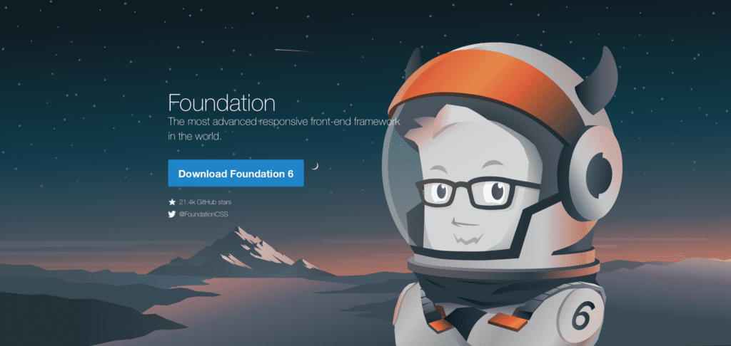
Foundation is notable for the fact that it implements a convenient XY grid. The framework contains all the interactive components necessary for modern web development, such as navigation, buttons, tables, menus, and so on. The framework focuses on the Mobile First approach. From the beginning, the mobile version is being developed, new elements are gradually added, and thus the desktop version of the application appears. This is very convenient and saves a lot of time, as it immediately introduces design restrictions on the product. Foundation uses jQuery, Normalizr, Boilerplate.
Additional features:
There is no incompatibility with any server technologies. Mobile First approach.
To get started use
# Installgit clone https://github.com/foundation/foundation-sitescd foundation-sitesyarn
Bulma
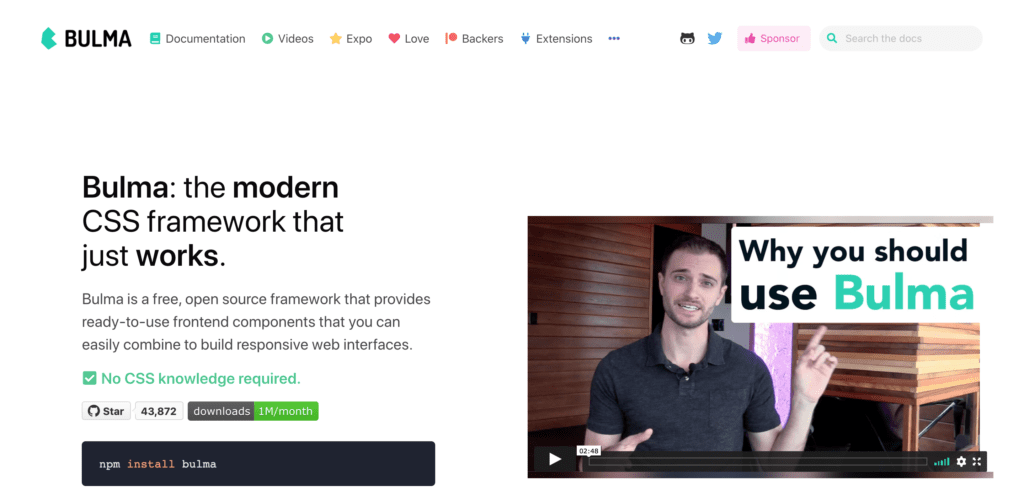
Bulma is a pure CSS framework (no JS files at all), that helps developers to create a quality web interface without the need to include additional JS files into your project. This is one of the main features of Bulma and exactly that one why developers love it. That framework has more than 40 k stars on GitHub and 3,5 k forks. Bulma is the most popular JS free alternative to Bootstrap.
Additional features you should know about:
You can find a lot of developers, that use that framework, open community, and free support. Although it’s quite easy to start using Bulma, it becomes even easier when thousands of developers are ready to help and a vast amount of tickets have been already solved.
There are several related projects from Bulma’s developers on GitHub that can be useful. For example, Bloomer – a set of React components for Bulma.
Bulma goes with detailed and comprehensive documentation for classes, colors, elements, and modular architecture.
If you decide to give a chance to Bulma, there are several ways:
– npm install bulma
– yarn add bulma
– bower install bulma
– download package from CDN
Semantic UI
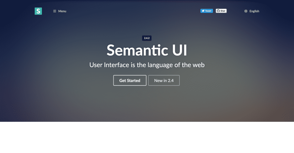
Semantic UI is a UI framework that helps you build beautiful websites, simplifying the process of front-end development. The framework uses CSS, HTML, and JavaScript. “User interface is the language of the web” – that are the opening words from the official website. And that words represent the core idea of Semantic UI. It helps you to create your theme with the help of progressive truthfulness in the process of development. Progressive truthfulness is the concept originating in the book “The Design of Design” by Frederick P. Brooks Jr. The point is that you don’t need to create a component or UI element from a blank canvas, instead you use a built-in component and customize it with CSS variables and variables inheritance (Semantic UI contains more than 3000 CSS variables). That framework gained great popularity on GitHub with 48 k stars.
Additional features:
Easy integration with React, Angular, Meteor, and Ember frameworks.
Semantic UI offers several additional versions: CSS only, LESS only, LESS plugin, EmberJS, Meteor-Less, Meteor-CSS, Bower.
If you decide to start using it:
You need to install Node.js and Gulp first. Then use the next command:
npm install semantic-ui # Use themes, import build/watch tasks into your own gulpfile.
Closing words
In closing we want to quote the words of full stack developer Brad Traversy:
“The more you learn, the easier it is to learn more and to fit all of these technologies together. Try not to get overwhelmed. Take it one step at a time and do some research, and figure out what you want to do.”
The source
Thanks for reading!
