Javascript UI Frameworks and Libraries make it easier for developers to build clean and consistent User Interfaces (UI). They provide components and utilities for common use within your Application. Some UI Libraries give you the freedom to switch things up using themes, while others provide a clear and consistent User Experience.
Developing a responsive User Interface from scratch is time-consuming, particularly for business software where efficiency and responsiveness are crucial. Utilizing external UI component libraries offers a practical solution, providing pre-made, efficient, and user-friendly components that significantly expedite the development process.
What are Javascript UI frameworks and libraries?
While creating this article I couldn’t normally find a Google request on how to find products that we will discuss in this article. It seems to me that there is some confusion in the concepts between JavaScript UI components and frameworks. Often requesting JavaScript UI library I would get React or Angular results.
Let’s decide what JavaScript UI components libraries are in the first place. What are they and how do they differ from each other?
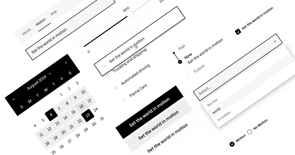
A modern JavaScript UI component library is going to have a wide range of building blocks available to the developer. These can range from buttons to input elements, scrolling lists, and more. Other advanced components like headers, tab bars and grids are also necessary.
It is also critical to introduce a JavaScript UI component library into your development system in order to keep up with building a modern application. But what exactly is a UI component?
What is a component or UI library?
A component is made of two parts. The first is how it looks (the UI) and the second is how it works (the user experience or simply UX). Often it is easy to style a component to match the corresponding component in the native library.
JavaScript UI component library is a set of ready-made components and controllers for building the interface of almost any web application. There are both paid and free versions of such products.
They are quite popular, allowing you to quickly and cost-effectively build web applications, including complex enterprise systems.

Most Javascript UI component libraries are designed to work with a specific front-end framework. Angular Material, for example, only works with the Angular framework.
The nice thing about components is that they’re modular without many app-specific dependencies. This means that you get to reuse the components to build awesome apps and interfaces super fast. And thanks to Bit, you can share them with other React enthusiasts too.
Choosing the JavaScript UI library
- Create a short-list of JavaScript UI libraries;
- Before you even start looking at particular UI libraries, you need to investigate your existing system to understand your needs;
- Create an inventory of components you already use in your system;
- Identify which functionality of existing components is an absolute must-have, and which isn’t;
- Figure out if any functionality of existing components is currently missing or needs to be improved.
After getting this data, you may start going through all available UI libraries and check if their offers are close to what you want to get.
So, let’s go and look through the best libraries divided by the technology they support.
JavaScript UI Libraries
React
Baseweb
Github link: https://github.com/uber/baseweb
License: MIT
Web-site: https://baseweb.design/
Documentation: Well-documented
Pricing: Free
BaseWeb provides a robust suite of React UI components out of the box. These include complex, ready-to-use components such as the Datepicker and low-level composable primitives, such as Layer. Base Web was originally built by Uber. Base web components are built with accessibility to being a first-class citizen.
Material UI
Github link: https://github.com/mui-org/material-ui
License: MIT
Web-site: https://material-ui.com/
Documentation: Well-documented with a lot of examples
Pricing: Free
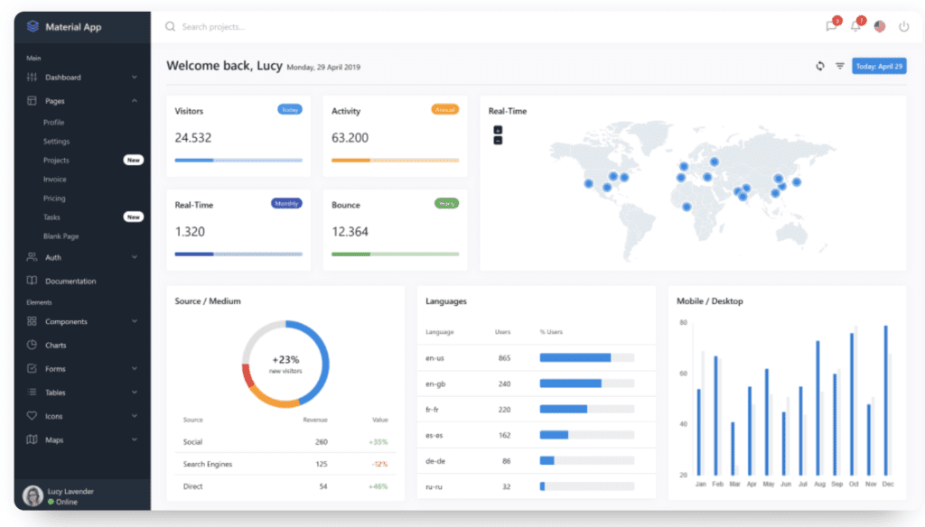
Material UI is one of the most popular React component libraries with over 48,000 stars on GitHub. The components and all the template elements are built according to Google’s Material Design guidelines but are all React components. For those of you who need filling in, material design takes inspiration from the physical world and textures while keeping the actual UI elements to a minimum.
A wide range of helpful components is available: app bars, auto-complete, badges, buttons, cards, dialog boxes, icons, menus, sliders, and more. Material-UI also offers React themes and templates so you can have a custom color theme for your app.
Evergreen
Github link: https://github.com/segmentio/evergreen
License: MIT
Web-site: https://evergreen.segment.com/
Documentation: Well documented with the active community in Spectrum chat
Pricing: Free
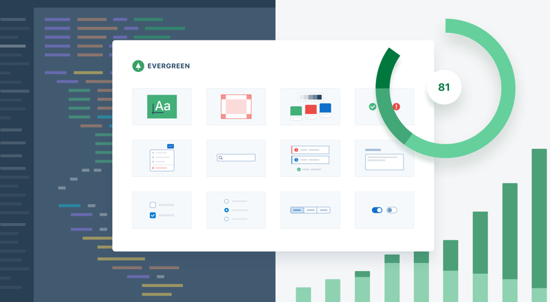
Evergreen contains a set of React components that’s suitable for enterprise grade web applications. Since it uses React Primitive, it’s highly flexible.
It includes a wide range of components and tools starting from basic layouts, typography, colors, and icons to function-based components such as dropdowns, toggles, file uploads, and feedback indicators. After installing the Evergreen package, you can pick and choose the components you want to import.
The documentation is very easy to read, understand and implement and is inspired by React Primitive UI. It was last updated a few days ago showing it is regularly maintained. The library has a very active and growing community in Spectrum chat. It is also worth mentioning that this library is quite reliable because it is backed by Segment.
Rebass
Github link: https://github.com/rebassjs/rebass
License: MIT
Web-site: https://rebassjs.org/
Documentation: Well-documented
Pricing: Free
Rebass is a React primitive UI component built with modern styling conventions like styled-components and emotion. It has 8 main components and those 8 have sub-components, all being really small in size. It has very responsive and at the same time very easily-themeable style properties. It has a flexbox grid with box and flex components, it has been starred over 5,900 times on GitHub and is very regularly maintained.
Some of the Features:
- Styled System props;
- Mobile-first responsive styles with array-based syntax;
- Flexbox layout with Box and Flex components;
- Minimal footprint of about 4KB.
Grommet
Github link: https://github.com/grommet/grommet
License: Apache 2.0
Web-site: https://v2.grommet.io/
Documentation: Full documentation with examples
Pricing: Free
Grommet has a wide library of components in its kit and counts big names like Netflix and Boeing among its users. Whether your app is for phones or for wider screen displays, you’ll be able to design layouts. Accessibility is via a keyboard or screen reader.
Theming tools help customize color, type and layout. The React UI components library rates a star count exceeding 5500 on Github.
Angular
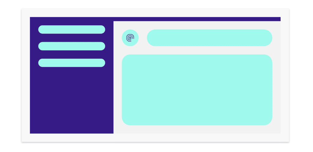
VMware Clarity
Github link: https://github.com/vmware/clarity
License: MIT
Web-site: https://clarity.design/
Documentation: Full documented
Pricing: Free
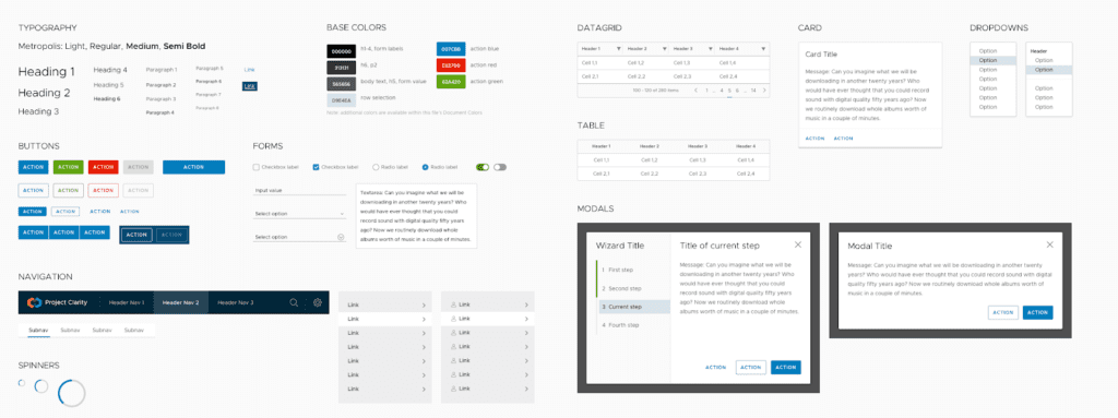
Clarity design is a set of UX guidelines, HTML/CSS Frameworks and a set of Angular Components – all rolled into one. The goal of the Clarity Design System is to provide an exceptional UX by combining the three. The UX guidelines are developed through research to make it easy to design and deliver great UX.
The features are almost as limited as ones of a Material library, but with some dealbreaker differences – small details in every component, which were often closing the gaps in the functionality of Material Library.
Pros:
- Clean, modern, but calm and restrained UI. Very enterprise-friendly looking and not as widespread as Material design;
- Good free support via Github issues or Stackoverflow.
- Very good performance and overall UI responsiveness;
- Documentation is good. It contains code examples and UI guidelines for each component.
Cons:
- Clarity relies on open-source Metropolis font, which is available only for Latin languages;
- The library is relatively mature, but not stable. Some updates introduce small breaking changes, and more of them are coming with the next major release;
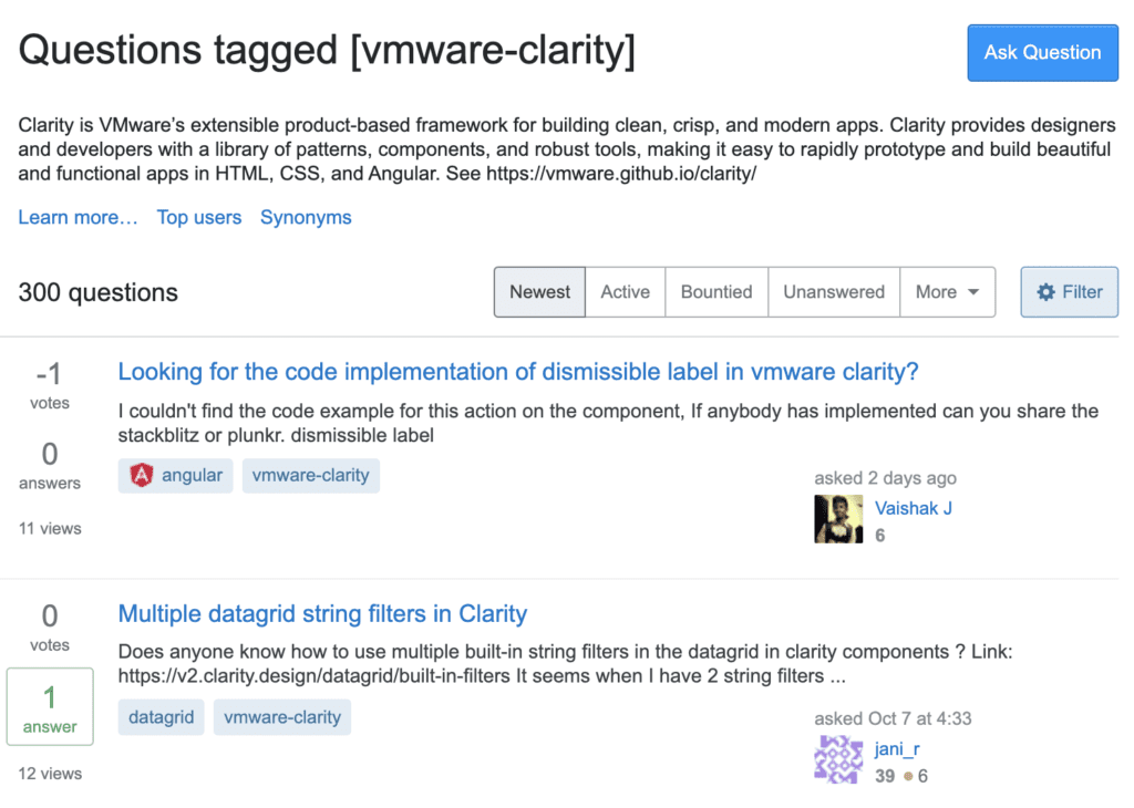
- Clarity clearly lacks any real-world examples. All you have is their documentation website.
Clarity UI framework is definitely one of the best on the market, but its limitations and incomplete feature set may be a no-go for your circumstances.
Angular Material
Github link: https://github.com/angular/components
License: MIT
Web-site: https://material.angular.io/
Documentation: Well documented, large community support
Pricing: Free
Angular 2 Material is an adaptation of Google Material Design Language for Angular 2 and above. We offer Material Design Components for Angular. Some of these components include Cards, Dialog, Lists, Grid, Side Nav, etc. It is closely integrated with Angular, offering APIs for its components with excellent documentation and demos. If you are a fan of Material Design, this should be on top of your list. On its own, it lacks the ability to provide a powerful responsive design system. Therefore, it is common to pair it with Angular Flex-Layout.
Pros:
- A pretty good set of UI components that will cover most of your tasks;
- Good performance;
- Customizable components give you the ability to naturally integrate your own custom components;
- CDK allowing you to add advanced behavior to your own custom components;
- Library roadmap is available;
- Huge development community, lots of examples, tons of learning courses and videos from conferences.
Cons:
- Lack of advanced components;
- Lack of documentation for some components and CDK entries;
- UI design may not be Enterprise-looking enough.
This UI library will be perfect for enterprise development, which is tightly integrated with external customer pages, company’s website and mobile apps.
NGX Bootstrap
Github link: https://github.com/valor-software/ngx-bootstrap
License: MIT
Web-site: https://valor-software.com/ngx-bootstrap/#/
Documentation: Well-documented with developed community
Pricing: Free

At 3.5K stars, this library contains all core (and not only) Bootstrap components powered by Angular. With performance for both Mobile and Desktop, it’s designed with extensibility and adaptivity in mind. It contains all core (and not only) Bootstrap components powered by Angular. So you don’t need to include the original JS components, but use markup and CSS provided by Bootstrap.
All the bootstrap components are built with Angular, so it provides a responsive UI and better performance on all platforms.
It is the best way to quickly integrate Bootstrap 3 and Bootstrap 4 Components with Angular.
Angular UI Components of ngx-bootstrap include Accordion, Alerts, Buttons, Carousel, Collapse, Datepicker, Dropdowns, Modals, Pagination, Popover, Progressbar, Rating, Sortable, Tabs, Timepicker, Tooltip and Typeahead.
Vue
Bootstrap Vue
Github link: https://github.com/bootstrap-vue/bootstrap-vue
License: MIT
Web-site: https://bootstrap-vue.js.org/
Documentation: Well-documented
Pricing: Free

Bootstrap-Vue brings the power of Bootstrap, a widely used CSS library, into Vue. It provides you with readily available UI components and a grid system, plus everything is mobile-first and responsive. Further on, the components of this library are compatible with the WAI-ARIA guidelines for web accessibility. Keeping up with Bootstrap’s philosophy of quickly creating UI components, Bootstrap-Vue enables a developer to quickly start a project.
Features:
- Readily available UI components;
- Responsive grid system;
- Library components are compatible with the WAI-ARIA guidelines for web accessibility;
- Strong community support;
- More than 75 custom UI components;
- Over 40 plugins.
Storefrontui
Github link: https://github.com/Divanteltd/storefront-ui
License: MIT
Web-site: https://www.storefrontui.io/
Documentation: Well-documented
Pricing: Free
Storefront UI is a Vue.js-based library of UI components for developers, designers, and agencies striving to build storefronts.
The library was built only for building e-commerce shops. It has tons of pre-built components to build an entire store from scratch. Storefront has the ability to customize single UI elements for the whole library at once.
The community and documentation are also well-developed.
Buefy
Github link: https://github.com/buefy/buefy
License: MIT
Web-site: https://buefy.org/
Documentation: Full documentation
Pricing: Free
Buefy is a lightweight UI component library based on Vue and Bulma, a CSS framework. If you are comfortable with SASS, you will feel right at home with Buefy’s similarities with SASS. That being said, while Buefy provides a ready-made list of components to use for a beginner application, you may find it insufficient while working on a larger project.
Features:
- Open-source on GitHub;
- Each component of Buefy library is responsive;
- No internal dependency, hence it is light-weight;
- Supports Font Awesome and Material Design icons;
- Semantic code output.
Vuetify
Github link: https://github.com/vuetifyjs/vuetify
License: MIT
Web-site: https://vuetifyjs.com/en/
Documentation: Well documented with developed community
Pricing: Free
Vuetify is one of the greatest UI component libraries based on Vue. It offers a large set of crafted components (80+) based on the Material Design spec, which is enough for almost any app’s needs.
You can use it to build SSR apps, SPAs, PWAs and mobile apps. There is also a system to pick and choose only the components in use, thus reducing the final size of your app dramatically.
What makes Vuetify an interesting choice among the best Vue UI component libraries is the availability of ready-made scaffolding for code – in the form of pre-made Vue-CLI templates. This helps you get started quickly. Vuetify also has a good community and regular updates.
Highlights:
- Vuetify combines the power of Vue, Material design and a massive library of well-crafted components for building apps and sites faster;
- Compatible with Vue CLI 3;
- More than 100 components;
- Responsive grid system.
Pure JavaScript
Webix
Github link: https://github.com/webix-hub/webix
License: MIT
Web-site: https://webix.com/
Documentation: well-documented, active forum, responsive tech support
Pricing: From $449
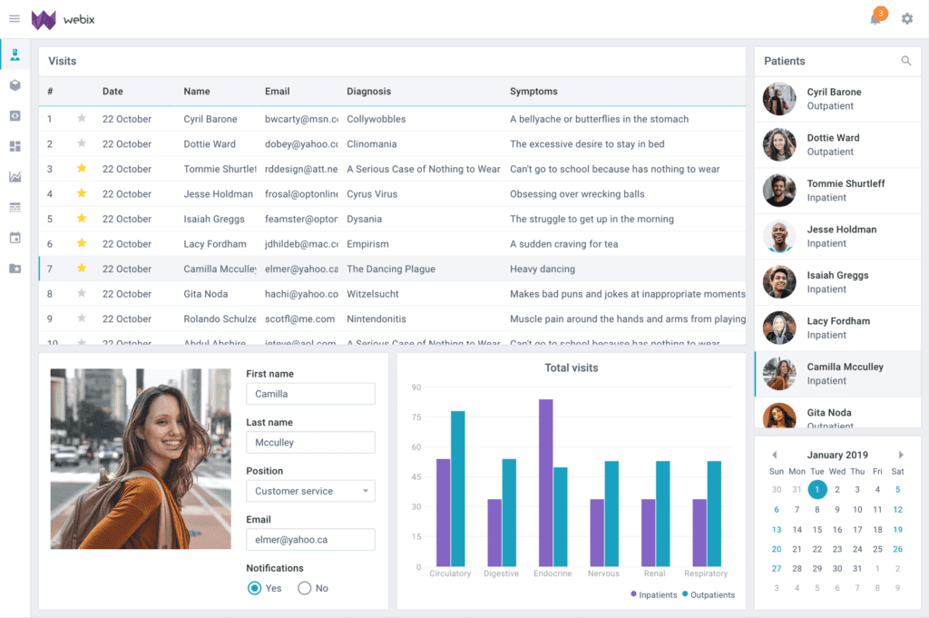
A library is a powerful tool, lightweight, and easily customizable. It includes 100+ widgets. Complex widgets are ready-made SPA applications that can be used straight away or integrated into any project. Among the most popular widgets are Kanban, User Manager, Chat, Gantt, Report Manager, and Scheduler. But the list is much longer, and the opportunities at the library are staggering.
Another powerful solution is Webix Jet microframework. It allows creating and maintaining web applications of various sizes and functionality. All the apps will be compatible with all devices and screen sizes.
Webix library is ready to offer outsourcing services. The developers of the library are all experienced professionals who can develop any project or work remotely in a team with your experts.
Pros:
- Large variety of widgets and templates
- Webix Jet microframework
- perfect performance and rendering speed
- regular updates
- responsive support
- extensive samples gallery
Cons:
- the documentation lacks details
- not enough examples of combining Webix with TypeScript
The Webix library is a powerful tool, which is well developed and carefully maintained. It is definitely value for its money.
Semantic UI
Github link: https://github.com/Semantic-Org/Semantic-UI
License: MIT
Web-site: https://semantic-ui.com/
Documentation: Well-documented, active community on GitHub
Pricing: Free
Semantic UI uses human-friendly HTML for its development framework and has integrations with React, Angular, Meteor, Ember, and many other frameworks. All jQuery functionality has been re-implemented in React, Angular, and other frameworks.
Semantic UI treats words and classes as exchangeable concepts. Classes use syntax from natural languages like noun/modifier relationships, word order, and plurality to link concepts intuitively.
Semantic uses simple phrases called behaviors that trigger functionality. Any arbitrary decision in a component is included as a setting that developers can modify. It also comes equipped with an intuitive inheritance system and high level theming variables that let you have complete design freedom.
Dhtmlx
Github link: https://github.com/DHTMLX
License: GNU General Public v2.0
Web-site: https://dhtmlx.com/
Documentation: Well documented with dedicated support
Pricing: from $99 for a single component
The DHTMLX suite (or dhtmlxSuite) is a JavaScript GUI widget library for building dynamic web applications with desktop-like user experience and Ajax data loading.
The modular architecture of the library allows using the components separately or combining them into one JavaScript file. The first components, dhtmlxTree and dhtmlxGrid, were released in 2005-2006. Later, DHTMLX was extended with other user interface components to become a complete toolkit that covers the most important aspects of the modern application interface. Being a standalone library written in pure JavaScript and CSS, DHTMLX does not conflict with other well-known JavaScript libraries, including jQuery, YUI, Prototype, etc.
Multi-framework
Storybook
Github link: https://github.com/storybookjs/storybook
License: MIT
Web-site: https://storybook.js.org/
Documentation: Well-documented
Pricing: Free
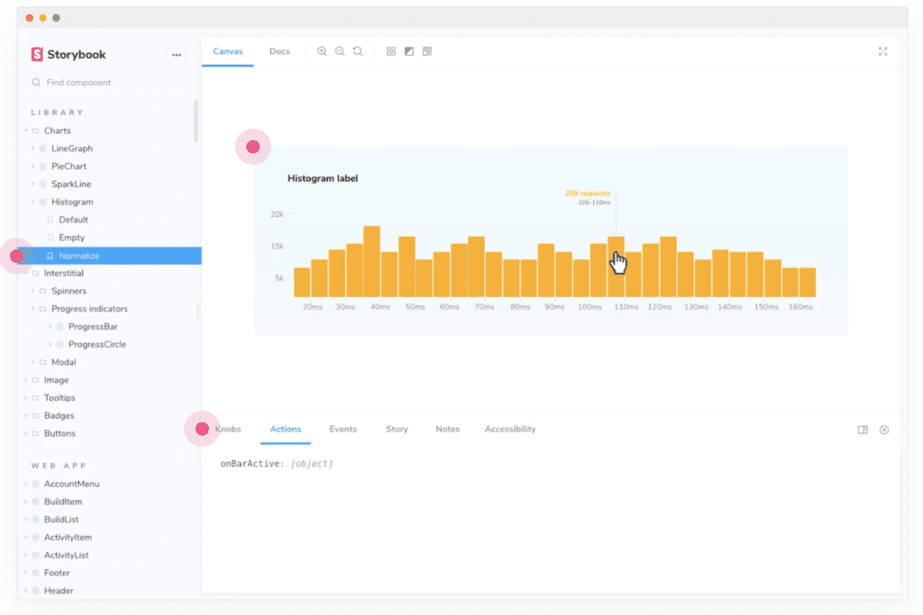
Storybook allows you to develop, manage and test UI components in an easy-to-use and isolated environment. The tool enables developers to create components independently from the main app and showcase them interactively in an isolated development environment without worrying about app-specific dependencies and requirements.
The isolated manner of development allows you to work in a more incremental and gradual way. It surfaces questions around ownership of layouts and styles. It makes situations that are difficult to manually test easy.
Storybook provides plenty of add-ons, plus a flexible API to customize your storybook as needed. You can also export a static web app and deploy your project to any HTTP server.
Primefaces
Github link: https://github.com/primefaces/primefaces
License: MIT
Web-site: https://www.primefaces.org/
Documentation: Well-documented
Pricing: Free
A comprehensive component suite including over 70 UI components with different themes from material to flat design. At 3.3k stars and used by eBay, Fox and other companies, this library is an interesting option to consider.
It offers over 80 components for Angular, React and Vue. On top of that, it can be easily customized through the use of themes. All widgets are open source and free to use under the MIT License.
UI Components of PrimeFaces:
- Basic Input Components plus advanced input components like AutoComplete, Calendar, ColorPicker, Editor, KeyFilter.
- Buttons and SplitButton.
- Data Components like DataGrid, DataList, DataTable, Tree Table, and more.
- Panels Components like Accordion, Card, TabView, Toolbar, ScrollPanel.
- Overlay Components like Dialog, Lightbox, Overlay Panel.
- File Upload Component.
- Menu Components like MenuBar, MegaMenu, Breadcrumb, TabMenu.
- Charts Like Bar, Radar, Pie, Line, Doughnut.
- Alert Messages using Messages and Growl.
- Advanced Components like Galleria, Drag and Drop, Progress Bar, Captcha.
Each component provides a unique widget that can be applied to your app. Using PrimeNG will improve productivity and the rate of speed at which you develop. It will also give you a solid starting foundation to develop any future apps.
Conclusion
Here is a quick overview of a few JavaScript UI component libraries you should be familiar with in your workflow. There are a lot more: you can always make your choice according to your personal preferences. The only important thing to note is if the library is regularly maintained.
About Flatlogic
At Flatlogic, we develop admin dashboard templates and React Native templates. We are listed among the Top 20 Web Development companies from Belarus and Lithuania. Over the last 6 years, we have successfully completed more than 30 big projects for small startups and large enterprises. As a team, we always have a deep desire to help our clients.