A Short Intro
Today design development doesn’t begin with a designer drawing good-looking and elegant buttons and fields on the website. It all starts with understanding how the user will navigate your application. We reverse-engineer the user’s every step and see if the path he or she follows is easy and intuitive. It matters little how many features your app has, how talented the developers are, and what well-known designers worked on the design. The cornerstone is how much your app helps achieve users’ purposes and how it meets the users’ needs. In this article, we’ll focus on the main UX trends in 2023 for Mobile Apps.
“The best products don’t focus on features, they focus on clarity.”
– Jon Bolt
So, our first prescription is to stay focused on clarity and simplicity. But UX today is not only about usability – it becomes more and more connected with other aspects of user experience, such as fun, pleasure, perception. We also want to highlight new attributes that provide good UX:
- Simplicity – One of the key attributes and one of the oldest requirements for good UX. Is the experience as simple as possible and tailored to user needs?
- Affordance – Is the app navigation map simple, logic, al and easily determined at a glance?
- Feedback – Apps become more complicated and multifunctional. So is it clear what is happening/ what has happened?
- Reversibility – How easily a user can reverse actions and how does the app recover from errors?
- Accessibility – Does the application provides functionality that can be used by all intended users on any device or environment conditions?
A Little About UX Trends in 2023 in Design
Do not animate for the sake of animation. Instead, use it to make the interaction between the app and users clearer. Using animation is a controversial topic. There is a popular opinion that animation inflates UI and sends UX down the drain. And yet animations can be so much fun and so hard to resist. For one, moving objects attract people’s attention. Another and more important reason is that animation gives a familiar feeling of interacting with real-life objects: you take action and get a response.
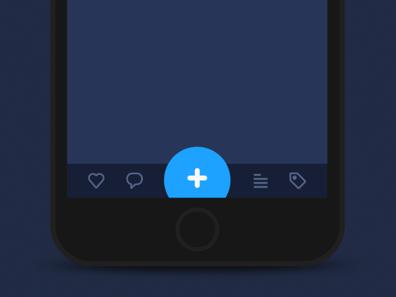
Thanks to that, animation can solve such tasks as feedback from the app that the action is done, saving the space in the app with a multifunctional button, understanding that the action is in progress, and creating an organized space with structured and dynamic blocks of information.

- Feedback from the app that the action is done;
- Multifunctional button;
- Progress indicator #1;
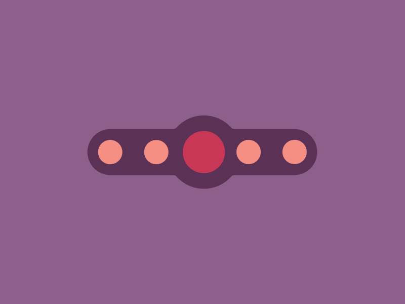
- Progress indicator #2;
- Progress indicator #3;
- Creating an organized space with structured and dynamic blocks of information;
You can also find an increased use of animation for companies’ logos. This is not just an attempt to stand out from competitors. It’s an additional opportunity to establish an association of what your company is about within a short time fray of logo animation.
We didn’t cover the full list of animation options, but that’s not the article’s focus. We want to convey the message that despite the existence of people who consider animation a redundancy, it enriches an app with great functionality, a compact interface, and a great user experience.
Data-Driven Design
It is common to build a design based on not just personal vision, but quantitative analysis as well. By implementing machine learning principles, deep analytics, and a psychological approach to user research, designers might reach a new level of interaction with users.
The «data-driven» concept implies surveys with questions, A/B testing, app analysis, behavioral research, and other tools and techniques that you can find on the internet.
This concept is common among website developers. The quality of their work has a lot to do with visitors’ behavior which is hard to evaluate without complex tools. The data-driven analysis offers a comprehensive insight into users’ interaction with the app, the areas of the highest engagement, the information users look for, and the functionality they need.
A designer’s vision is impossible to replace completely but we believe the growing interest in quantitative analytics will be a trend for quite some years.
A Little Bit More About Trends in UX Design
To make the user interface convenient and easy to understand, the scenarios (navigation) should be consistent and concise. Besides, tools like fonts, vibrant colors, and gradients are great for altering user perception. These elements are typically seen as UI components, not UX. But we see that in the era of an in-depth study of users’ behavior, even the color of a button affects conversion on websites and user final perception.
Easy Navigation
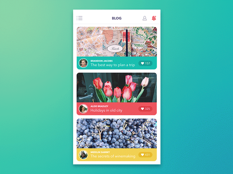
Life is accelerating. Time has the price, and people count it. That’s why the interface should be informative, so even a cursory glance helps understand what this app is and how it will solve problems. That also applies to navigation. A user needs to know where he or she is, where he or she can go from there, and what to do to get there.
It means that there is no place for useless, going nowhere and for nothing buttons, clickers, blocks, and other UI elements. Every element has its value for users. Look at Google’s home page – it has one input field and five buttons (try to find all)! A typical smartphone has one (if any) navigation button that carries multiple functions. And designers may use animation to create an extra simple navigation system.
Video source: https://dribbble.com/shots/5674408-Kayaking-travel-experience
The simplification of navigation and app-user interaction is supposed to develop further and further not only in 2023. We expect big changes in the way apps communicate with users not by navigation panel, but via voice UI. There are several existing voice apps like Alexa and Siri, but they don’t offer you great and stunning functionality. However, according to Allied Market Research, the smart speaker market is estimated to $23.32 billion by 2025 with more than fivefold increase from 2017. What should we expect? Look at Jarvis, a voice assistant of Tony Stark from Marvel studio – this may become the future of the smart speaker industry.
Vibrant Colors and Gradient
Until the late 2000s gradient used for attracting attention, now it comes back to enhance flat design bringing depth and dimension to the interface.
The sphere of gradients is further developed with vibrant color palettes. Depending on colors used in the design you can set the mood for your app and change people’s perception of the interface. Use bold colors to create energetic feel, soft colors to create the perception of trust, pastel colors for a calming and serene experience.
It matters what colors you choose. They have to be aligned with the emotional response you want to evoke in your audience, and furthermore, you need to know your audience to predict its response to the design you choose – so pay attention, please!
New Old Typography
Typography has an alike effect on user perception as colors. Typography speaks louder than words – this statement has more than 5 million results from google search, so it can be true. But is typography really matters?
There’s an increasing emphasis on alternative ways to communicate with users such as animation and voice UI. Still, text is the main method to convey the key idea of the app and motivate users to take action. The time when the text was displayed in a straight line, in the same size and font passed a long time ago. Now it’s time when typography comes first, the text follows.
The main purpose of typography is to highlight ideas in the app that are of the most priority. Allow users to grab the key points as easily as possible and make their experience memorable, customize where it needs, and use simple fonts without excesses if you want to make your message clear.

Be specific about what message you want to convey, why you want to convey it, and how you expect people to remember your message. The typography is not a new trend and since users have seen very aggressive and creative experiments with text presenting this field has become the combination of science and art.
Personalization
«Make your clients feel special» – this is the driving force of personalization. It starts with recognizing first-time visitors with words of welcome. It goes on with giving special attention to returned users, saving personal preferences, serving up location-relevant content, and much more. The internet is not a private thing and incognito mode from chrome doesn’t save you.
A small personal profile of a user is internet cookies, that store information about user activity on websites. Almost all websites gather cookies and ask your permission to do that in the first visit of the site. They save information about your locations, products you were interested in, personally identifiable information like name, home address, telephone number, etc. This allows the site to show you the information that fits your needs.
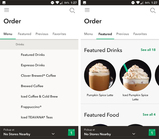
But personalization doesn’t end here. Spotify and Yandex music suggest songs that you may like. How they do that? Data analytics, deep learning, and AI – this is all about providing data-driven experience. Starbucks uses smart personalization with the «Featured» tab. The app picks what you may want based on your previously ordered items, thus users don’t need to browse the full menu to find something new they may like.
If you’re interested in incorporating personalization into your own web application, you might want to check out this link: https://flatlogic.com/templates/react. They offer a variety of templates that use data analytics, deep learning, and AI to provide a data-driven experience for your users.
Cut a Long Story Short… Let’s Skip a Long Conclusion!
Did you get the message from this article? Yeah, that’s right. Don’t create UX For the sake of it. Use it to Convey the message to your users and highlight ideas that you want to be heard. That’s it for our collection of major UX trends in 2023. Thanks for reading.