TL;DR
- How to choose a React table library by use case: simple, spreadsheet-like, or large datasets.
- Step-by-step with react-table v7: build basic, sorting, and filtering using hooks.
- Side-by-side comparison of top grids with pros, cons, pricing, and pitfalls.
- Guidance on UX challenges: responsiveness, readability, speed, scrolling, and layout.
Fact Box
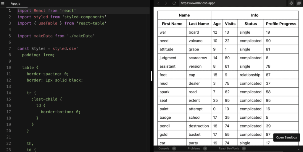
- The react-table install example pins the dependency as "react-table": "^7.1.0" in package.json.
- The basic react-table demo builds a table with 3 columns and 3 rows (City, Temperature, Weather Forecast).
- In the filtering example, the global search input uses useAsyncDebounce with a 200 ms delay.
- React-Table is described as lightweight: 5kb–14kb+ depending on features used.
- Bryntum Grid is described as capable of handling 100k+ rows while maintaining good UX.
Are you looking for a React Table Guide to help you with complex layout issues? Are you searching for the top React Table Examples? Do you need a step-by-step tutorial on creating a React Table? If so, you have come to the right place!
In this article, we will provide helpful information about React tables. We will discuss the importance of React tables in web development, explain how to select a React table, and provide tips on how to overcome the difficulties of React table development. Additionally, we will give you a small guide on building a React table using the popular React-table library. Understanding React tables is crucial for developing efficient business software, as they enable the presentation of complex data in an accessible and user-friendly manner. Make sure to also check out our article on Bootstrap Tables to learn more about the topic!
How to choose a React table library
Selecting the right React table for your business software can significantly impact its usability and performance, guiding you to make choices that enhance your application’s functionality and meet your specific data management needs. For example, whether you need pagination or sorting. Think of the features you need and choose the react table library that fits them.
It is also worth deciding whether you are willing to pay for the library or not. Paid versions of the react tables libraries have a very wide range of features that will help you develop them.
Now let’s see what this looks like in real-life examples:
- If you need a simple page with a small amount of data, custom styles, and a minimum number of features like sorting and filtering, we recommend using react-table;
- When in need of a mini Google Sheets, use react-data-grid or react-datasheet;
- If you need to manipulate very large amounts of information, then we recommend using react – -virtualized or paid libraries such as the React data grid of Syncfusion.
| Name | Key Features | Pricing | Pitfalls |
|---|---|---|---|
| React-Table | Lightweight, headless, supports pivoting and aggregation, wide plugin ecosystem | Free | Limited documentation, not ideal for large datasets |
| Bryntum Grid | High-performance, locked columns, cell editing, easily themeable, dedicated support | Paid | Not a pure React application |
| Griddle | Customizable, plugin support for reusability, architectural flexibility | Free | Seems abandoned (last update in 2019) |
| DevExtreme React Grid | Pure React, virtual scrolling, multi-column sorting, tree-view mode, custom UI rendering | Free and Paid | Complex for beginners |
| Rsuite React Table | Supports virtualization, fixed columns and headers, tree views | Free | Customizing can be challenging, and limited community |
| React Virtualized | Optimized for large datasets, comprehensive documentation, mature community | Free | Overkill for normal use cases, advanced API |
| React Data Grid | Lightning-fast rendering, rich editing, excel features, inline editing | Free | Complicated to start, poor documentation, no default pagination |
| Kendo React Grid | Zero dependencies, comprehensive features, well-structured documentation, dedicated support team | Paid | High price, custom styling might be tricky |
| React-datasheet | Good for Excel-like apps, well documented, good customization, pre-built formulas | Free | Limited to specific use cases, not suitable for large datasets |
| Material Table | Feature-packed, pre-built CSV export, robust documentation, based on Material-UI | Free | Component overriding issues, not everyone prefers Material UI |
| RC-Table | Lightweight, easy to start with, many examples with source code | Free | Limited documentation, not ideal for core app functionalities |

Features of a good React Table
Developing a good react table is a difficult challenge that you must go through. The challenge is that a good react table must simultaneously correspond to several requirements – responsiveness, speed, readability, etc. Let’s take a closer look at each of these.
Responsive React Tables
React data tables need to be displayed correctly on all types of screens. Usually, this is solved by the columns decreasing in width and increasing in length, but this solution is not always optimal for the user experience.
Readable React Tables
Tables often provide information that is very difficult to read, manipulate, and edit. A good spreadsheet shows information so that it is readable and well-parsed, even if you have hundreds and thousands of lines. A flexible react data table solution can account for long strings of data without creating misalignment or compromising readability.
React table needs to be fast
Another important feature of a good react table is the speed of working with data – i.e. filtering and sorting. Good UX often depends on application speed.
The Challenges of React Table UI
Many aspects need to be taken into account when we work with tables. Let’s define them.
Filtering and sorting data
It is very important to make these basic functions work quickly and intuitively – these are the two main functions that define a table as an element.
Styles
Good React tables need to be styled: well-done styles can make tables readable and nice to look at. For example, an easy selection of cells with a hover when you hover over them will help users understand which cell they are in.
Responsiveness
It’s difficult to make a table responsive without changing the layout to suit smaller screen sizes. Responsive tables often look and perform awfully. Therefore, the task of showing the table on different size screens looks complicated. Features such as pagination can help you with this.
Scrolling
Default browser scrollbars will work well for full-width tables, but most have custom widths. The solution is to develop a custom scroll bar or implement one from ready-made libraries. However, custom scrollbars are very tricky to support on both touch and non-touch screens.
Right positioning of the table
It is also important to correctly position the react table relative to other elements on the screen so that you can work with it efficiently and read the information properly.
React table Guide
Now that we know a bit more about React tables, let’s have a look at the development of different types of React tables. We’ll use the most popular react-table library as an example. We will use create-react-app as a boilerplate for better development speed.
The first thing you need to do is install the react-table library. To do this, run npm install react-table or yarn add react-table in the following command. After you enter these commands, check the package.json file, you should see the following entry:
"dependencies": {
 "react-table": "^7.1.0"
}
Additionally, if you want to modify styles, please edit src/index.css file.
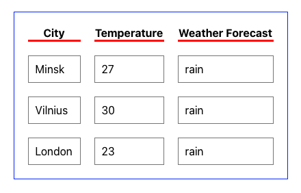
To begin with, we will build the simplest react table with 3 columns and 3 rows. Each column will have its separate header. In this example, we will not build multi-level constructs with grouped headers.
Basic react table
React-table, like other libraries, consists of:
- Columns – an array of columns. Columns can be nested, which act as header groups. In addition, columns can be recursively nested as much as needed;
- Data is an array of rows to be displayed on the table.
To build a react table you will need a dataset. In our case, we did not create any separate files in the form of JSON objects: for speed reasons, we created these objects directly in App.js.
Here’s what an example code looks like for a simple table based on the React-tables library:
import React, { useState, useEffect } from 'react';
import { useTable } from 'react-table';

function Example() {

 const data = React.useMemo(
 () => [
 {
 col1: 'Minsk',
 col2: '27',
 col3: 'rain',
 },
 {
 col1: 'Vilnius',
 col2: '30',
 col3: 'rain',
 },
 {
 col1: 'London',
 col2: '23',
 col3: 'rain',
 },
 ],
 []
 )

 const columns = React.useMemo(
 () => [
 {
 Header: 'City',
 accessor: 'col1', // accessor is the "key" in the data
 },
 {
 Header: 'Temperature',
 accessor: 'col2',
 },
 {
 Header: 'Weather Forecast',
 accessor: 'col3', // accessor is the "key" in the data
 },
 ],
 []
 )

 const {
 getTableProps,
 getTableBodyProps,
 headerGroups,
 rows,
 prepareRow,
 } = useTable({ columns, data })

 return (
 <div>
 <table {...getTableProps()} style={{ border: 'solid 1px black }}>
 <thead>
 {headerGroups.map(headerGroup => (
 <tr {...headerGroup.getHeaderGroupProps()}>
 {headerGroup.headers.map(column => (
 <th
 {...column.getHeaderProps()}
 style={{
 borderBottom: 'solid 3px red',
 color: 'black',
 }}
 >
 {column.render('Header')}
 </th>
 ))}
 </tr>
 ))}
 </thead>
 <tbody {...getTableBodyProps()}>
 {rows.map(row => {
 prepareRow(row)
 return (
 <tr {...row.getRowProps()}>
 {row.cells.map(cell => {
 return (
 <td
 {...cell.getCellProps()}
 style={{
 padding: '10px',
 border: 'solid 1px gray',
 }}
 >
 {cell.render('Cell')}
 </td>
 )
 })}
 </tr>
 )
 })}
 </tbody>
 </table>
 </div>
 );
}

export default Example;
Note that the spread operator is used to expand the expression more easily.
In all the columns we have an accessor, which is the data we have in the data object. Our data is inside the shown object in the array – that’s why all our accessors have shown as a prefix.
Also, let’s explain a little about what the functions and hooks used in the code above mean:
useTablehook takes options and plugins to build a table instance. The basic options are columns and data.getTablePropsis a function to resolve any props needed by the table wrapper. Built-in table props are {role: “table”}, which can be customized.- getTableBodyProps is a function to resolve any props needed by the table body wrapper. The built-in table props are {role: “rowgroup”}, which can be customized.
prepareRowis a function that must be called on any row to be displayed. It is responsible for preparing a row for rendering.headerGroupsand rows are internal data structures derived from columns and data.
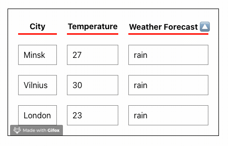
React Table with Sorting
Row sorting is a basic and must functionality for the react table. To implement sorting of the columns in react-table you need to use the useSortBy the optional hook plugin. We have received the following results:
The updated code of src/App.js looks like this:
import React, { useState, useEffect } from 'react';
import { useTable, useSortBy } from 'react-table';

function Example() {

 const data = React.useMemo(
 () => [
 {
 col1: 'Minsk',
 col2: '27',
 col3: 'rain',
 },
 {
 col1: 'Vilnius',
 col2: '30',
 col3: 'rain',
 },
 {
 col1: 'London',
 col2: '23',
 col3: 'rain',
 },
 ],
 []
 )

 const columns = React.useMemo(
 () => [
 {
 Header: 'City',
 accessor: 'col1', // accessor is the "key" in the data
 },
 {
 Header: 'Temperature',
 accessor: 'col2',
 },
 {
 Header: 'Weather Forecast',
 accessor: 'col3', // accessor is the "key" in the data
 },
 ],
 []
 )

 const {
 getTableProps,
 getTableBodyProps,
 headerGroups,
 rows,
 prepareRow,
 } = useTable({ columns, data }, useSortBy);

 return (
 <div>
 <table {...getTableProps()} style={{ border: 'solid 1px black' }}>
 <thead>
 {headerGroups.map(headerGroup => (
 <tr {...headerGroup.getHeaderGroupProps()}>
 {headerGroup.headers.map(column => (
 <th
 {...column.getHeaderProps(column.getSortByToggleProps())}
 style={{
 borderBottom: 'solid 3px red',
 color: 'black',
 }}
 >
 {column.render('Header')}
 <span>
 {column.isSorted
 ? column.isSortedDesc
 ? '🔽'
 : '🔼'
 : ''}
 </span>
 </th>
 ))}
 </tr>
 ))}
 </thead>
 <tbody {...getTableBodyProps()}>
 {rows.map(row => {
 prepareRow(row)
 return (
 <tr {...row.getRowProps()}>
 {row.cells.map(cell => {
 return (
 <td
 {...cell.getCellProps()}
 style={{
 padding: '10px',
 border: 'solid 1px gray',
 }}
 >
 {cell.render('Cell')}
 </td>
 )
 })}
 </tr>
 )
 })}
 </tbody>
 </table>
 </div>
 );
}

export default Example;
We used the useSortBy plugin after declaring useTable the hook.
getSortByToggleProps() is a function that resolves any props needed while toggling the sort direction.
Lines 29 to 31 display a descending or ascending arrow for the sorted column.
The sorting works in the following way:
Clicking a column header will toggle between ascending, descending, and no sort. If you shift-click a column header, the other column sort states will be preserved and the new column will be sorted afterward. This ends up with multi-sort.

Filtering React Table
This is another default function for React-table. To do this, we add useFilters and useGlobalFilter hooks to our code. The difference between these two hooks is that the first is responsible for filtering a specific column, while the global filter works on the entire table – any column and row.
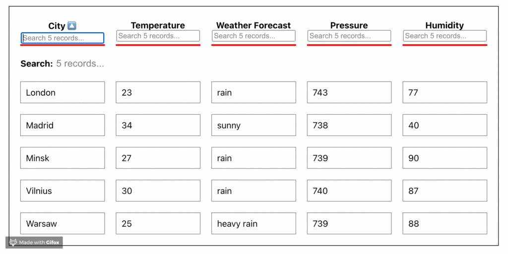
The code, in this case, will look like this:
import React from 'react';
import { useTable, useSortBy, useFilters, useGlobalFilter, useAsyncDebounce } from 'react-table';

function GlobalFilter({
 preGlobalFilteredRows,
 globalFilter,
 setGlobalFilter,
 }) {
 const count = preGlobalFilteredRows.length
 const [value, setValue] = React.useState(globalFilter)
 const onChange = useAsyncDebounce(value => {
 setGlobalFilter(value || undefined)
 }, 200)

 return (
 <span>
 Search:{' '}
 <input
 value={value || ""}
 onChange={e => {
 setValue(e.target.value);
 onChange(e.target.value);
 }}
 placeholder={`${count} records...`}
 style={{
 fontSize: '1.1rem',
 border: '0',
 }}
 />
 </span>
 )
}

// Define a default UI for filtering
function DefaultColumnFilter({
 column: { filterValue, preFilteredRows, setFilter },
 }) {
 const count = preFilteredRows.length

 return (
 <input
 value={filterValue || ''}
 onChange={e => {
 setFilter(e.target.value || undefined) // Set undefined to remove the filter entirely
 }}
 placeholder={`Search ${count} records...`}
 />
 )
}

function Example() {

 const data = React.useMemo(
 () => [
 {
 col1: 'Minsk',
 col2: '27',
 col3: 'rain',
 col4: '739',
 col5: '90',
 },
 {
 col1: 'Vilnius',
 col2: '30',
 col3: 'rain',
 col4: '740',
 col5: '87',
 },
 {
 col1: 'London',
 col2: '23',
 col3: 'rain',
 col4: '743',
 col5: '77',
 },
 {
 col1: 'Madrid',
 col2: '34',
 col3: 'sunny',
 col4: '738',
 col5: '40',
 },
 {
 col1: 'Warsaw',
 col2: '25',
 col3: 'heavy rain',
 col4: '739',
 col5: '88',
 },
 ],
 []
 )

 const columns = React.useMemo(
 () => [
 {
 Header: 'City',
 accessor: 'col1', // accessor is the "key" in the data
 },
 {
 Header: 'Temperature',
 accessor: 'col2',
 },
 {
 Header: 'Weather Forecast',
 accessor: 'col3',
 },
 {
 Header: 'Pressure',
 accessor: 'col4',
 },
 {
 Header: 'Humidity',
 accessor: 'col5',
 },
 ],
 []
 )

 const defaultColumn = React.useMemo(
 () => ({
 // Let's set up our default Filter UI
 Filter: DefaultColumnFilter,
 }),
 []
 )

 const {
 getTableProps,
 getTableBodyProps,
 headerGroups,
 rows,
 prepareRow,
 state,
 visibleColumns,
 preGlobalFilteredRows,
 setGlobalFilter,
 } = useTable(
 {
 columns,
 data,
 defaultColumn, // Be sure to pass the defaultColumn option
 },
 useFilters,
 useGlobalFilter,
 useSortBy
 );

 return (
 <div>
 <table {...getTableProps()} style={{ border: 'solid 1px black' }}>
 <thead>
 {headerGroups.map(headerGroup => (
 <tr {...headerGroup.getHeaderGroupProps()}>
 {headerGroup.headers.map(column => (
 <th
 {...column.getHeaderProps(column.getSortByToggleProps())}
 style={{
 borderBottom: 'solid 3px red',
 color: 'black',
 }}
 >
 {column.render('Header')}
 <span>
 {column.isSorted
 ? column.isSortedDesc
 ? '🔽'
 : '🔼'
 : ''}
 </span>
 <div>{column.canFilter ? column.render('Filter') : null}</div>
 </th>
 ))}
 </tr>
 ))}
 <tr>
 <th
 colSpan={visibleColumns.length}
 style={{
 textAlign: 'left',
 }}
 >
 <GlobalFilter
 preGlobalFilteredRows={preGlobalFilteredRows}
 globalFilter={state.globalFilter}
 setGlobalFilter={setGlobalFilter}
 />
 </th>
 </tr>
 </thead>
 <tbody {...getTableBodyProps()}>
 {rows.map(row => {
 prepareRow(row)
 return (
 <tr {...row.getRowProps()}>
 {row.cells.map(cell => {
 return (
 <td
 {...cell.getCellProps()}
 style={{
 padding: '10px',
 border: 'solid 1px gray',
 }}
 >
 {cell.render('Cell')}
 </td>
 )
 })}
 </tr>
 )
 })}
 </tbody>
 </table>
 </div>
 );
}

export default Example;
Other react-table basic functions
React-table also allows you to implement basic table features such as pagination, row selection through checkboxes, column grouping, column ordering and even column drag and dropping using plugins already written. You just need to add the appropriate hook to your code. API reference describes in great detail all the actions that you need to do to make your table work.
Best React Table Libraries and Examples
In this block, we will look at the best react table libraries and examples: today it is no longer effective to build and style tables manually, for there already is such a huge spectrum of fully prepared libraries available. We will present the pros and cons of each and point out the differences between them.
React-Table
React Table is one of the most popular table libraries in React. It has almost 15,000 stars on GitHub. The react-table library is very lightweight and offers all the basic features necessary for any simple table. Now, after version 7 was released, it also supports Hooks. Moreover, the library is designed to have zero design, so you control the render and look of your table. Another great feature of React-table is a plugin ecosystem: if you want to extend the functionality of your grid, just add the necessary hook and that’s all.
Pros
- Easy customization;
- Headless approach;
- Supports Pivoting and Aggregation;
- Wide plugin ecosystem;
- Lightweight (5kb – 14kb+ depending on the features used).
Cons
- In some cases the documentation is limited;
- In our opinion, this table is not suitable for large data sets.
Notable features
- Global search plugin;
- Basic filtering and sorting options;
- Custom sorting and filtering options for columns based on data types (numbers, string, boolean, select input, etc.);
- Pagination support;
- Ability to create custom plugin hooks.
Here’s a quick recap: react-table is good for simple tables that need basic features like searching, sorting, filtering, etc. Basic sports statistics, weather forecasts, basic finance data, user management tables, and others.
Bryntum grid
Bryntum Grid is a powerful & high-performance table component capable of handling 100k+ rows while still providing a great user experience. It runs on pure Javascript, so its framework is agnostic. However, it comes with React wrappers to make integration into your project seamless. The main cons for this table are that it is not a pure React application, plus it’s a paid library. For that amount of money, you want the pure react table component.
Features
- Locked / frozen columns;
- Cell editing;
- Custom cell rendering;
- Dedicated support;
- Paging Easily themeable with SASS.
Griddle
Griddle is a customizable architectural React datagrid component. It ships with some basic conventions and functionality but gives you the ability to customize just about anything (components, methods, etc). To encourage customization reuse, Griddle has plugin support. Plugins are packaged Griddle customizations that can be reused or shared. However, the library seems to have been abandoned. The cons: seems that the support for this library is deprecated – the latest commitment was in July 2019.
DevExtreme React DataGrid
DevExtreme React Grid is a component that displays table data from a local or remote source. It supports pagination, sorting, filtering, grouping, and other data generation options, row selection, and data editing. The support for managed and unattended state modes allows the Grid to be used in a regular or Redux-based application. The DevExtreme Grid component has a composable and extensible plugin-based architecture and also provides built-in Bootstrap and Material-UI rendering functionality and theme creation.
Notable features
- Pure React;
- Virtual scrolling;
- Multi-column sorting and grouping;
- Tree-view mode;
- Custom UI Rendering.

Rsuite React Table
This is a component of the React Table that supports virtualization, fixed columns and headers, tree views, and more. The good thing about this library is that it comes with a lot of examples of each feature.
Pros
- The library offers sorting, expandable child nodes, and RTL;
- Detailed docs with many examples;
- Many pre-built components are inside.
Cons
- Customizing this library might be a bit challenging;
- There is no big community or active development of the library.
React Virtualized
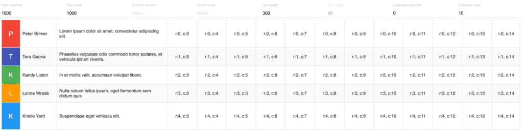
React-virtualized is a react table library heavily optimized for performance when the dataset is large. This library is not exactly a table library; it’s React components for efficiently rendering large lists and tabular data. You should consider using this product when you want to manage a large set of data. The documentation is comprehensive and the community around this tool is very mature, it has more than 18k stars on GitHub.
For normal use cases, this library would be overkill, and the API would be too advanced. You can successfully go with react-virtualized for custom timelines, charts involving infinitely long calendars, and heavy UI elements for your large dataset.
React Data grid
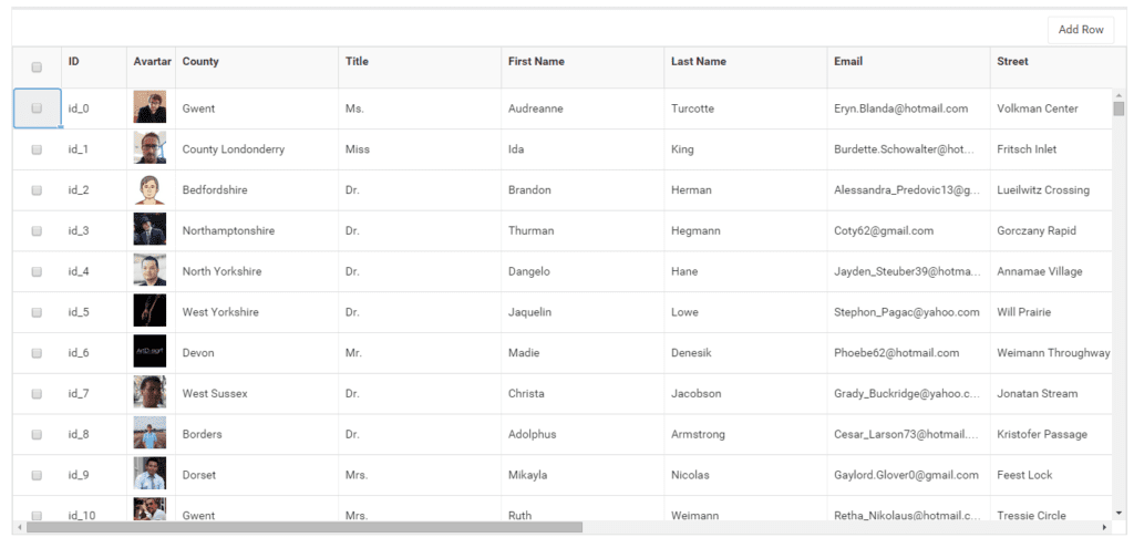
React Data Grid is a react table library for creating apps similar to google spreadsheets and MS Excel. The broad range of features includes data binding, editing, Excel-like filtering, custom sorting, row aggregation, Excel, CSV, and PDF format collection and support.
Pros
- Lightning-fast rendering;
- Rich editing and formatting;
- Configurable and customizable;
- Packed with Excel features including cell copy and paste.
Cons
- Сomplicated to jumpstart the development of the table;
- Poor documentation;
- It does not support pagination by default;
- It is not easily customizable.
Key features
- Excel-like filtering and grouping options;
- Data exporting in any format: PDF, CSV, or Excel;
- Inline editing of columns;
- Supports virtual rendering for infinitely long table rows;
- Uses Bootstrap for styling.
Kendo React Grid component
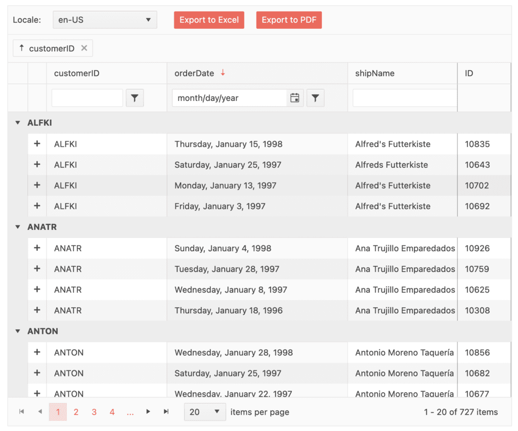
Kendo React Grid component is one of the most powerful data grid components available to React developers, containing many must-have features. React data table has a lot of complex features: reordering and resizing columns, displaying hierarchical data, and column and context menus. This provides additional functionality based on currently selected rows and columns, options for custom rendering, and much, much more. Moreover, the Kendo React library is compliant with many security and accessibility standards out of the box.
Pros
- Zero dependencies;
- 100+ features to effectively manipulate the bit amount of data;
- Documentation is very (!) well structured and comprehensive;
- 3 themes of your choice;
- Dedicated support team option.
Cons
- The price is a bit high;
- We assume that the implementation of custom styles can be a bit tricky.
If you want the table/grid to be a very comprehensive feature-packed component for your application, with good docs and dedicated support – we recommend looking at the Kendo UI React grid.
React datasheet
React-datasheet is similar to react-data-grid. It has many GitHub starts, so it’s well-maintained and has a very helpful and productive community. As you presumably noticed, the main goal of this library is to help you create your own Google Sheets/Excel-like application on React. The project has prebuilt styles and functions, so you will receive that view and complex functions out of the box. However, note that this library is not suited for basic, small-sized tables with limited functionality.
Pros
- Well documented;
- Good looking UI;
- Good customization;
- Pre Built formula tables.
Cons
- Limited to the specific use case;
- Not suitable for large datasets.
Material Table
The material table is one of the most popular react table libraries, thanks to material design and usage of Material-UI components. The project is very easy to use and install even for beginners; robust documentation will speed up the development.
Pros
- Feature-packed;
- Pre-build Export to CSV;
- Robust documentation.
Cons
- Component overriding;
- Not everyone is a fan of Material UI.
How Material Table works
To start development you need to install this library by typing yarn add or npm install commands in the console. You also need to add Material-UI icons.
The library works in the following way – you just need to transfer two props to the <MaterialTable /> component. The prop data is there to display the data in row format. Another prop column defines the number of columns.
A third prop on <MaterialTable /> a the component called ‘title’ can be used to give a title to the whole table. See the example below:
return (
 <div>
 <MaterialTable columns={columns} data={data} title='Flatlogic' />
 </div>
);
By default, the material-table library displays a search bar and pagination. At Flatlogic we recommend using the Material table in case you are in love with Material-UI and material design.
RC-Table
Rc-Table is another useful tiny React Table library with a set of basic functions that will equip you to build a well-structured React table. The table is good if you want to use your styling. The other good thing about this library is that it is very easy to understand and start.
Pros
- Very lightweight;
- The docs have many examples with the source code;
- Fast jump start to the actual development;
- Limited community.
Cons
- Documentation is not so good. Some functions are not described at all.
Thus this library is good for small applications or apps where the table is not a core part of the app.
Conclusion
As we saw from our guide, building react tables requires some effort compared to other libraries such as Bootstrap. We also learned the fact that in most cases you do not need to develop your own react table from scratch: there already are many react table solutions for various project requirements, both paid and free.
When choosing a library for your requirements, pay attention to the number of stars on GitHub, how active the community is, how often the library is updated, and how often the downloads happen.
However, let’s look at the cases when you can still consider building your own react table:
- When you need a custom UI for the table. It might be faster to build your own;
- When your table is just a showcase;
- You need a very lightweight table without any dependencies.
We hope that our guide and selection were useful for you and that you have chosen the library that you will use when building the react table.
If you notice that our article is missing a good react table library, we will gladly consider including it in the collection – just drop us a line.
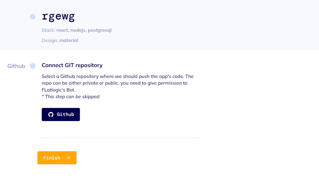
Create a React table app in minutes with Flatlogic
We have built a development platform that simplifies the creation of web applications – we call it the Flatlogic Platform. The tool allows you to create the React app in minutes with tables, forms, and other components, whether you are shaping CRMs or ERPs, you just need to choose the stack, design, and define the database model with the help of an online interface and that is all. Moreover, you can preview generated code, push it to your GitHub repo, and get the generated REST API docs. Try it for free!
See the quick guide below on how to do the full-stack web app with the help of the Flatlogic platform.
Step №1. Choose your project name
Any good story starts with a title, and any good React App starts with a name. So, summon all of your wit and creativity and write your project’s name into the fill-in bar in Flatlogic’s Full Stack Web platform.

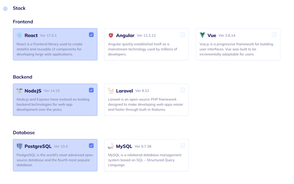
Step №2. Select your Web App Stack
At this step, you will need to choose the frontend, backend, and database stack of your app. And, to correlate with our illustrative React App, we will choose here React for the frontend, Node.js for the back-end, and MySQL for the database.
Step №3. Choose your Web App Design
As we’ve already mentioned, design is quite important. Choose any from several colorful, visually pleasing, and, most importantly, extremely convenient designs Flatlogic’s Full Stack Web App Platform presents.

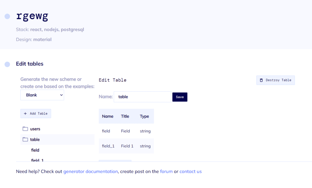
Step №4. Create your Web App Database Schema
You can create a database model with a UI editor. There are options to create custom tables, columns, and relationships between them. So basically, you can create any type of content. Also, you will receive automatically generated REST API docs for your application.
Step №5. Review and Generate your Web App
In the final step, just to make sure everything is as you want it to be, you can review all of the previously made decisions and click the “Create Project” button. After a short time to generate, you will have at your fingertips a beautiful and fully functional React Node.js App. Voila! Nice and easy!