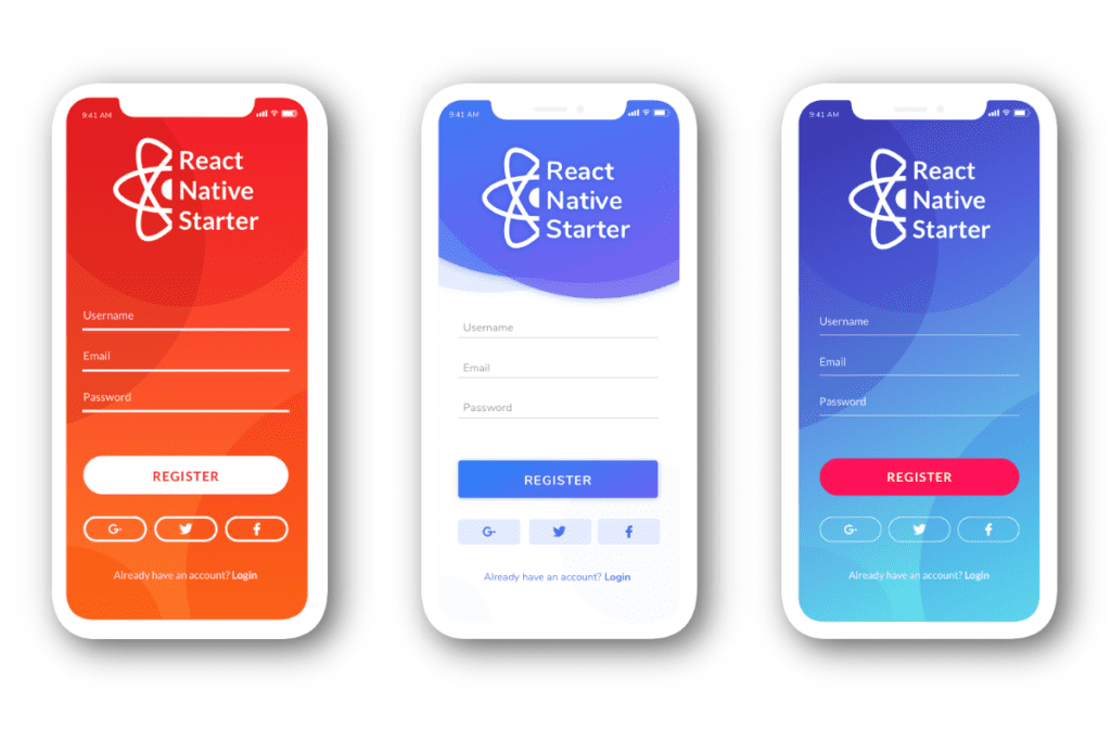
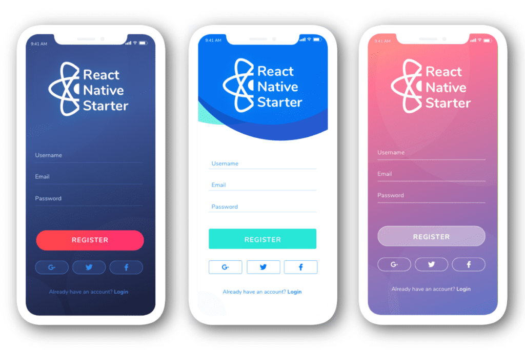
We know that you all want to make your applications unique and remarkable. But sometimes you need to have your app done as quick as possible or you need a prototype that will represent your idea, has a professional look and impressive modern design. And that when using a Starter Kit might be a good idea.
We try to gather as much information from our clients as possible. That includes the requests about design. And in particular, we received lots of requests about different color themes.
Our designer Natalie Ermolenka created two various themes of the React Native Starter from the start of our project. And now she designed four more using the most influential design trends of 2019.

There is no doubt that to make a good impression with your app you have only a few seconds to grab users attention. The screenshots and the description should be eye-catching and memorable.
The outdated look can lower your conversion and engagement. If you use React Native Starter then we feel the responsibility to give you professional advice on what will work in your app design and what is not.
Gradients and duotones
Over the past few years, we can trace the evolution in the use of gradients and duotones. This multipurpose trend is so long-playing because it will work almost on any type of design. So the good news is that this trend is going to last for a few years more. The gradient is used for the sake of adding a burst of color, the use of a good highlight of the specific content and for creating a captivating background.

Natural and smooth lines
The use of natural and smooth lines gives us a feeling of comfort. The organic shape adds depth to the layout because they are naturally imperfect. We try to make it imperfect so it can appear humanistic and could break up the monotony.
Thumb-friendly navigation
One of the most popular UX design trends is thumb-friendly navigation. Your user holds a cup of coffee in one hand and in the other he shops for Christmas gifts. So the main task of the UX designer is to make all UI elements thumb-accessible. Navigation on large screens can be a phone killer. 
Vibrant colors
The use of a vibrant color palette is a dazzling eye-catching trend which ads a splash of color and brightens up a composition. It is the best attention-getter and we should say that it takes a bit of exercise to get bright colors to work together. Using this trend we made a pretty simple layout that really pops in.
We want to thank all of you who sent us letters, made commits on GitHub, left comments in our social media. Without you, we wouldn’t have all the necessary information to make our product better. When we started React Native Starter we were relying only on our needs. We were just accumulating our experience in creating mobile apps. But for the past months, we managed to have so many useful insights and ideas for the future. We promise you that in a couple of weeks you will receive much more huge updates and exciting news from us.