TL;DR
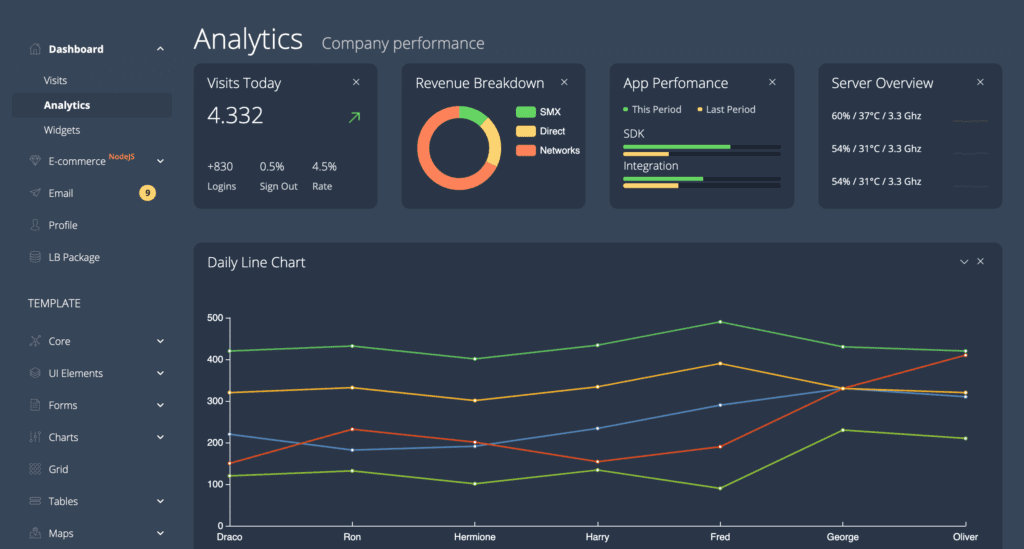
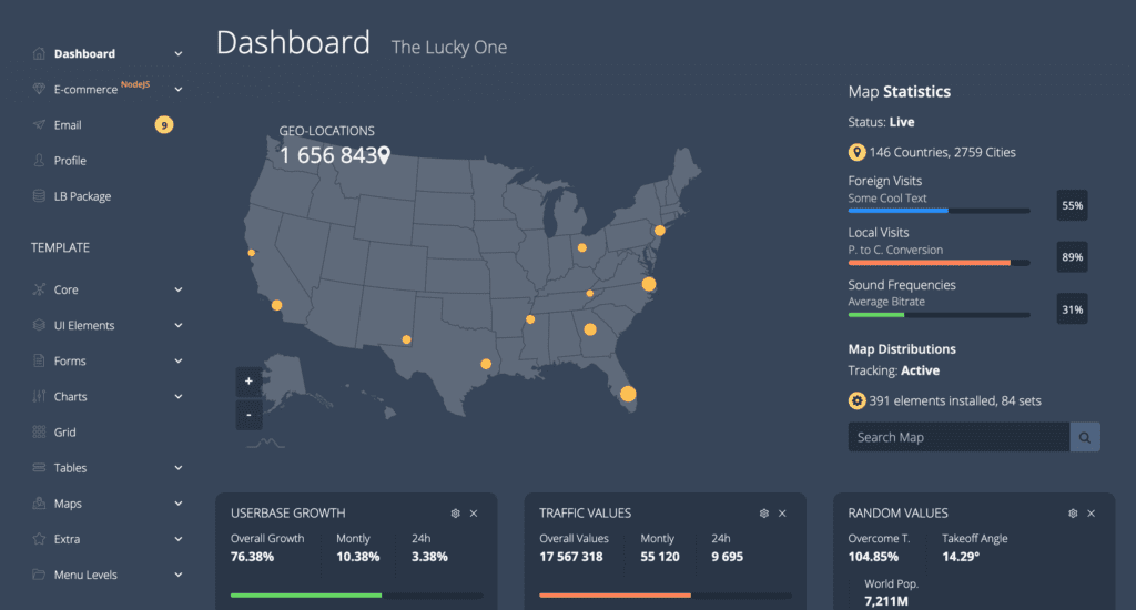
- Light Blue Angular admin template receives a design refresh.
- New look is modern, fresh, and clean with subtle gradient usage.
- Minimalistic, flat design guides the update, reflecting Flatlogic's philosophy.
- UX prioritizes accessibility and user behavior; simplicity remains central.
Great news! We have updated the Light Blue Angular template. The most important changes are in design. We made it modern, fresh, and clean.
Those changes are inevitable. Technologies are changing the world, their growth influences major design trends. So we have to evolve, to learn, to be better than yesterday. And we are happy that we can share our knowledge with you. Every template should have an up-to-date design on the market. Based on our experience we chose the most important design trends and adjusted Light Blue to them.

We had an updated view of gradients for example. We implemented a very subtle color scheme, in this case, minimalism and flat design are what we need. As you can understand from our name Flatlogic, flat-design is our philosophy. It is our big love forever and always.
Actually, as years go by, we’ve noticed that UX sensibilities online try to come close to the experience offline, as in physical existence. As you may have noticed in our real-life there are tons of examples of gradients. And almost every gradient is very simple.

What we are trying to say is that now design trends are not trying to have an aesthetically pleasing look. The most important is design accessibility to the user. UI requirements now lie in the research of user behavior. Well, the trick was always in user behavior. The only difference is now that it is the priority.
One of the timeless design trends that we use is simplicity. All of our products embody this principle as we never add some element that we are not sure about or expand the existing one. Admin dashboard template is a complex app but minimalism still is the main principle that our UX/UI designers use.
