TL;DR
- Curated 13+ Bootstrap date pickers with types, time input, and customization notes.
- Selection criteria: single vs range, time/numeric input, indicators, design, presets.
- Highlights UX Solutions, Date Range Picker, MDBootstrap, Eonasdan, and more.
- Includes a feature comparison table and practical links to demos/docs.
- Suggests Flatlogic Platform to build CRUD apps with date pickers in minutes.
Fact Box
- UX Solutions Bootstrap Datepicker has about 12k GitHub stars. Source
- MDBootstrap Datepicker ships with 40 language translations out of the box. Source
- Smalot's Bootstrap Date Time Picker has about 3.5k GitHub stars. Source
- Date Range Picker supports time input and presets like Yesterday and Last 30 Days. Source
- There are 4.2 billion mobile internet users worldwide. Source
Embark on a journey to discover the ultimate date picker for your Bootstrap website in 2024, boldly stepping into a world where precision meets ease, ensuring your site’s time management is flawless and intuitive, an essential component for enhancing business software efficiency.
What should you look for in a date picker? Are you curious about the different types available and how to decide which one suits your website best? How can you ensure the date picker and choice enhance your site’s functionality? Thomas Edison once remarked, “Time is the only capital that any human being has, and the only thing he can’t afford to lose.” This sentiment perfectly encapsulates the significance of integrating a reliable and efficient date picker into your website, particularly for business software where precision in scheduling and time management is paramount.
The quest for the ideal date picker is not just about selecting a tool, it’s about embracing a solution that simplifies date selection for events, posts, and more, ensuring accuracy and consistency across your website. With numerous options available, the challenge lies in choosing between crafting a custom calendar from scratch or opting for a ready-made solution. The latter is often recommended, offering a plethora of finely designed Bootstrap date pickers tailored to meet the needs of applications where the date and time functionality is paramount, especially in business software environments.
How to Use Date Picker Component
There are various scenarios in which users need to input a date: purchasing tickets, scheduling appointments with doctors, friends, colleagues, or bosses, selecting delivery dates, entering birth dates (or those of relatives), planning events, and tracking time. The date picker you choose must align with its intended use, ensuring seamless integration into your business software to facilitate these diverse scheduling needs.
To be frank, the internet hosts a limited selection of quality Bootstrap date pickers, and even fewer offer substantial customization options. It’s challenging to find examples that combine both high functionality and attractive design. However, a select few date pickers manage to be highly customizable and boast an appealing interface-and we’ve identified them for you!

In this article, we explore not just a list of well-coded Bootstrap date pickers but also delve into the various types available and the functionalities they provide. Enjoy discovering how these tools can be effectively utilized in your business software to enhance user experience and streamline operations.
| Name | Type | Time Input | Numerical Input | Indicators | Design | Complex Patterns | Additional Features |
|---|---|---|---|---|---|---|---|
| UX Solutions Bootstrap Datepicker | Single, Range | No | Yes | Today, the Selected day, Group of days | Simple, clear, intuitive | All internet variants | 12k GitHub stars, day limit, 30+ languages, etc. |
| Date Range Picker | Single, Range | Yes, digital | Yes | Today, Selected day, Range of days | Cool, modern | Yesterday, today, last 30 days, etc. | – |
| Blue-themed Datepicker | Single, Range | No | Yes | Selected days, range of days | Overwhelmed, 6 colors | No | Week counter |
| Ab-datepicker (Eureka2) | Single, Range | No | Yes, format helper | Selected day | 5 color patterns, clear separation | Disable weekdays | 40+ languages, 5 themes, etc. |
| MDBootstrap Datepicker | Single | No | Yes, no format helper | Today, the Selected day | Simple, Material | No | 40 languages, hidden input elements, etc. |
| Dark-themed Date/Time Picker | Single | Yes | No | Selected day and time | Black and blue, stylish | No | – |
| Jtsade-datebox | Single | Yes, various | No | Today, Selected day, time | Intricate, highlighted elements | Many options | Several picker types, highly customizable |
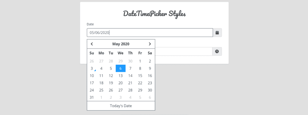
| DatePicker from Flatlogic | Single | No | No | Selected days, events, today | Clear, simple, colorful markers | No | Direct calendar selection, scheduler use |
| Eonasdan’s Bootstrap Datepicker V4 | Single, Range | Yes, digital | Yes, no helper | Today, Selected days | White, and blue for selected days | Disable weekdays | A month or several days pick, widespread |
| Smalot’s Date Time Picker | Single | Yes, steps | No | Today | Different positioning, simple | No | 3.5k GitHub stars, time-focused |
| Check-in and out Picker (Amanda Louise) | Range | No | For days only | Selected day | Minimalistic, calendar icon | No | User-friendly check-in/out |
| John Fink’s Date/Time Picker | Single | Yes | Yes | Today, the Selected day | Stylish, elegant, fancy fonts | No | – |
| Vitaliy Potapov’s Datepicker | Single, Range | No | Yes | Today, the Selected day, group of days | Simple, clear, intuitive | All internet variants | Inline version |
Selection Criteria for Bootstrap Date Pickers
Aldatabraries in the article are calendar-based. That means that to choose the date you can simply type it in the text field, but it’s expected that you will use the calendar to pick the date.
Let’s define parameters for date picker libraries.
First of all, there are range and single date pickers. Single date pickers allow users to pick only one day within one frame. On the other hand, range date pickers provide users with the opportunity to pick a range of dates within a single calendar. Libraries with two linked input fields (start date and end date) are not range date pickers in their plain meaning, because in each field you define a single date, not a range. However, using a pair of two different days gives us a range of dates from an earlier date to a later one.
You can extend the date picker with time input. It serves specific purposes and is mostly used for scheduling or arranging meetings. The opportunity to set a list of predefined values is especially helpful there.
Numerical input support. Sometimes it’s easier to type the necessary data from the keyboard than tap and scroll through years and months. For that purpose, some date pickers keep the date field active so users can type the value in it. You shouldn’t forget to set up a format helper like DD/MM/YYYY. Moreover, the transition between year, day, and month must be automatic without the necessity to type any additional symbol like a dot or slash.
The next option is indicators on the calendar like a dot near the date, highlighting with different colors, bold borders, and a gray day number for inactive dates. Indicators play a significant role when you develop a complex calendar-based app, where users are supposed to use the calendar as a schedule or arrange meetings/visits.
Design. If you have a specific design in the app it’s reasonable to look for a simple and straightforward design that is not based on Material design principles.
Complex date patterns. Every Friday, Monday, the previous week, month, etc.
Additional features. Do you need a clear button, today button, additional language for the calendar, or documentation? Maybe you are looking for the most popular library on GitHub. We mention such things in that paragraph.
Why Bootstrap?
Bootstrap is probably the most popular HTML, CSS, and JS library in the world. A lot of websites and apps are based on it. That is the first reason why the article is devoted to Bootstrap 4 date pickers. The second reason is also quite simple: Bootstrap is a very good framework for developing responsive UI for mobiles thanks to the mobile-first Bootstrap grid system. According to Statista, there are 4.2 billion mobile Internet users and 61% of Google search visits take place on mobile devices. Bootstrap makes the user experience much more enjoyable and the process of development easier.
13+ Best Bootstrap date pickers for your next App
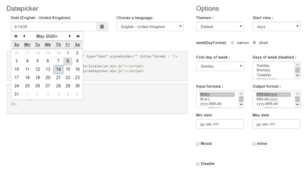
Bootstrap date picker from UX solutions
Type: Single, Range
Time input: No
Numerical input support: Yes
Indicators: Today, Selected day, Group of days
Design: Simple, clear, and intuitive, convenient display of range with different colors
Complex date patterns: All possible variants that exist on the Internet
Additional features
- comprehensive documentation
- 12k stars on GitHub
- day limit
- setting min/max view mode (decades/ centuries)
- today button
- 30+ languages, multidate opportunities, days disabled, and much more
More info: https://github.com/uxsolutions/bootstrap-datepicker/blob/master/docs/index.rst
Date Range Picker
Type: Single, Range
Time input: Yes, in digital format
Numerical input support: Yes
Indicators: Today, Selected day, Range of days
Design: Cool and modern, the range is highlighted with 2 colors
Complex date patterns: Yes, a lot of them. Yesterday, today, the last 30 days, last month
More info: https://www.daterangepicker.com/
Bootstrap blue-themed date picker with date range and week number
Type: Single, Range (the UI consists of one field with highlighted range, but the component works with two fields that the user must select separately)
Time input: No
Numerical input support: Yes
Indicators: Selected days, range of days
Design: A little overwhelmed with 4 different logic fields (week counter, calendar, month/year selector, and clear button). The color scheme uses 6 different colors in one frame which is a lot.
Complex date patterns: No
Additional features: Week counter, is a straightforward date picker without additional features.
More info: https://bbbootstrap.com/snippets/blue-themed-date-picker-date-range-and-week-number-61366925
Ab-datepicker fropickerska2
Type: Single, Range (with the help of two linked date pickers)
Time input: No
Numerical input support: Yes, with format helper
Indicators: Selected day
Design: 5 color patterns, clues for the names of days of the week, and days of the month are separated with perpendicular black lines.
Complex date patterns: You can disable the days of the week
Additional features
- well documented
- 5 different design themes
- more than 40 languages
- sta art view from month or year
- date limits
More info: https://github.com/eureka2/ab-datepicker
MDBootstrap date picker
Type: Single
Time input: No
Numerical input support: Yes, but without a format helper like DD/MM/YYYY
Indicators: Today, the Selected day
Design: Simple, Material
Complex date patterns: No
Additional advantages
- well-documented
- 40 language translations out of the box
- you can add a hidden input element to display a selected day in an input field like “You selected (this is an additional element): 13 May 2020”
- you can limit the available dates and disable some
More info: https://mdbootstrap.com/docs/jquery/forms/date-picker/
Bootstrap 4 Dark-themed date and time picker
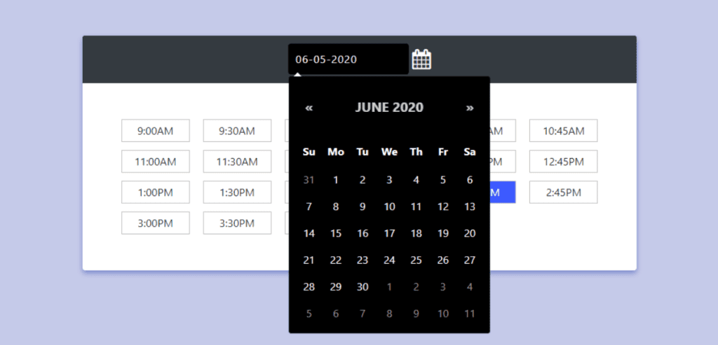
Type: Single
Tithe me input: Yes, and it’s a core functionality
Numerical input support: No
Indicators: Selected day and time
Design: Stylish black and blue design. The widget is divided into two main areas: one with an input field for date and another with a big white window with prescribed hours.
Complex date patterns: No
Additional features: No
More info: https://bbbootstrap.com/snippets/dark-themed-date-and-time-picker-76906698
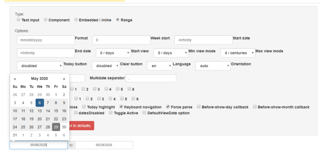
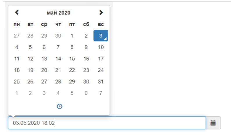
Jtsade-datebox
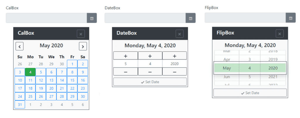
Type: Single
Time input: Yes, in different variations
Numerical input support: No
Indicators: Today, Selected day, Select3.5kme
Design: intricate design with buttons and unnecessarily highlighted elements
Complex date patterns: A lot of different customization options Bootstrapable in the documentation
Additional features
- Extensive documentation
- several types of the date picker are available, like standard calendars, scrolling date pickers
- date box with a plus or minus one button, and much more. Highly customizable with a great number of options
More info: https://github.com/jtsage/jtsage-datebox
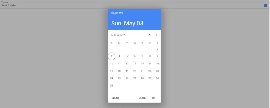
Best Bootstrap date pickers
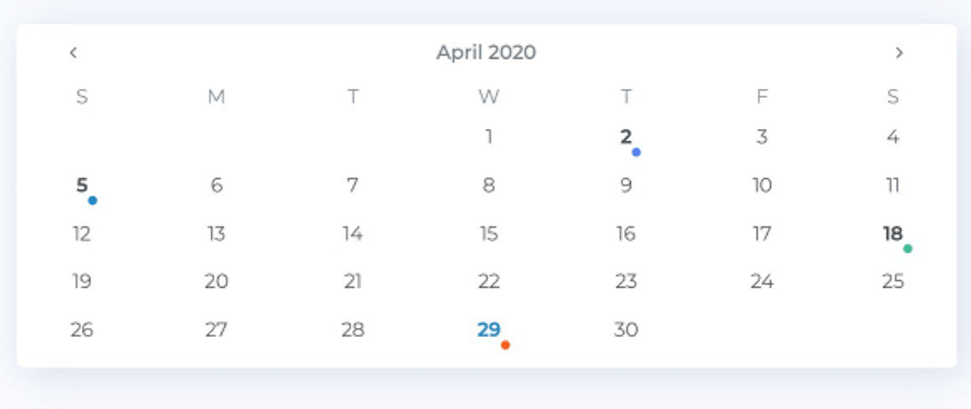
Type: Single
Time input: No
Numerical input support: No, because there is no input field
Indicators: Selected days and speciaPickercators for events, today
Design: Clear and simple with white background and colorful indicators
Complex date patterns: No
Additional features:
- Well-documented,
- no text input field,
- you chose the date on the calendar directly,
- you can select dates with colorful markers,
- good choice if you want to use the calendar as a scheduler.
More info: https://github.com/T00rk/bootstrap-material-datetimepicker
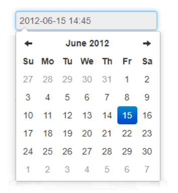
Eonasdan’s Bootstrap Datepicker V4the
Type: Single, UX solutions separate inputs to define range)
Time input: Yes, in digital form
Numerical input support: Yes, no format helper like DD/MM/YYYY
Indicators: Today, Selected days
Design: White design with blue color for selected days, no visual grid between dates
Complex date patterns: Yes, an option to disable days of the week.
Additional features:
- well-documented
- you can pick a month or several days, not in a row
- widely spread across the Internet.
More info: https://eonasdan.github.io/bootstrap-datetimepicker/
Date Time Picker from smalot
Type: Single
Time input: Yes, and there are two steps selection of time: hours first, then tens of minutes. This is a good example of how time input may work
Numerical input support: No
Indicators: Today
Design: Simple with different calendar positioning opportunities
Complex date patterns: Additional features: 3.5k stars on GitHub, all features are connected with time pick.
More info: https://www.malot.fr/bootstrap-datetimepicker/demo.php
Check-in and out bootstrap 4 date picker by Amanda Louise
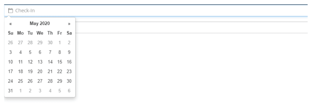
Type: Range, based on two single pickers
Time input: No
Numerical input support: Only for days
Indicators: Selected day
Design: Minimalistic with a calendar icon in the input field
Complex date patterns: No
Additional features
- The only purpose of this calendar is a user-friendly calendar to select check-in and check-out date
- The later date cannot be more than the first
More info: https://codepen.io/amandalouise/pen/PNzeGx
Bootstrap Date/Time picker by John Fink
Type: Single
Time input: Yes
Numerical input support: Yes
Indicators: Today, the Selected day
Design: Styliperiodant with fancy fonts. Perpendicular lines in the calendar and time picker fit strict applications.
Complex date patterns: No
Additional features: No
More info: https://codepen.io/johnfinkdesign/pen/NRyBZb
Datepicker for Bootstrap from Vitaliy Potapov
About: This fork was created for the inline version of date picker by UXsolutions
Type: Single, Range
Time input: No
Numerical input support: Yes
Indicators: Today, Selected day, Group of days
Design: Simple, clear, and intuitive, convenient display of range with different colors
Complex date patterns: All possible variants exist on the Internet
More info: https://vitalets.github.io/bootstrap-datepicker/
Conclusion
We hope you became, better at understanding Bootstrap date pickers and found one that you like. Just don’t forget to spend time and define cases on how your users are going to pick dates/times – that helps a lot to find a necessary library for your app.
The usability of the data picker, as well as any other UI component, is a priority for any web page or web application, especially inside admin panels and other operational tools. A bug in date pickers can disrupt a business meeting or a trip to warm countries due to bugs. Therefore, it is so convenient to use ready-made solutions, although custom web development services are still useful when the date logic has to fit a larger workflow. We have selected several ready-made solutions for Bootstrap 4. Read more about the advantages and disadvantages of Bootstrap date pickers and see a table that contains information about the type, time input, numerical input support, several designs, and complex data patterns.
The table at the beginning of the article will help you choose the right solution for a specific project, or serve as inspiration for creating your own. Most of the data pickers in this article are very simple in their functionality, as well as in coding. As you know, the UI of a product should not contain unnecessary elements that significantly slow down the development, as well as worsen the UX. Therefore, most projects only need to select a specific date, time period, and numeric input of the date.
However, there are also complex alternatives that you can customize according to your preferences. All date pickers are generally comparable to each other and have similar settings.
Create a Web App with Datepicker in Minutes
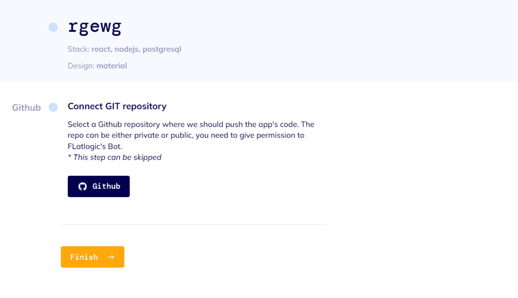
We have built a development platform that simplifies the creation of web applications – we call it the Flatlogic Platform. The tool allows you to create the CRUD app with different components like tables, date pickers, and forms in minutes, you just need to choose the stack, design, and define the database model with help of an online interface and that is all. Moreover, you can preview generated code, push it to your GitHub repo and get the generated REST API docs. Try it for free!
See the quick guide below on how to do a full-stack web app with the help of Flatlogic Platform.
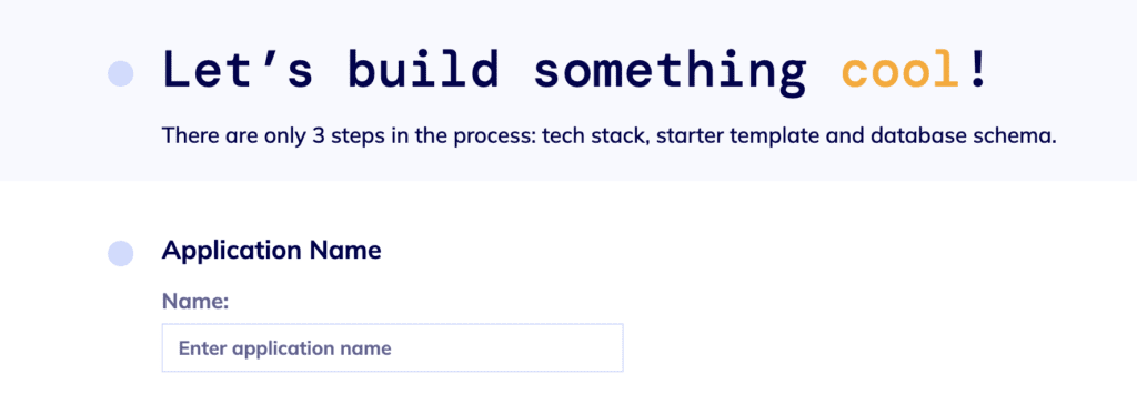
Step №1. Name a web project
Any good story starts with a title, and any good React App starts with a name. So, summon all of your wit and creativity and write your project’s name into the fill-in bar in Flatlogic’s Full Stack Platform.
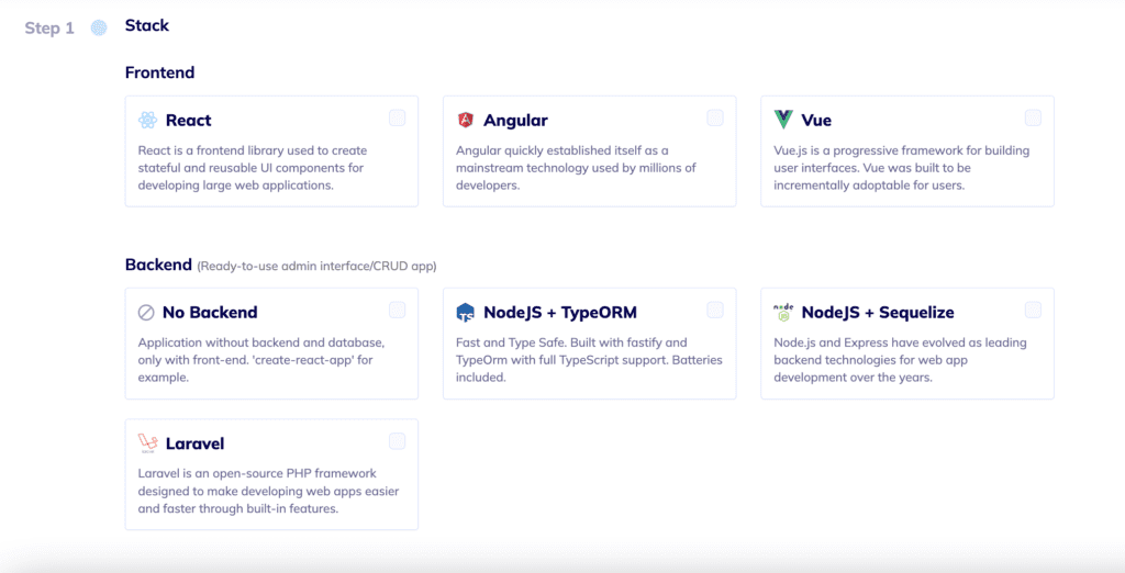
Step №2. Select your Web App Stack
Pick the frontend, backend, and database stack for your app. And, to correlate with our illustrative React App, we will choose here React for the front-end, Node.js for the back-end, and MySQL for the database.
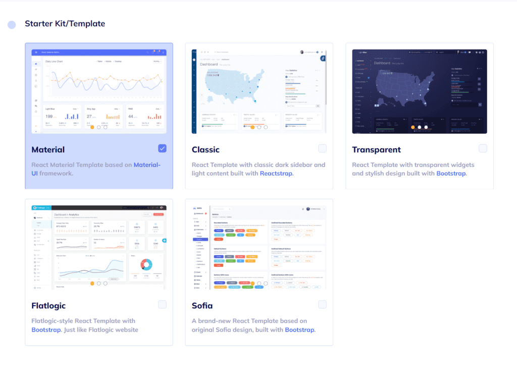
Step №3. Choose your Web App Design
As we’ve already mentioned, design is quite important. Choose any from a number of colorful, visually pleasing, and, most importantly, extremely convenient designs Flatlogic’s Full Stack platform offers.
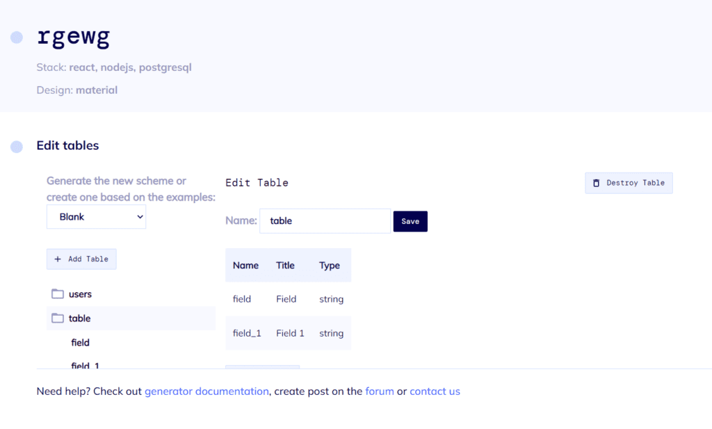
Step №4. Create your Web App Database Schema
You can create a database model with a UI editor. There are options to create custom tables, columns, and relationships between them. So basically, you can create any type of content. You will also receive automatically generated REST API docs for your application.
Step №5. Review and Generate your Web App
Review all of the steps completed and click the “Create Project” button. After a short time to generate, you will have at your fingertips a beautiful and fully functional React Node.js App. Voila! Nice and easy!