TL;DR
- Install @material-ui/core and @material-ui/icons via npm or yarn.
- Import icons individually or as named imports; choose from Filled, Outlined, Rounded, TwoTone, or Sharp.
- Customize icons with CSS and props; SVG icons use a 24×24 viewport and support theme colors.
- Create custom icons with SvgIcon and ensure accessibility and responsiveness.
Fact Box
- Material UI icons render in a 24×24 px viewport for consistency.
- Install Material UI with: npm install @material-ui/core and npm install @material-ui/icons.
- Icon variants include Filled (default), Outlined, Rounded, TwoTone, and Sharp.
- Import per icon (default import) or via named imports from @material-ui/icons.
- Create custom icons with SvgIcon; color prop supports primary, secondary, action, and disabled.
Are you looking for a way to give your React application an attractive visual appeal? Have you ever asked yourself how to install the Material UI Icon library? What are the best ways to use Material UI Icons? How can I make sure my icons are responsive and accessible? In this article, you will learn how to use Material UI Icons in React and make your app stand out.
Material UI Icons have become increasingly popular for React developers, as they provide a great way to give their applications a modern and professional look. However, using Material UI Icons in React can be tricky, as there are a lot of features that need to be considered. For example, you need to ensure that the icons are accessible and responsive and that they are optimized for different screen sizes. The integration of Material UI Icons in React applications enhances the aesthetic and professionalism of business software, necessitating careful consideration of accessibility, responsiveness, and optimization for various screen sizes to ensure a seamless user experience.
By reading this article, you will be able to confidently use Material UI Icons in your React applications. You will also gain an understanding of the best practices for using Material UI Icons, as well as learn how to make sure your icons are optimized and accessible. So let’s get started!
What is Material UI
Material UI is a React library based on Google’s Material Design. Google introduced Material Design in 2014 and has since encouraged developers to use its guidelines. The benefits are smoother integration with Google services and a well-received “Googly” look that so many have grown to like. As you can assume, the Material UI library combines the pluses of Material Design with those of React. Those pluses include broad compatibility, easy development, and the ability to remove unnecessary features. The latter comes in handy since many frameworks tend to weigh the application down, and “shaking off” what you’re not using negates that to an extent. Keep reading about Material UI icons and you’ll know:
- What Material UI templates are
- How we can use them with React
- How to import Material UI templates
- The best ways to use them in your project

What Is Material UI Icons and How to Use Them
Material UI Icons, serving as intuitive shortcuts for commands, operations, and navigation in applications, play a vital role in enhancing the user interface of business software, streamlining user interactions through visually coherent and easily recognizable symbols. They can also be used to represent frequent operations and savings, and are usually placed in applications and/or toolbars. Such Icons are used to create an easy shortcut to any action on the site or in the app, as well as allowing to replace long word descriptions with an easily understandable icon for a user. Material UI Icons mainly consist of two components: SvgIcon and Icon.
When it comes to Material UI Icons, the SVG component serves as the SVG path child and converts it into a React component. This React component allows you to customize the icon’s style and the reaction it makes after a click. It should also be mentioned that the size of said Icon should be 24×24 pixels, but we are getting ahead of ourselves. The second component, which is the Icon component, is there to display an icon from any ligature-enabled icon font.
Where does React fit in?
“What does it all have to do with React?” – you might ask. The answer is quite simple: you can also use them when creating a project with React’s help, which is good because it allows you to keep this task in your line of focus without a need to switch. And there are even no pitfalls, as the pack is ready to use. However, it should be said that Material UI Icons are not a be-all and end-all of UI Icons, as there are plenty of other packs on the market.
So, why choose it? In our opinion, you should choose them, because they are slick, stylish, minimalistic, and are supported by all major platforms, as well as browsers. But the best part is that they were created by Google. And this mastodon of a corporation knows a thing or two about creating site components.
So, there you have it. Now, let’s take a closer look at the process of creating and using said icons in your project.
How to import a React Material UI icon for your project
So, let’s say you are creating a website for your awesome project and you want to make it more colorful, vibrant, and, dare we say it, more internationally accessible. That’s where Material UI Icons can come to your rescue, as they tick all of the upper-mentioned boxes. So, first of all, here’s a little guide to how you can add the ready-made Material UI Icons to your project.
Step 1. Installing Material UI framework. First and foremost, install the Material UI framework to work with its components. To do so, add one of the following command lines, depending on whether you do it with npm or yarn, into your project:
npm install @material-ui/coreyarn add @material-ui/coreStep 2. Installing Material UI Icons. The next step here would be to install the icons themselves into the project’s catalog. Once again, there are two ways to do it: through yarn or npm:
npm install @material-ui/iconsyarn add @material-ui/iconsThese components use the Material UI SvgIcon component we have mentioned above to render SVG paths for every icon. This, in order, constitutes peer dependency on the next Material-UI release.
Step 3. Importing Material UI Icons. After the installation of the Material UI Icons into your project’s catalog, your next step would be to import them by using one of the following two methods:
Method #1. This option would be safer than the second one, also it somewhat restricts the creative potential of the developer’s experience:
import AccessAlarmIcon from '@material-ui/icons/AccessAlarm';import ThreeDRotation from '@material-ui/icons/ThreeDRotation';Method #2. This option is less safe, but, on the other hand, allows an experienced developer more creative freedom:
import { AccessAlarm, ThreeDRotation } from '@material-ui/icons';By using one of these methods, we’ve imported Access Alarm and 3D Rotation icons into our project and you will be able to see them next time you boot up your project in their default variation. But keep in mind, that all of the icons in the Material UI framework have five different variations:
- Filled variation (the default option);
- Outlined variation;
- Rounded variation;
- Twotone variation;
- And Sharp variation.
So, if you want to use any of these variations, you would need to append the theme name to the icon name. Also keep in mind that while Material Design icons use “snake_case” naming, @material-ui/icons use “PascalCase” for the naming.
Step 4. Adding CSS to Material UI Icons to change styles. Let’s assume that your project has its own YouTube channel and you would like to add the link to it to your site. Adding the full link would look rather unfitting on any site, so, using a Material UI icon of YouTube would be a fit here. And let’s also assume that for stylistic reasons you want it to be in red and white, just as the original logo. In that potential situation, your next step would be to add CSS to your icon to make it appear the way you need. Your specific next move would be as follows:
import React, { Component } from 'react' import YouTubeIcon from '@material-ui/icons/YouTube'; export class Maticon1 extends Component { render() { return ( <div> <AppBar className="mrg" position="static"> <Toolbar> <div style={{ 'paddingLeft': "600px" }}> Material UI Social media Icons</div> </Toolbar> </AppBar> <YouTubeIcon style={{ 'color': "red" }}/><br></br> </div> ) } } export default Maticon1 In this example, Maticon1 is the component where we add social media icons. After that, don’t forget to add a reference to this component in the app.js file by doing the following:
import React from 'react'; import logo from './logo.svg'; import './App.css'; import Maticon1 from './Maticon1' function App() { return ( <div className="App"> <Maticon1/> </div> ); } export default App;And, the next time you run your project you will see a beautiful small Material UI Icon of YouTube in red and white.
But what if you need an icon that is not in the default set of Material UI Icons? Well, in that case, the SvgIcon wrapper we’ve already mentioned above would come to your rescue. It allows you to create custom SVG icons by extending the native <svg> element. Bear in mind that all the SVG elements should be scaled for a 24×24 pixels viewport. This way the resulting icon would be available to use as a child for other Material UI components that themselves use the icons and would be available for customization with the viewBox attribute. You would also be free to apply any of the theme colors by using the color prop, as by default all the components inherit the current color. The code for customization would look the following way:
function HomeIcon(props) { return ( <SvgIcon {...props}> <path d="M10 20v-6h4v6h5v-8h3L12 3 2 12h3v8z" /> </SvgIcon> );} And the code for color setting would look the following way:· <div className={classes.root}><HomeIcon /><HomeIcon color="primary" /><HomeIcon color="secondary" /><HomeIcon color="action" /><HomeIcon color="disabled" /><HomeIcon style={{ color: green[500] }} />And, after adding these lines, your icons will look the following way:

That is how you install and customize your Material UI Icons. Feel free to wield this power to decorate your project with all sorts of beautiful icons and somewhat secretly enrich your end-user’s experience with it.
About Flatlogic Platform
In this article, we’ve talked about Material UI icons and how to use them in React. Icons are an integral part of what differentiates your website from competitors. They take up a small portion of the website’s face but command a great deal of the user’s attention. If you want to create your Apps by hand, this guide will help you a great deal. If saving time is of greater priority to you than individual design, there’s another path you could choose.
Creating web Applications with Flatlogic
Some Apps have unique, unpopular functionality we have to craft by hand. But those Apps are as rare and unique as the functions they perform. Most apps have more similarities than differences. Most web Apps’ basic functions are Creating, Reading, Updating, and Deleting Data. Just like the basic functions, many components and parts of an App can be categorized and replicated. We followed this line of thought and built the Flatlogic Platform to help you create React Apps without hiring a whole team of developers and with little to no special expertise. App creation with Flatlogic consists of a few choices. Let’s see what they are!
#1: Choose a name
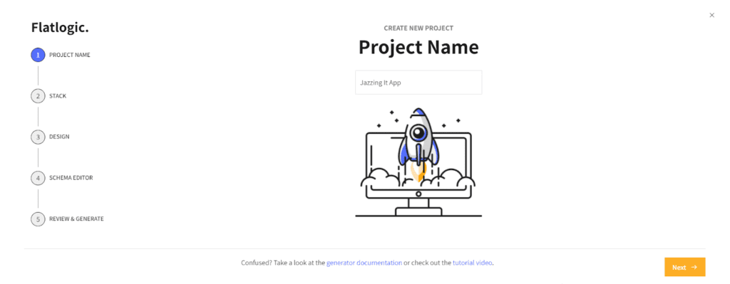
First off, you choose a name for your project. If you have to create another project soon, you’ll need to differentiate between the two, so choose wisely!
#2: Choose stack
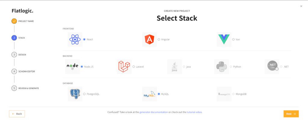
A complete App consists of the database, the front end, and the back end that mediates between the two. We choose the underlying technologies for each part. Any combination will work fine but depending on the resources your App will operate with, some options might have additional benefits. So, a quick research of what works well with React, Vue, or another option you choose will do you good.
#3: Choose the Design
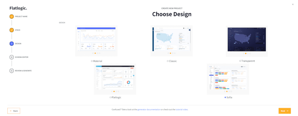
If you’re creating an admin dashboard, the visual part may be of lower priority than other parts. Still, you’ll likely look at the panel for hours on end, so choose carefully! It might have a heavy impact on your productivity.
#4: Choose Database Schema
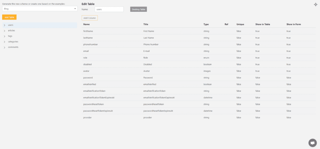
We can visualize a database’s structure as a spreadsheet. A spreadsheet has two dimensions with lines and columns crossing to represent a field with two distinct parameters. If we were to picture databases similarly, some would have three or even more dimensions, each one representing a relevant parameter. The parameters we need, the type of data they consist of, and how they relate to each other are the things that comprise a database schema. This part is perhaps the trickiest since it requires a thorough understanding of the data your App will process.
#5: Review and Generate
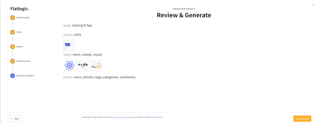
The choices have been made. It’s time to check them and (assuming everything’s in place) hit “Create App” After compiling for a while (usually a few minutes), your Application will be complete. At this point, you can connect it to your API’s data endpoints and use it. You can push it to GitHub or host it without outside services, both in one click. Enjoy!
Conclusion
Icons are small parts of an App by the screen space they occupy but not by their importance. They help us navigate the interface without spending time reading. They help project an idea or a vision in a clear and concise form. Material UI icons are easy to integrate into React, customize, and shape to your needs. It makes Material UI Icons a must-try for any project development.
And that is all for today. We wish you a happy day, filled with small pleasant things to enjoy. And, as always, feel free to read up on any other of our articles. Until next time!