Are you looking for the best React component libraries to help you create stunning apps? Do you want to know which libraries are the most popular and which ones are the most reliable? Are you curious about the benefits of using a React component library?
Designing an app can be a tedious and time-consuming task, and developers often struggle to find the right components. Everything should be made as simple as possible, but not simpler. Having the right components can make your React app development process much smoother and help you create a great product.
Recent studies have shown that the use of React component libraries can significantly reduce development time and provide a better user experience. React component libraries can provide developers with a wide range of components and reusable elements, significantly reducing the amount of coding that is required.
By reading this article, you will learn which React component libraries are the most popular, which ones are the most reliable, and the benefits of using a React component library. You will also get an overview of some of the most popular React component libraries and their features. With this knowledge, you will be able to create stunning apps with the best React component libraries.
What is React?
React is the most commonly used web framework today. What started as a universal UI library developed by Facebook in 2011 and went open source in 2013 is now widely used to create compelling user interfaces.
React consists of components – small pieces of code that populate a specific part of the user interface you create. Think of these components as JavaScript functions that have properties and states at the input and produce a description of the user interface at the output.
We’ve researched and selected the best options and beyond to make it easier for you to find the perfect framework. In this article, we’ll look at the features and usability of each React UI framework in the following sections so that you can choose the perfect one for your development needs.
Material UI (MUI)

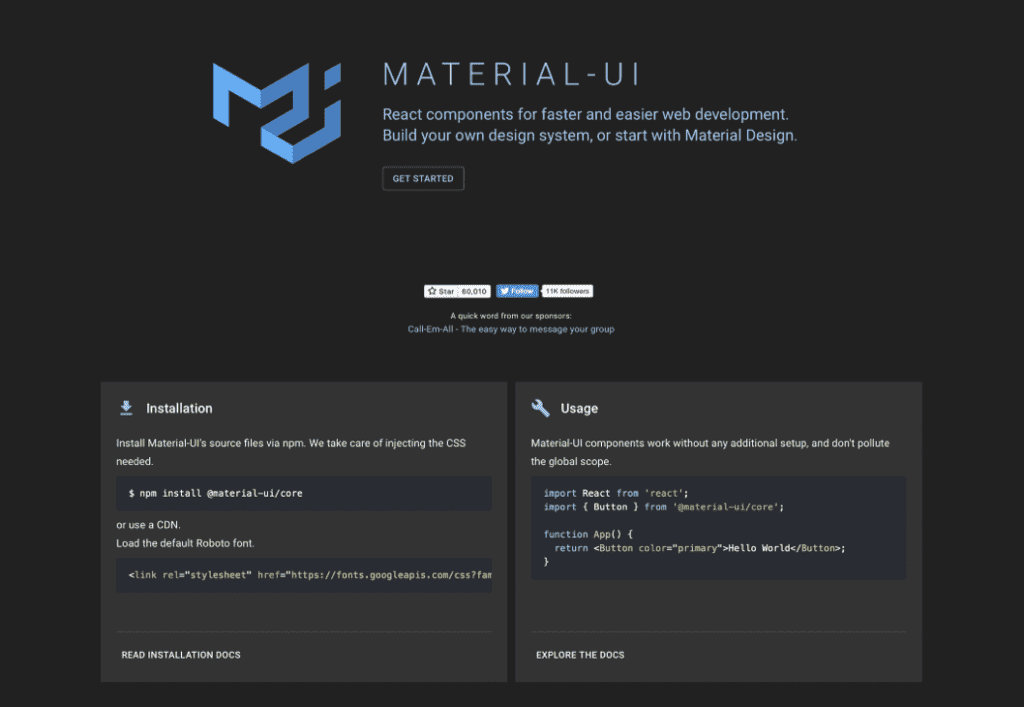
Material-UI (MUI) is a CSS framework that provides React components out of the box and follows Google’s Material Design launched in 2014. MUI makes it possible to use different components to create a UI for a company’s web and mobile apps. Google uses Material Design to guarantee that no matter how users interact with the products they use, they will have a consistent experience. Material Design includes guidelines for typography, grid, space, scale, color, images, etc. And it also allows designers to build deliberate designs with hierarchy, meaning, and a focus on results.
The MUI library for React has over 76k stars on GitHub and is one of the most improved UI libraries. You can build an incredibly stylish application in a short amount of time with pre-styled components, as well as tune and expand these components according to your needs. It is based on Leaner Style Sheets (LESS), a CSS development extension.
React Bootstrap
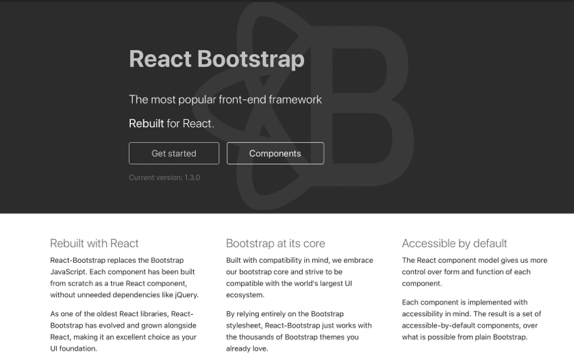
React Bootstrap is a Bootstrap reimplementation of React, where styles stand changed to components. Accordingly, if you are a web developer, it is probably easier to work with React Bootstrap, as it is famous for the form you work with it.
React Bootstrap provides a clear React user experience, with no jQuery dependencies. Additionally, it is one of React’s original libraries, meaning it includes a vast number of components. These components were designed with accessibility in mind. This means you don’t have to customize them when making your theme, plugin, or app available to users.
It has gained popularity over the years and has over 18,000 stars on GitHub and over 500,000 downloads on NPM weekly. This is the best way to get started with Bootstrap in React.
Semantic UI
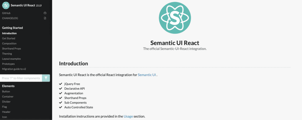
Semantic UI React is an official plugin for Semantic UI. Featuring no jQuery and a declarative API, reduced props, sub-components, add-ons, auto-managed state, and more. Libraries boast a collection of more than 50 components, with segments, transitions, progress bars, pagination, etc.
Semantic UI is a framework that helps you build web applications. It provides a set of components for your applications, tools for defining responsive layouts, and flexible theming support. Semantic UI supplies integration with React using Semantic UI React. This library provides component implementations in React, so you don’t need additional JavaScript dependencies. Semantic UI React uses themes from Semantic UI, so you can reuse CSS stylesheets and use Semantic UI themes.
Blueprint
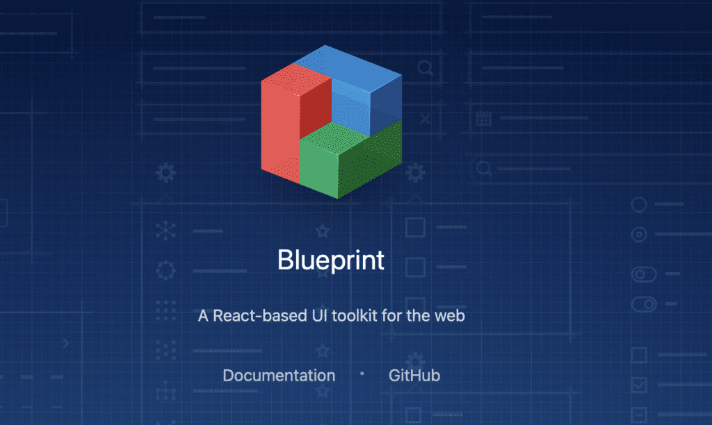
Blueprint is a React user interface library created by Palantir, an American technology company specializing in big data analytics. Their React library contains more than 40 components, optimized separately for complex, data-rich desktop application interfaces.
Blueprint is written in TypeScript, as are all the code examples in their documentation. The library supports different types of browsers such as Chrome, Safari, etc.
Blueprint has detailed documentation for almost every aspect of its functionality. These guides include written and visual instructions to help you master the user interface. Blueprint is thus a relatively user-friendly option that may be more accessible than the MUI.
Blueprint is regrettably not the best UI for mobile applications. While it does feature support for mobile interaction, many mobile components that can be discovered in interfaces such as the MUI are missing from it.
Next UI
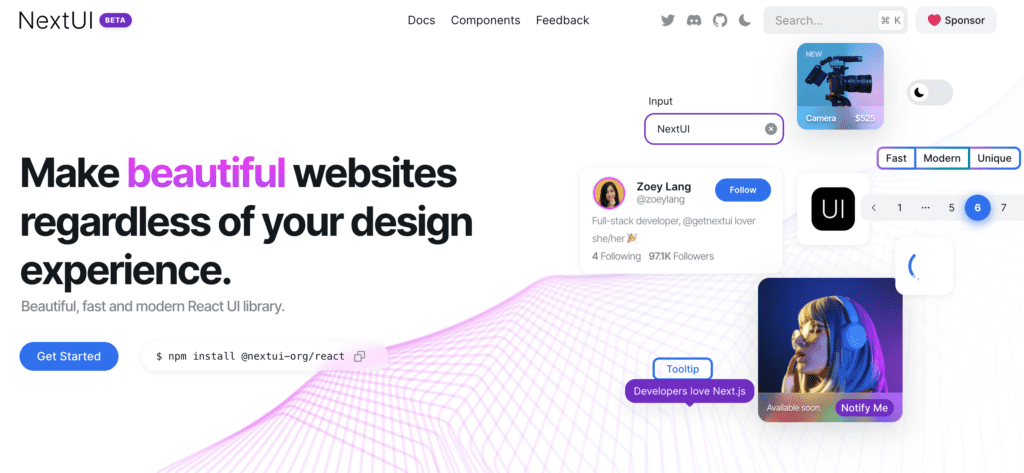
The Next UI library was created by Junior Garcia and sponsored by Vercel and is still on the Beta list, but it looks completely promising. One of the features of this library is that it is best suited to React libraries for web development. All components are bespoke and not based on any visual trend or design rule.
They follow WAI-ARIA guidelines and feature keyboard help and focus control efficiently. The default themes are easily customisable, and dark mode can be changed with just a few lines of code. Rendering on the server side improves the development experience, allowing components to be developed without importing and blending many elements to display only one.
Headless UI
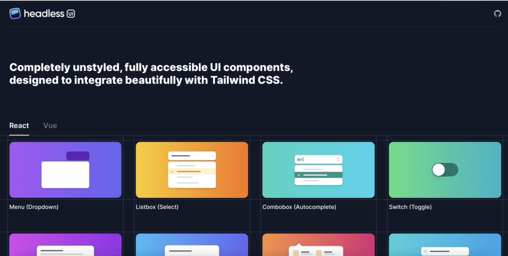
Headless UI is a concentration of completely non-styled, full-access UI components. Since it decouples logic from visual components, Headless UI is a really good choice if you want to create a design by yourself (or have been assigned a specific design). Using Headless UI, you can implement your custom styles into the out-of-the-box components.
Headless UI was designed to integrate with Tailwind CSS. It currently has only a small number of components, but Tailwind developers are actively working on expanding this number.
Fluent UI
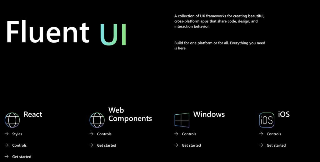
Fluent UI React is the officially open-source Microsoft UI frontend framework powered by React, intended to create user experiences which can be easily integrated into a range of Microsoft products. Using CSS in JS, allows you to create highly customisable, affordable, reliable and relevant components.
Fluent UI React also provides a variety of React JS UI controls, like buttons, pop-up boxes, checkboxes, grids, as well as other standard components. Likewise, it contains other Microsoft controls.
Fluent UI is more than simply a bunch of UX frameworks for building a website and mobile apps with shared code, designed and behaving interactions. The UI is instead a fresh look at how we work between different product disciplines and teams to create a smoother and more seamless user experience across devices that feel authentic on the devices our customers use throughout the day.
Ant Design
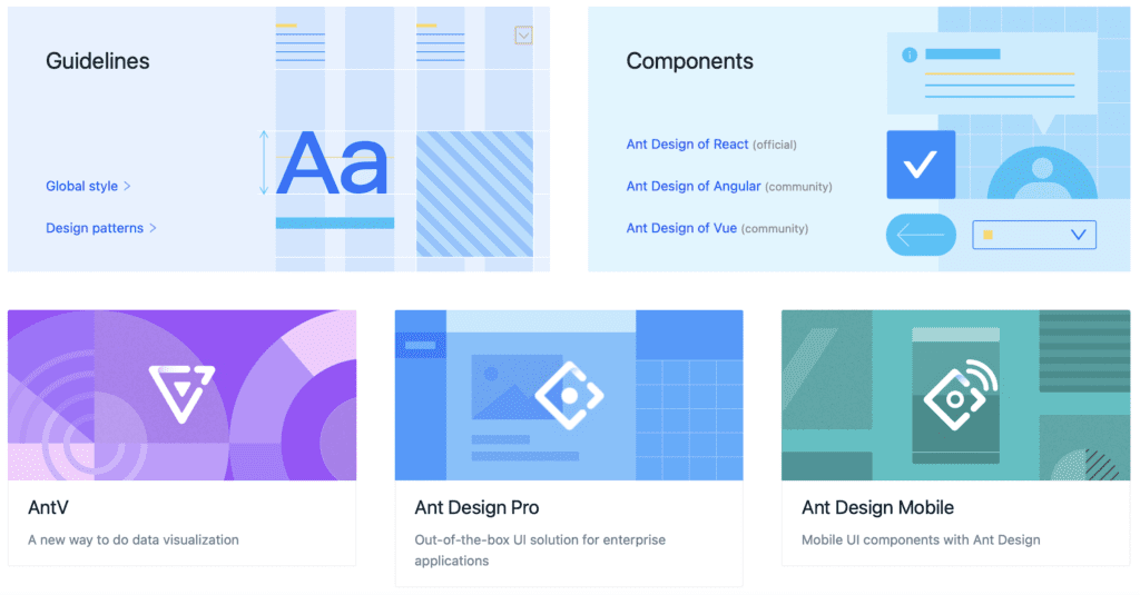
Ant Design focused on standardising UI specifications and reducing duplication and excessive production costs, helping product designers focus on the best user experience. and React library, used by over 185,000 users, and the world’s second most popular React UI.
Ant Design provides a complete and flexible design and has a library of 50 components. With Ant Design being the suitable React component library for an application, you can think about designing and developing a full-sized application.
Ant Design provides a set of more than 50 components. These components also serve as building blocks for enterprise applications. They also recommend using other third-party React libraries for components outside the Ant Design specification, such as React Hooks Library or React JSON View.
Grommet
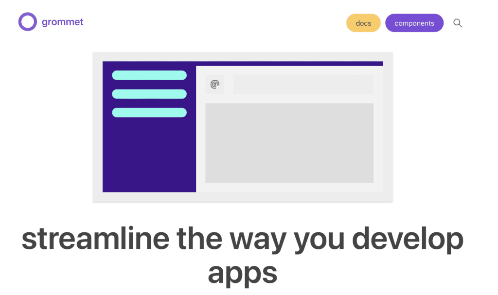
Grommet is a React component library that boasts responsive and accessible mobile-oriented code components. Thanks to the components that are the building blocks for the library. This library is contained layouts, types, colors, controls, inputs, visualization tools, and utilities. All Grommet components are developed with accessibility and responsiveness in mind.
Grommet provides support for the W3C specifications, which allows it to score big in terms of accessibility. It also provides powerful themes and tools that let you customize color, type, component elements, and layout to suit the needs of your project. Grommet features powerful theming tools allowing you smoothly customize any aspect of each component.
Conclusion
Choosing a React component library is a challenge, as no universal solution exists. We recommend carefully investigating your needs, preferred development style as well as every framework to understand which one suits you best.
You can create React components using the Flatlogic Platform since our platform generates them using Material UI. Also, you can easily find modern, ready-to-use, powerful Javascript and HTML Material Design Templates and build a robust React Application using the Platform. Flatlogic is also a hosting platform where you can host your full-featured web applications. Using this CMS approach, you can build and host any web application, reducing the time and cost of web development.
Comments